The network for creativity
Join 1.25M professional creatives like you
Connect with clients, get discovered, and run your business 100% commission-free
Creatives on Contra have earned over $150M and we are just getting started
Back to feedPost


Earth tone color combos to inspire your next design project!
https://www.instagram.com/p/DTuw9hpEdd3/
The network for creativity
Join 1.25M professional creatives like you
Connect with clients, get discovered, and run your business 100% commission-free
Creatives on Contra have earned over $150M and we are just getting started






Related posts

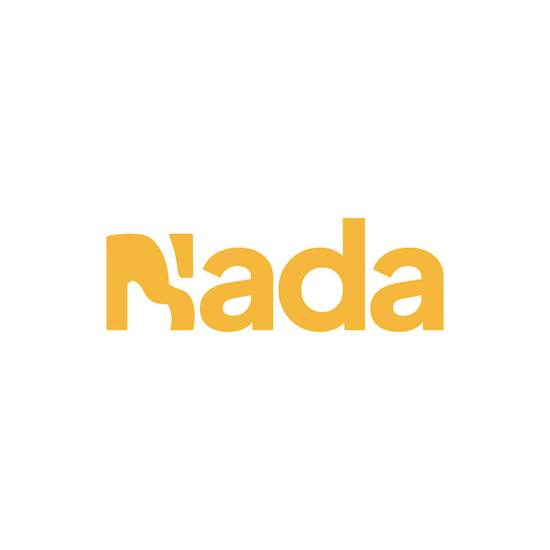
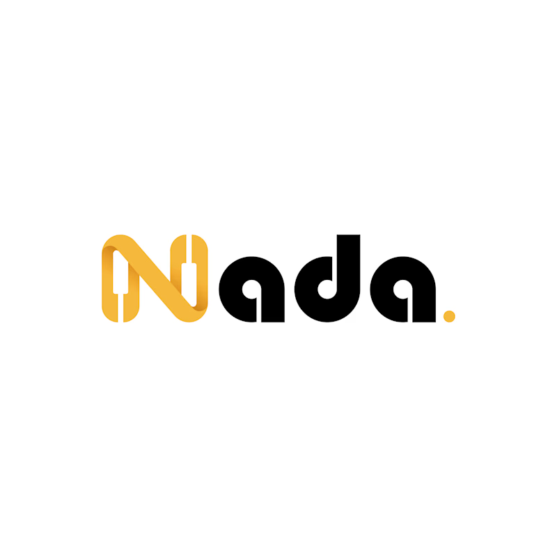
Challenge: Nada's old logo had a unique shape, but the "N" was hard to read and the design didn't connect to music.
Solution: I redesigned the logo with a piano-built "N" monogram and letterforms that carry music notes. A golden dot closes the wordmark like a final note. The warm gold stays, now paired with black for a more premium look.
Result: A clearer, more memorable logo that tells the brand story at a glance. The client loved it.
1 vote
Ends in 16h

The piano keys forming the N is a smart fix, it solves the readability problem and the music link in one move. The golden dot as a final note is a lovely detail.

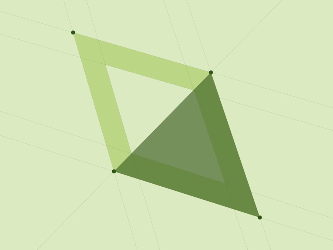
WEBANE is a web design studio with a Qibla-inspired geometric identity, combining bold typography, fresh green tones, and purposeful UI design.


That overlapping green triangle geometry is a beautiful nod to the Qibla inspiration — precise, calm and instantly recognisable as WEBANE's mark. The fresh green tones keep it feeling modern rather than ornamental, and the bold type lets the pattern speak.

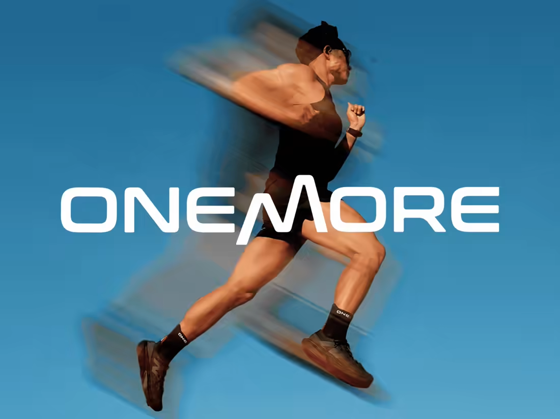
Visual identity for ONEMORE, an Indonesian performance apparel brand, built around progress, persistence, and the mindset of going one more.

The slanted cut in the M ties the wordmark to the motion blur in the photography. Does that blur treatment carry through the rest of the system, or is it reserved for campaign imagery?