The network for creativity
Join 1.25M professional creatives like you
Connect with clients, get discovered, and run your business 100% commission-free
Creatives on Contra have earned over $150M and we are just getting started
Back to feedPost

Metive - B2B Analytics SaaS Logo Branding
Metive is a B2B SaaS analytics platform that helps business leaders turn performance metrics into clear strategic direction. Most analytics brands feel cold, overly technical, or generic, built for analysts rather than decision-makers. Our goal was an identity that feels precise enough to trust with business data, yet calm enough to welcome leaders every day.
We built the "m" monogram on a strict column grid, with every curve drawn from the same circular construction, so the precision is visible in the form itself. We chose structured, rounded arches over sharp geometric angles, intentionally trading some technical edge for approachability. The palette (Maya Blue, Persian Blue, Prussian Blue, and Periwinkle) stays within one hue family so the brand feels calm and the data inside the product stands out.
The result is one consistent mark across the dashboard, app icon, browser, and social media, giving Metive a confident presence everywhere it meets its users.
Looking for the closer details? See the complete project here!
What do you think about this design? Let me know your thoughts in the comments!
The network for creativity
Join 1.25M professional creatives like you
Connect with clients, get discovered, and run your business 100% commission-free
Creatives on Contra have earned over $150M and we are just getting started
Related posts

A little behind-the-scenes look at a brand identity coming together.
I'm currently working on a new identity for a coworking space in Austin, TX, with a vintage-inspired direction, warm colors, and a logo that brings a bit of nostalgia into a modern setting.

Carrying the vintage idea onto the coasters and the dot pattern gives the identity somewhere to live besides the logo.

A little more about the inspiration behind Tindara.
I wanted the identity to have a connection to Tindari, Sicily. The Madonna di Tindari statue was the starting point for the symbol, while Sicilian decorative patterns inspired the graphics around it.
For the colors, I chose mustard yellow, deep green, and burgundy, balanced with cream. I wanted to bring some of that warmth and richness into the packaging, while keeping the different elements comfortable together.
For me, these references are what give the project its character and sense of place.



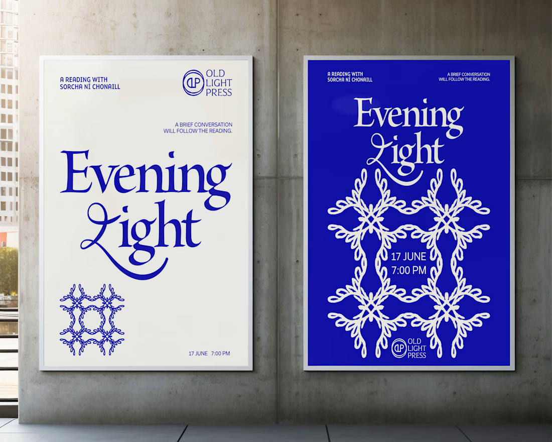
Brand identity concept for Old Light Press.


I love that all of your projects have a whimsy vibe 💖