The network for creativity
Join 1.25M professional creatives like you
Connect with clients, get discovered, and run your business 100% commission-free
Creatives on Contra have earned over $150M and we are just getting started


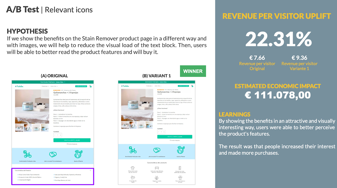
The network for creativity
Join 1.25M professional creatives like you
Connect with clients, get discovered, and run your business 100% commission-free
Creatives on Contra have earned over $150M and we are just getting started





Related posts

A personal identity experiment for Super Intelligence.
The symbol combines a star and the letters SI into one compact mark.
Logo design + motion.


Excellent use of geometry in the logomark!


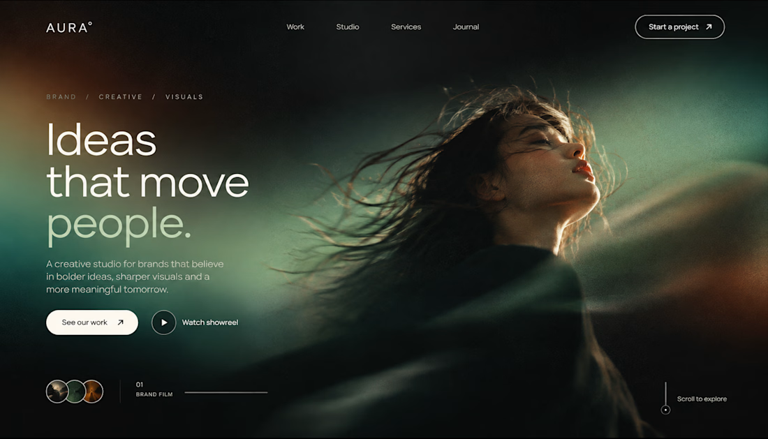
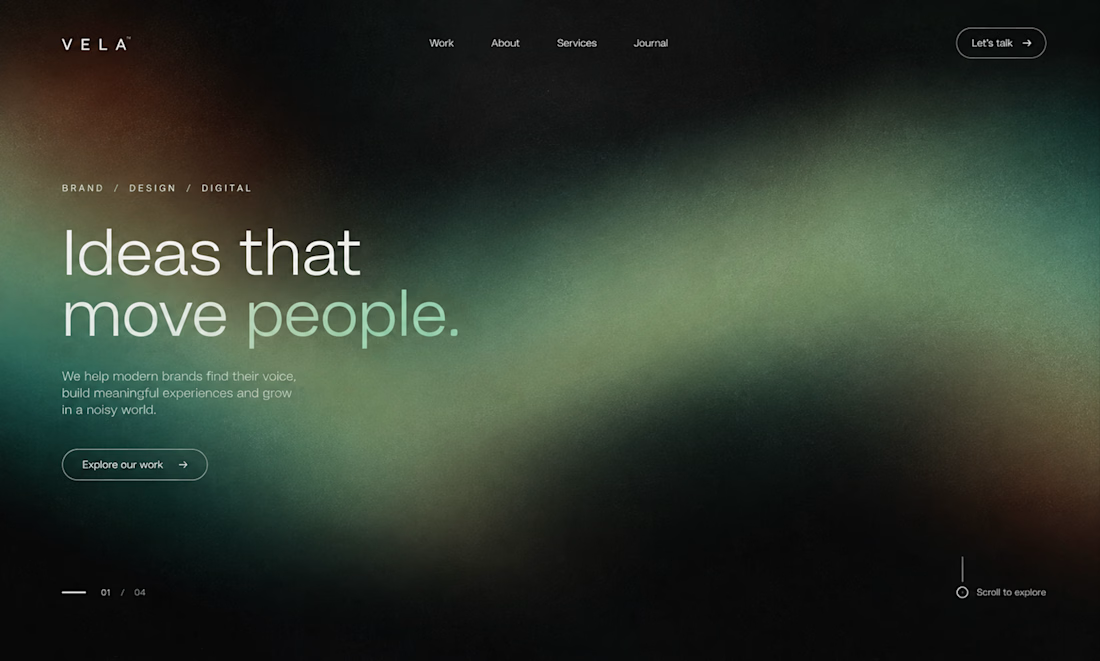

Five Logo Directions for a Health App — Logo Design & Motion
Five logo directions for a healthcare app that people trust with their medical records and their money.
I gave myself strict rules: each logo has to work at 16 px and at app-icon size, in one colour, and without the usual clichés (no shield, cross, heart or checkmark).
In the video, each logo builds in its own way, then you see it at every size and inside a real product: app icon, browser tab, notification.
I did the concept, the logo design and the animation.
Live interactive version: https://vipinsao.github.io/health-logomark-directions/
Self-initiated concept project.

@Mykola Malyhin thanks for appreciating my thoughts I really hope you liked my concept.