The network for creativity
Join 1.25M professional creatives like you
Connect with clients, get discovered, and run your business 100% commission-free
Creatives on Contra have earned over $150M and we are just getting started
Back to feedPost
Taste Test

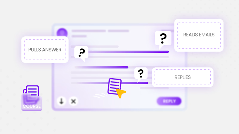
Illustration for an explainer about the US power grid 💡
Which one would you pick, 1 or 2?


4 voted
29%
10 voted
71%

14 votes
Closed

In the first version, the banner is white and merge with the white interface, so my vote for option 2

Going with 1. The labels stay readable, the glow on 2 swallows the dashed cards a bit.

The first one, with text that's easier to scan

Definitely 1, the light version It feels much cleaner, brighter and easier on the eyes when reading all the little labels. The dark one looks cool too though

2 looks better. Ideal SaaS work!
The network for creativity
Join 1.25M professional creatives like you
Connect with clients, get discovered, and run your business 100% commission-free
Creatives on Contra have earned over $150M and we are just getting started





Related posts

Which 3 seconds would sell you the ring?
I built ORBIT, a launch site for a fictional titanium health ring. Everything you see is live 3D running in the browser, not renders or pre-made video.
Left: as you scroll, the ring comes apart into its five layers, each one labeled.
Right: it turns to show the sensors, pulsing in time with a live heart-rate readout.
If a launch page only had room for one of these moments, which one makes you want to buy? Vote, then tell me why in the comments. The full scroll is in the case study on my profile.

16 voted
94%
1 voted
6%
17 votes
Closed

The teardown for me. Seeing the five layers come apart shows what I'm actually paying for, the heartbeat is cool but every ring brand does a version of it 😄 Love that it's all live three.js and not a video.
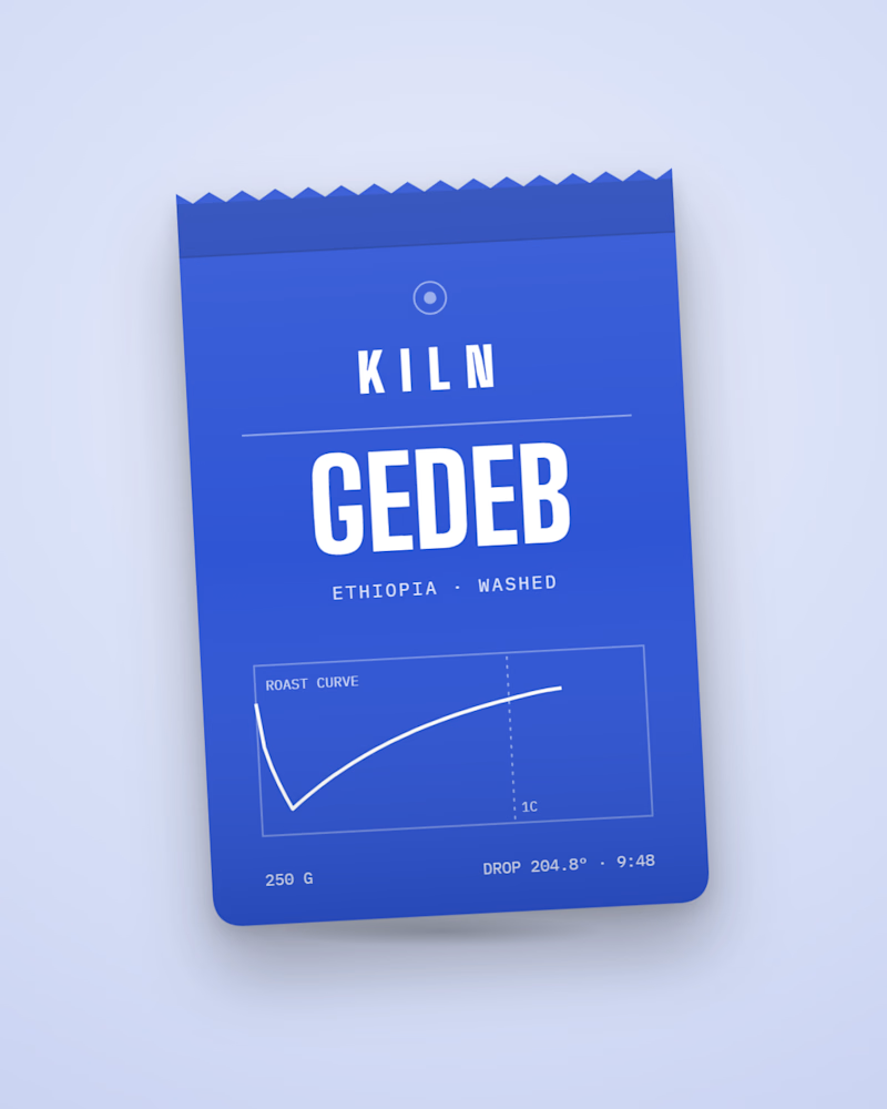
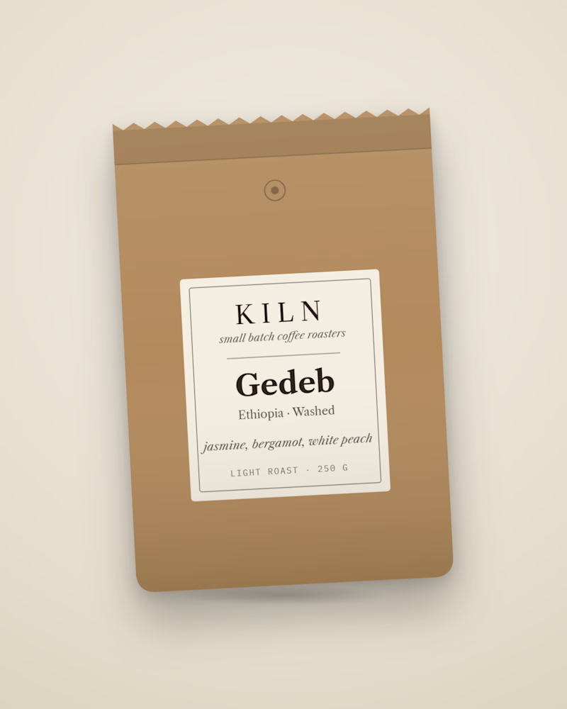
Which bag would make you buy the coffee?
Same coffee, two bags. One prints the real roast curve from its batch: drop temperature, roast time, first crack. The other is the classic kraft label most roasters ship. I built the first into KILN, a Shopify store concept where every bag is generated from its roast data. Which one are you picking up, and why?

8 voted
62%
5 voted
38%
13 votes
Closed

Printing the actual roast curve on the bag is such a good trust move, it turns the data into the packaging. I'd buy that one. Does the curve change with every batch on the print run?

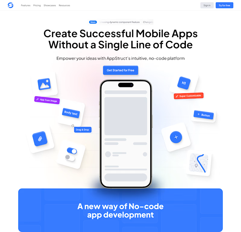
Before & After, although After is still in progress. What's your pick?
2 voted
14%
12 voted
86%
14 votes
Closed

After 🔥