The network for creativity
Join 1.25M professional creatives like you
Connect with clients, get discovered, and run your business 100% commission-free
Creatives on Contra have earned over $150M and we are just getting started
Back to feedPost

Most booking apps lose people at the sign up screen.
PaceDream lets people book a room, a parking spot or even a restroom by the hour. Users can also split the cost of a place with a roommate and find last minute flight and hotel deals.
I worked on it as a full stack developer. The choice I liked most was the no login booking option. People can book without creating an account so the first booking has almost no friction. Secure payments with fair credit and refund handling sit behind it.
Built with Next.js, TypeScript, Node.js, Express, PostgreSQL and Firebase.
My takeaway: every screen before the first booking costs you users.
Founders, which step in your signup flow could you remove tomorrow?
https://www.pacedream.com
The network for creativity
Join 1.25M professional creatives like you
Connect with clients, get discovered, and run your business 100% commission-free
Creatives on Contra have earned over $150M and we are just getting started



Related posts

Noise Reveal, a premium reveal component for Framer
I built a component that gives Framer sites cinematic reveals for images, video and live layouts. It has a soft, film-like edge with glow and grain, and can play on load, on view, from a variant or scrubbed by scroll.
It’s built for production: the reveal is prepared before it scrolls in, it’s accessible with reduced-motion support, it falls back when WebGL isn’t available, and pages stay plain HTML when nothing is moving.
Launched on the Framer Marketplace. Open to custom Framer and interaction work.


The WebGL fallback and reduced-motion support are the parts most reveal effects skip, so it's great to see them called out. Does the fallback keep some of the grain edge with CSS, or does it drop to a simple fade?

Zencastr came to us with a complex mix: they hosted their homepage on a custom server, blog on a separate platform and the rest of the pages on Webflow.
They had 3 days before the launch to tie it all together. This is their review:

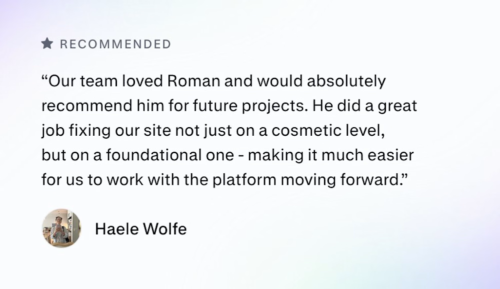
Three platforms behind one domain in three days is a real test. I'd guess the reverse proxy and keeping the nav and footer identical across all three took more care than any of the page building. Did you match the shared header in Webflow or pull it from one source?

A migration is not complete when the pages have moved. It is complete when the customer journey still makes sense.
For DVA, the work brought a Wix website, two lead funnels, a client portal, and segmented nurture automations into a clearer Kajabi experience.
Five checks I use before launch:
Map every public page and redirect.
Rebuild forms, tags, and follow-up paths.
Test offers and product access with a real user journey.
Check mobile pages and portal navigation.
Document what the client will manage after handoff.
#Kajabi #PlatformMigration #CourseCreator


two funnels, a portal, and nurture in one move. thats a lot of moving parts