The network for creativity
Join 1.25M professional creatives like you
Connect with clients, get discovered, and run your business 100% commission-free
Creatives on Contra have earned over $150M and we are just getting started
Back to feedPost

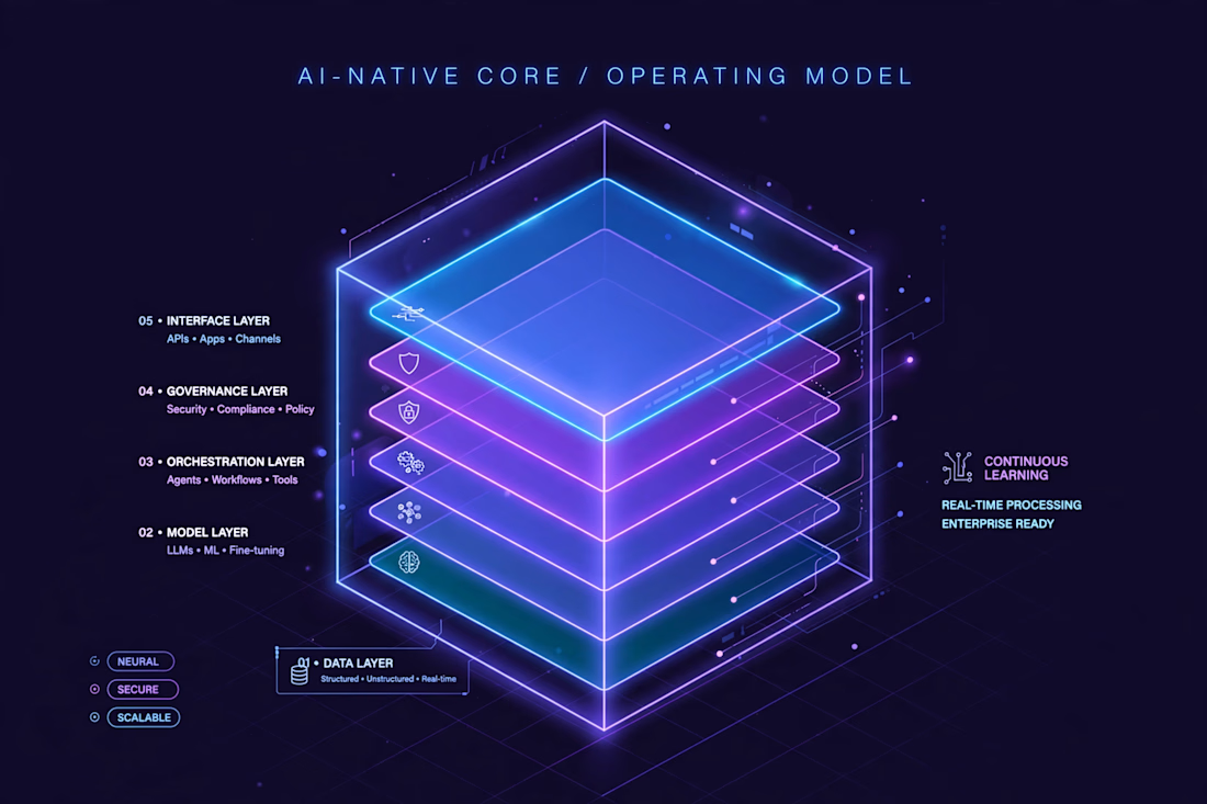
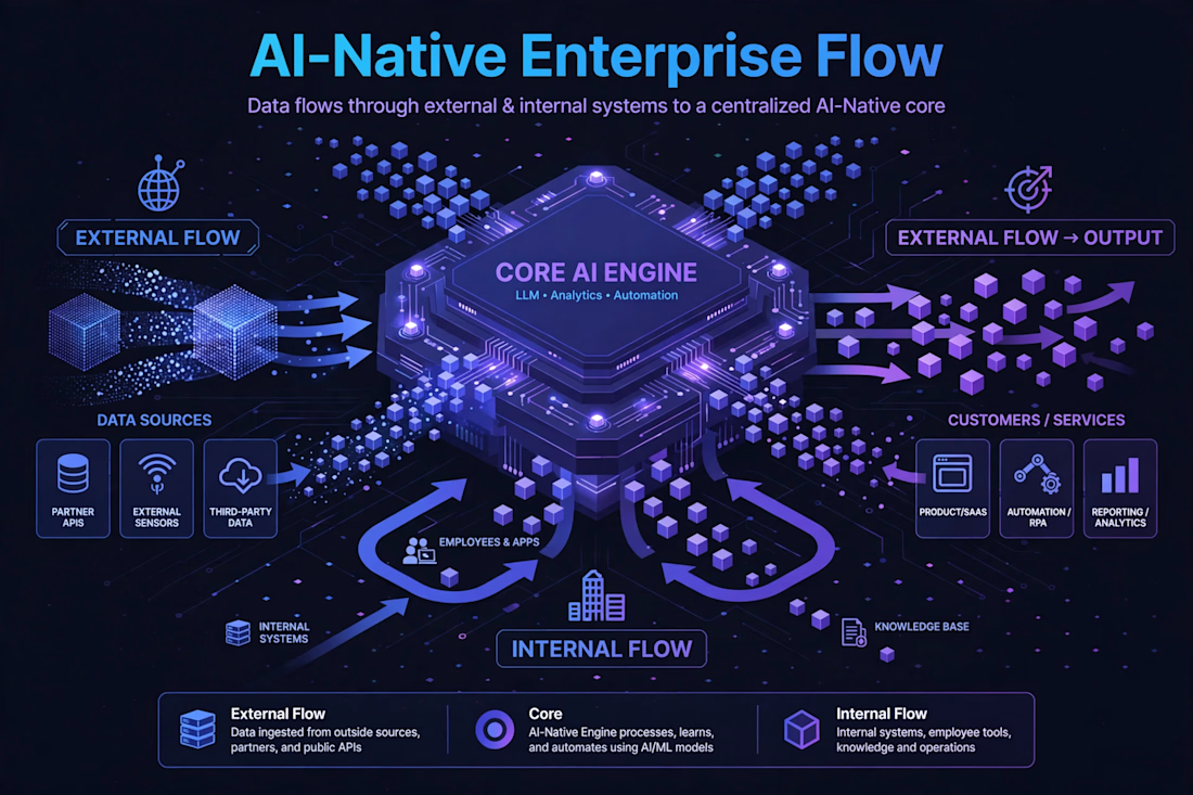
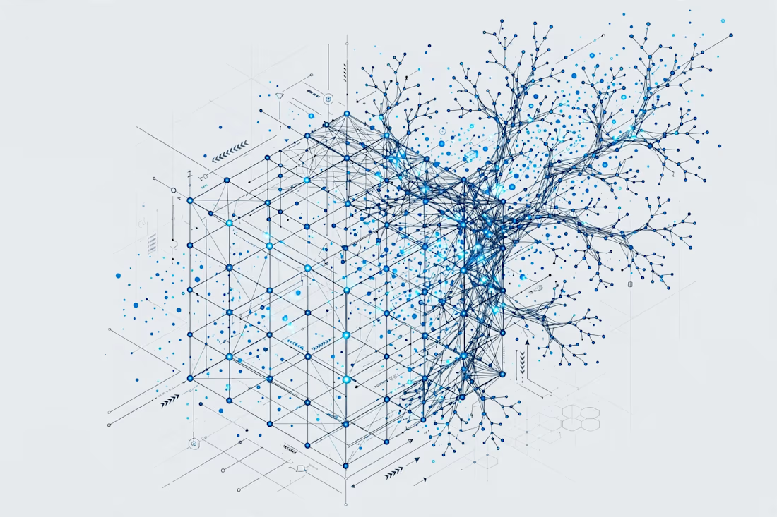
66degrees - AI-Native Isometric Illustration Library (3 Concepts)
1. CORE: 5-layer operating model. 2. ENTERPRISE FLOW: External & internal data flow to core. 3. ABSTRACT: Evolving living model.
Style: Clean isometric tech, blue/purple neon, made in Illustrator. Vector AI, SVG, PNG delivery.
I can create many more variations in this style so you can choose best 3-9 for your client.


The network for creativity
Join 1.25M professional creatives like you
Connect with clients, get discovered, and run your business 100% commission-free
Creatives on Contra have earned over $150M and we are just getting started

Challenges
View all


Related posts

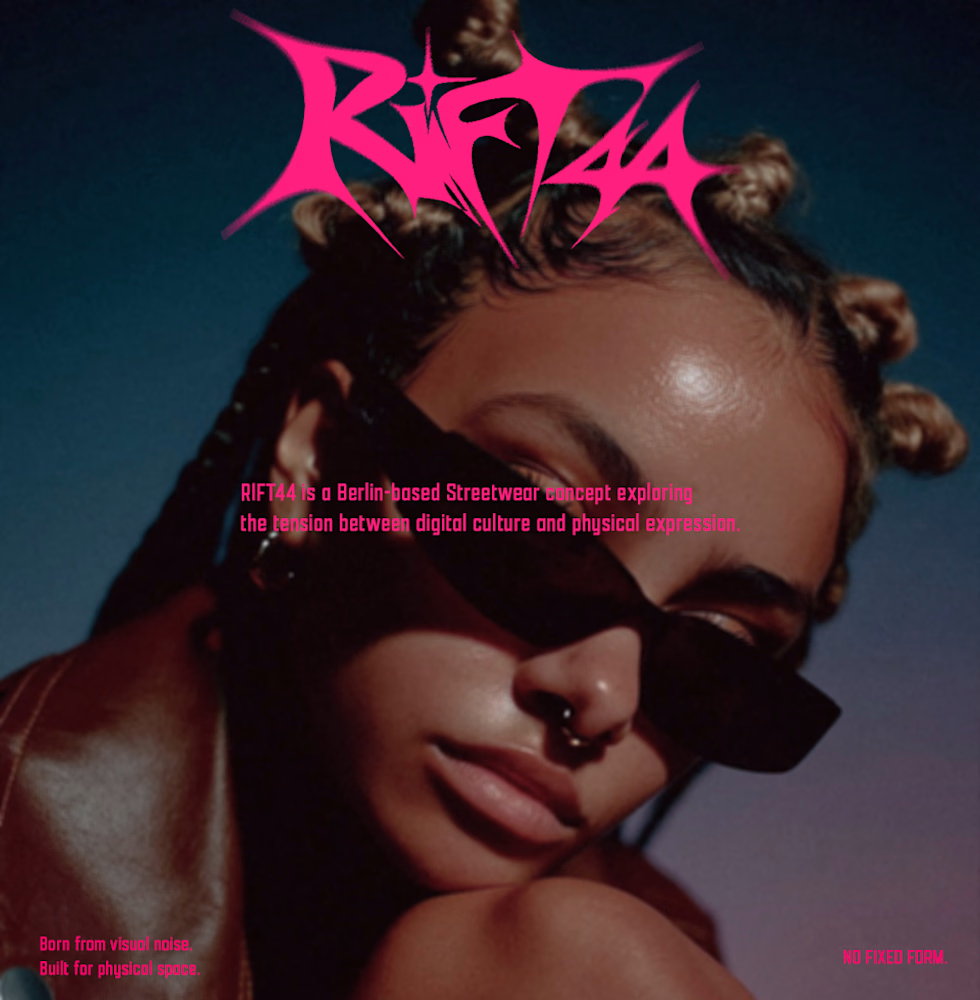
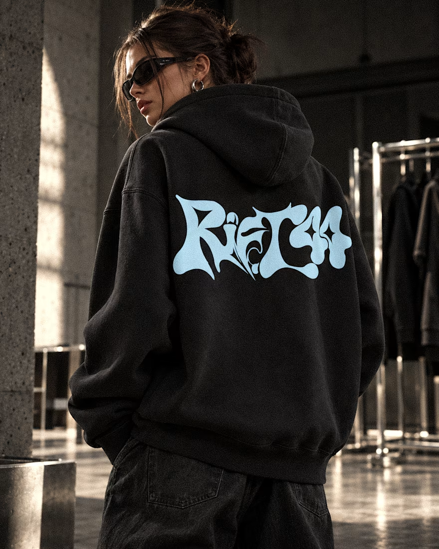
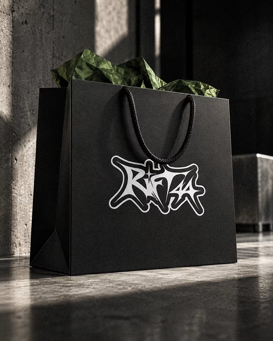
RIFT44 — Streetwear Visual Identity
A self-initiated identity exploring custom lettering, underground fashion culture and bold physical applications.
Visual Identity · Art Direction · Campaign Design


Beautifully done! 🌟🌟

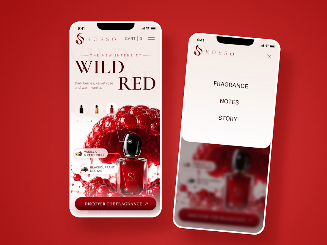
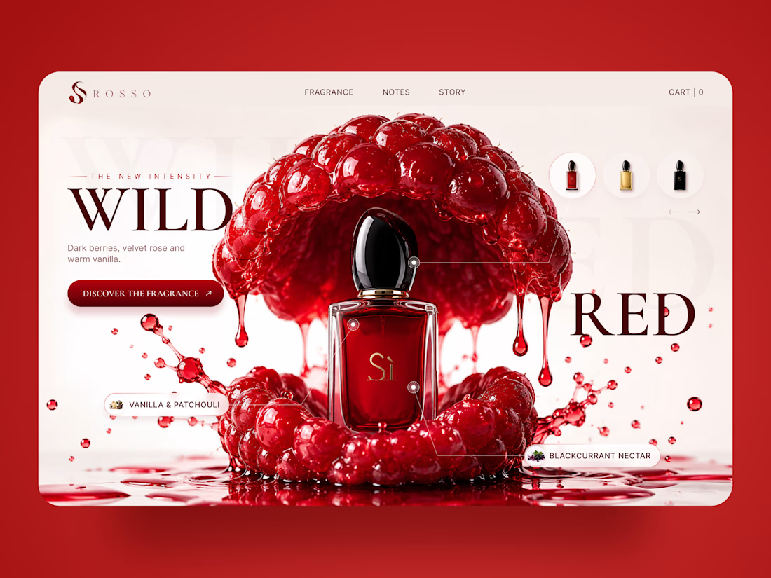
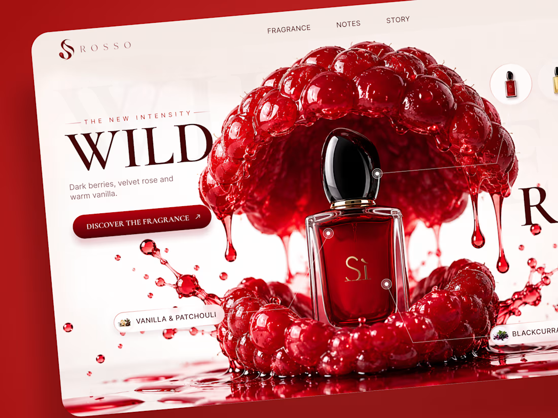
ROSSO — Wild Red Perfume Landing Page 🍒❤️
A bold fragrance landing page concept inspired by rich red berries, sensual notes, and luxury perfume aesthetics
The design combines deep red tones, oversized editorial typography, glossy fruit visuals, and elegant product presentation to create a rich and memorable experience
Special attention was given to:
• Bold product-first composition
• Rich red color palette
• Elegant editorial typography
• Fragrance notes and ingredient highlights
• Product variations and navigation
• Responsive mobile experience
The result is a vibrant, luxurious landing page that brings the fragrance to life through color, texture, and strong visual storytelling ✨
Looking to create a standout website for a beauty, fragrance, or luxury brand? Let’s connect


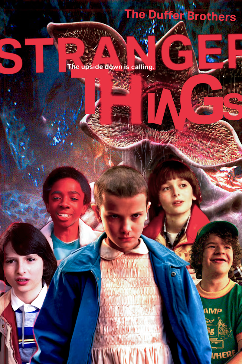
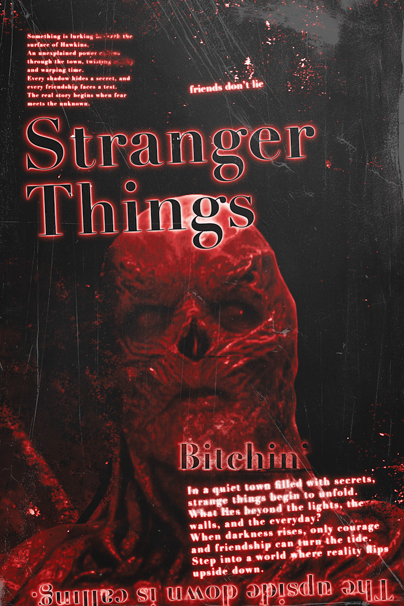
I Designed these stranger things poster last year.
A. what is expected our main character L which supporting characters and a big monster that show his/her power.
B. Other the more experimental one with different style of type experiment with main title "Stranger Things" is being in original stranger things main title style.
Comment down your thoughts, which one you like A or B and also which one you don't and why.
2 voted
50%
2 voted
50%
4 votes
Closed

a is absolutely incredible great job 🔥🔥