The network for creativity
Join 1.25M professional creatives like you
Connect with clients, get discovered, and run your business 100% commission-free
Creatives on Contra have earned over $150M and we are just getting started
Back to feedPost
Taste Test


Latest exploration on building Marble Store Landing Page. Which one is better style from you guys?
Modern vs Luxury
Modern style : Clash Display + Satoshi // Navy + White
Luxury: Cormorant + DM Sans // Navy + Terracota
2 voted
29%

5 voted
71%

7 votes
Closed

Luxury for this one. Marble is inherently a premium material and the Cormorant + terracotta palette communicates that without trying too hard. The modern version is sharp but feels more like tech branding than a stone supplier.

Luxury Style for me. The serif pairing and warmer accent color feel more aligned with a premium marble brand. The Modern version is bold and attention-grabbing, but the Luxury direction communicates craftsmanship and exclusivity more effectively, which feels like a stronger fit for this audience.
The network for creativity
Join 1.25M professional creatives like you
Connect with clients, get discovered, and run your business 100% commission-free
Creatives on Contra have earned over $150M and we are just getting started






Related posts

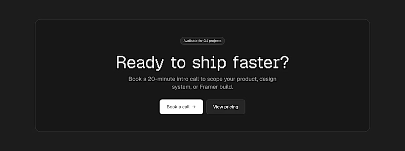
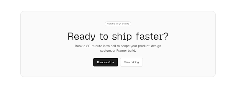
Which one converts better? Same layout and structure, just the color that gives that final push

8 votes
Ends in 7h


I'd guess dark wins here, but mostly because it breaks the rhythm after light sections above it, not because dark converts better on its own. The contrast with whatever sits right before the CTA is what makes it stop the scroll, so I'd judge both versions in the full page, not in isolation.

Working on a creative studio design website, which option looks better for the section "Works"?

30 votes
Ends in 1h

B for me. The staggered stack gives each project room and feels more editorial, while A's thumbnail strip reads more like a gallery viewer. Would B show project names on hover, or keep them fixed in the left column?

What if your design had to solve a problem before it got to look good?
Today’s exploration: a manta ray, retro terminal code, one line. “A little chaos looks good on you.”
My process: understand the problem first, design second.
Your outcome: a brand people get in seconds.