The network for creativity
Join 1.25M professional creatives like you
Connect with clients, get discovered, and run your business 100% commission-free
Creatives on Contra have earned over $150M and we are just getting started
Back to feedPost
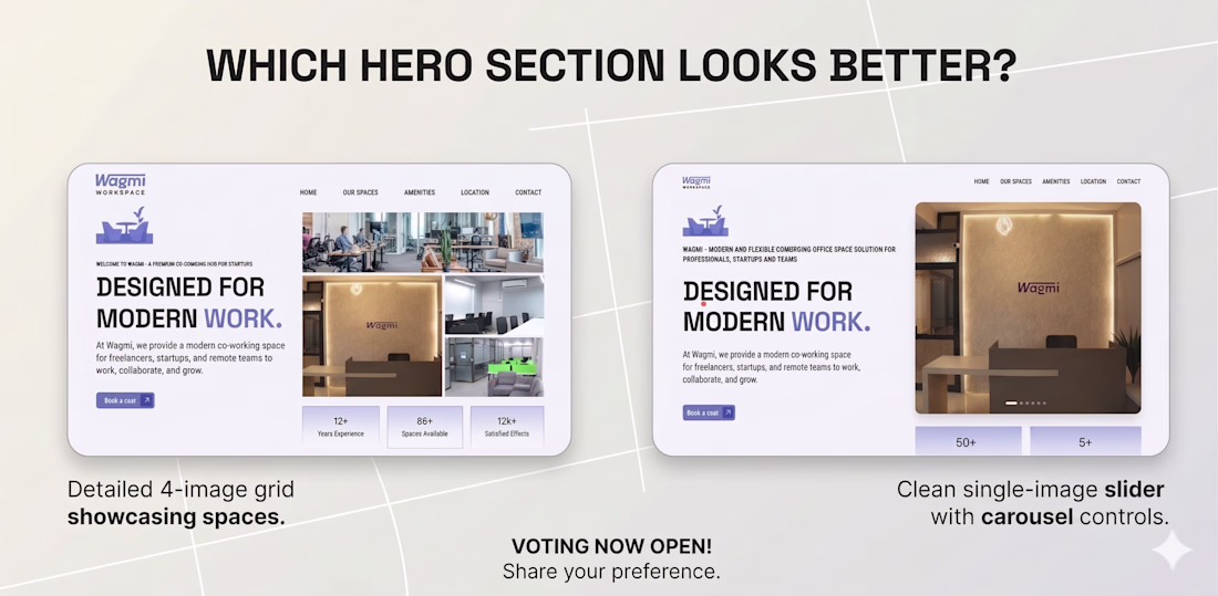
Same brand. Two different first impressions. Which converts better?
Here's a real design decision I ran into while building a landing page for a co-working space client.
Left — The 4-image grid:
Shows more of the space upfront. Multiple angles, more context, higher visual density. Great for someone who needs to be convinced before they scroll.
Right — The single-image carousel:
Cleaner, more focused. Lets the space breathe. The eye goes straight to the headline, then the CTA. Better rhythm, lower cognitive load.
So which one wins?
Honestly — it depends on what stage of the funnel the visitor is at.
If they're arriving cold (from an ad or a search), the carousel wins. Clarity beats completeness when someone hasn't decided to care yet.
If they're coming back to compare options, the grid wins. They want proof, not vibes.
This is the kind of decision most clients never think about — they just say "make it look good." But layout is strategy. Every design choice is a conversion decision.
What's your instinct — grid or carousel? Drop it in the comments 👇
The network for creativity
Join 1.25M professional creatives like you
Connect with clients, get discovered, and run your business 100% commission-free
Creatives on Contra have earned over $150M and we are just getting started
Related posts
Black or white?
Let me know what you think converts more for my portfolio
38 voted
51%
37 voted
49%
75 votes
Closed
Black look good man 👌
Every new Figma file starts the same way.
Variables. Page structure. Base frames. Annotation components. Cover slide.
Twenty minutes of setup before a single design decision gets made. If you're a product designer, you'll know exactly what I mean.
𝗦𝗼 𝗜 𝗯𝘂𝗶𝗹𝘁 𝗮 𝗽𝗹𝘂𝗴𝗶𝗻. Meet Starter, one click, and your entire foundation is ready.
→ Core variables: Typography, grids, spacing, and colours
→ Page structure: A clean, organised file hierarchy
→ Base frames: Pre-configured frames hooked up to your grids
→ Helper components: Sticky notes and status labels for quicker documentation
→ Base cover: A customisable project thumbnail
https://www.figma.com/community/plugin/1616860142658349536/starter?q_id=1e2ab7fb-d8fc-40f5-a2db-72164930f2df
Brilliant work! I'm testing it now!
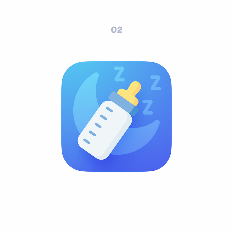
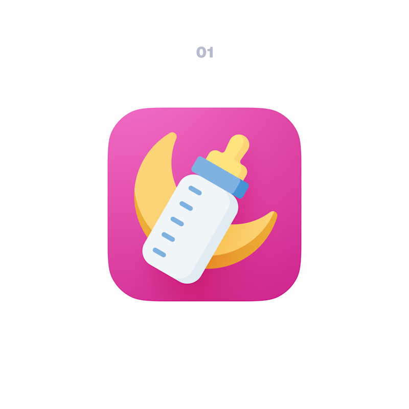
I always give a client at least two options, whatever the task.
Each one packs in as many small tweaks as possible: color, size, count, or position of elements. So the client can either pick a finished version, or mix and match by telling me which element they like from each.
Example on an app icon below.
Which one do you prefer?
14 voted
70%
6 voted
30%
20 votes
Closed
02
Challenges
View allTrending
Claude
Claude has entered the design space. How are you using Claude Design?
Contra University
Learn from expert creatives how to earn more using next-gen AI tools.
fifaworldcup2026
The World Cup is here and the whole world's watching. How are you designing for the world stage?
creativeaiflow
Creative AI workflows are evolving. What tools do you use, and what are their strengths and weaknesses?
freelancerlife
Freelancer life is wins, pivots, and everything in between. What’s yours right now?