The network for creativity
Join 1.25M professional creatives like you
Connect with clients, get discovered, and run your business 100% commission-free
Creatives on Contra have earned over $150M and we are just getting started
Back to feedPost

Most landing pages fail for one reason — they look good but don’t convert.
This project was different.
Instead of focusing only on design, the entire page was built around user behavior, psychology, and conversion strategy. From scroll flow to CTA placement, everything was optimized with intent.
The result?
A visually appealing, high-converting landing page that doesn’t just attract visitors — it moves them to take action.


The network for creativity
Join 1.25M professional creatives like you
Connect with clients, get discovered, and run your business 100% commission-free
Creatives on Contra have earned over $150M and we are just getting started


Related posts

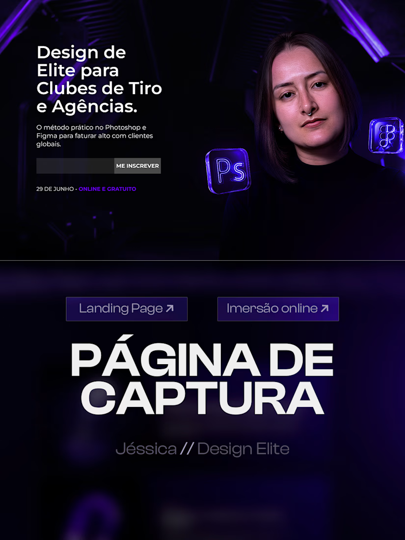
Just wrapped up a high converting landing page design for an online design masterclass.
The goal was to build a clear visual journey that turns visitors into students, guiding them from the hero section and class schedule down to the instructor presentation.
Key visual choices:
Deep purple and black color palette for a futuristic look
Custom 3D glass assets to elevate perceived value
Strong typography and structured cards for high readability
Swipe through to see the full layout structure. Available for new web and landing page design projects.

Nicely done!

I’ve been playing around with what a food website could feel like when you stop treating it like… just a website.
So I built this concept for Afrishow, a premium restaurant experience centred around African dishes from different regions.
The idea was to make the website itself part of the experience.
You scroll, the food moves, the story unfolds, and you get introduced to dishes from West, East, and North Africa in a more immersive way.
And honestly, this was one of those projects where I kept going, “Wait… what if I try this instead?” 😂
A lot of experimenting, a lot of back and forth, and plenty of vibecoding later… this is where I landed.
Tools used
• Claude Code - vibecoding
• Next.js + Tailwind + shadcn/ui - website
• GSAP - scroll animations
• ChatGPT - food imagery
I’m really enjoying exploring what happens when brand design, AI and interactive web experiences come together.
Would you actually explore a restaurant website like this?

I would, mostly because Book a table and Order stay in the header the whole way down. Immersive works when the thing people came to do is never more than one click away.

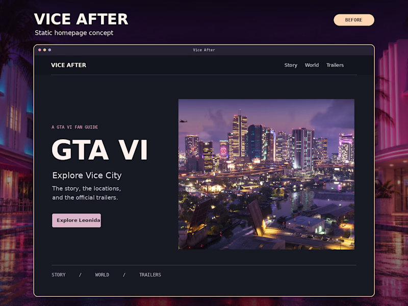
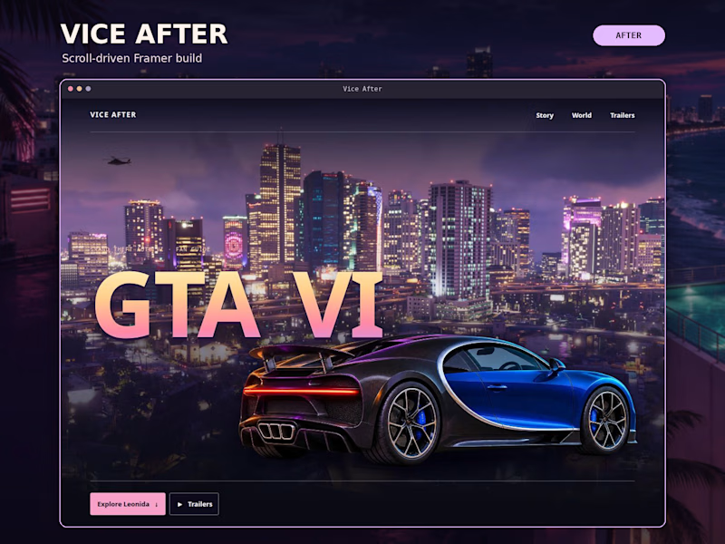
Same Vice City skyline. Which homepage makes you want to scroll?
Before: A clean, static concept with a split layout and a clear way into the site.
After: The Framer build. Scroll and the hypercar pulls into frame, the door opens, and the GTA VI title rises into view.
I wanted the first scroll to pull you into Vice City. Did the motion make you more curious about what’s below?
Vote Before or After. What caught your eye first?
watch the site i"ll build → https://gtavice6.framer.website/
#WebDesign #Framer #InteractionDesign

1 voted
20%
4 voted
80%
5 votes
Closed

After — the hypercar pulling into frame hooked me.