The network for creativity
Join 1.25M professional creatives like you
Connect with clients, get discovered, and run your business 100% commission-free
Creatives on Contra have earned over $150M and we are just getting started
Back to feedPost
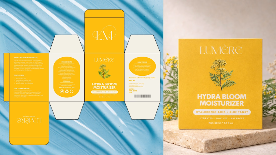
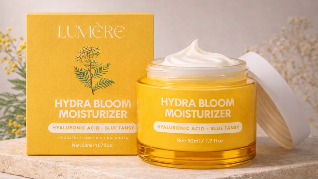
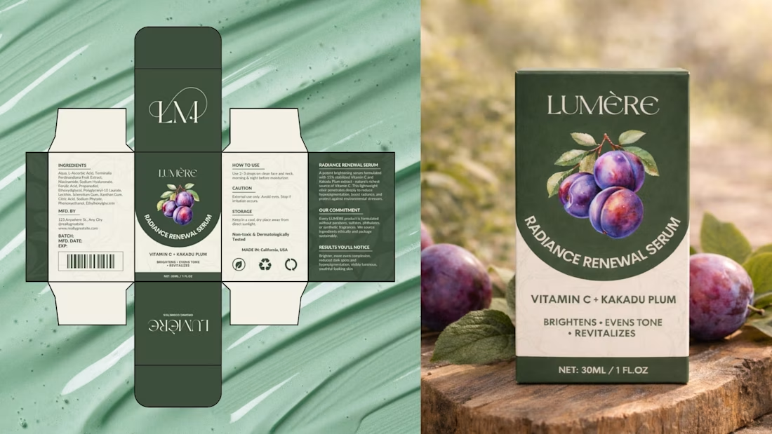
Just wrapped up a skincare packaging system designed to feel clean, modern, and shelf-ready ✨
From brand identity to a refined box experience, every detail is crafted to elevate the product at first glance.
If you’re building a beauty, skincare, or wellness brand and want packaging that actually sells —
👉 Reach out and let’s create something premium together.
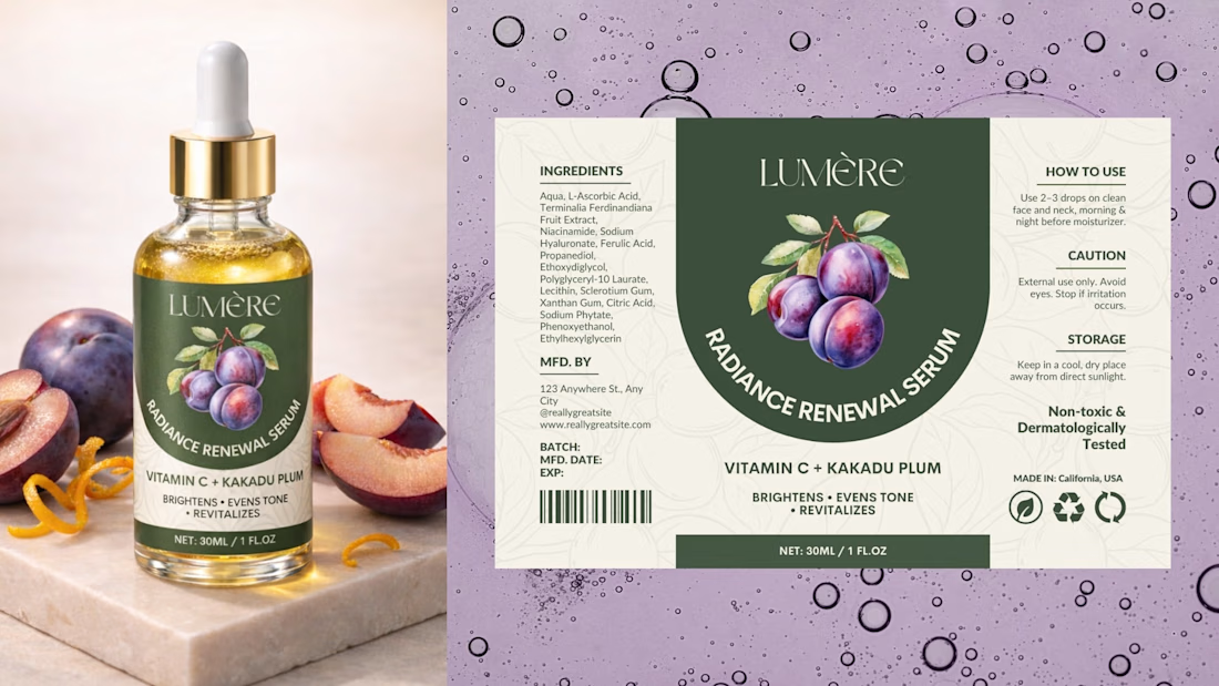
The packaging looks like it contains "orange peel extracts"
Great observation! The golden yellow is meant to convey glow and hydration, while balancing contrast with the Blue Tansy element. It can definitely feel citrus-warm, but the intent is more about radiance and skin vitality than a specific extract.
how you convert the packaging layout design to the mockups? Did you used A.I? or maybe the other tools?
anyway, great work 🔥
Thank you so much!🙌
Yes, I use AI-assisted mockups combined with Photoshop for final detailing and realism. Glad you liked it!
You’re welcome! 🙌
The result looks great — the details really stand out
Very nice and clean
Thank you so much!
This is so clean and polished! The color palette is gorgeous - those yellows and greens feel fresh and natural, perfect for skincare. I love how cohesive the whole system looks across different formats. The typography choices are spot on too. What was your inspiration for the visual direction?
Thank you so much! 🤍
The inspiration came from blending botanical freshness with clean, modern luxury. I wanted the system to feel natural and calming, but still refined and shelf-ready — something that communicates hydration, trust, and quality at first glance.
The yellow and...
The network for creativity
Join 1.25M professional creatives like you
Connect with clients, get discovered, and run your business 100% commission-free
Creatives on Contra have earned over $150M and we are just getting started
Related posts
Another day, another happy client! 🇪🇸✨
Proud to have designed the logo for TARA, a brand based in Spain. Every project is a chance to transform an idea into a meaningful visual identity, and seeing another satisfied client makes the journey even more rewarding.
Thank you for trusting me with your brand. Here's to creating logos that are simple, memorable, and built to leave a lasting impression.
minimallogominimalminimalistlogodesignLogo DesignBrand DesignGraphic DesignAdobe IllustratorAdobe PhotoshopAdobe XD
wow! perfect Branding. What tool did you use
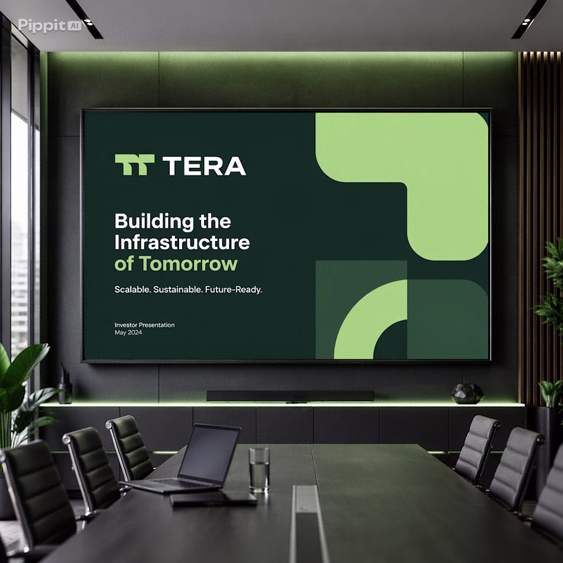
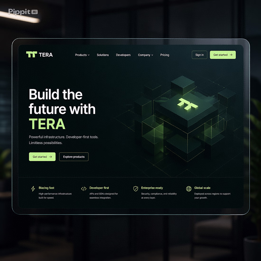
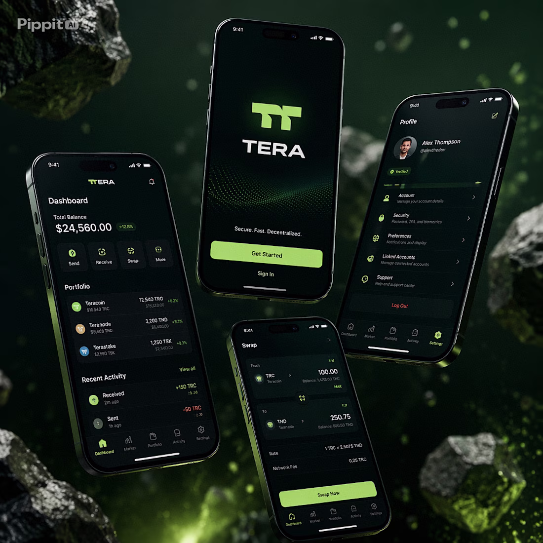
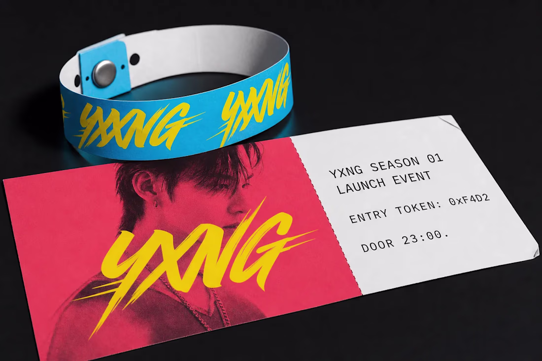
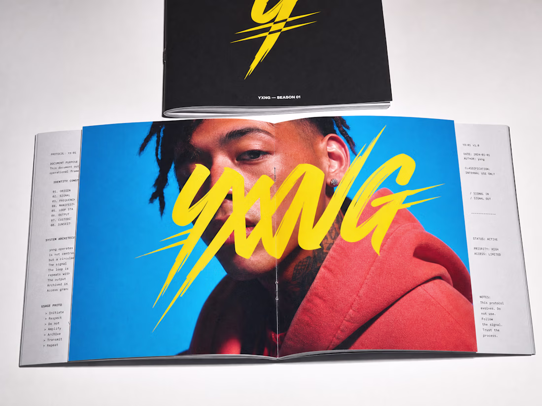
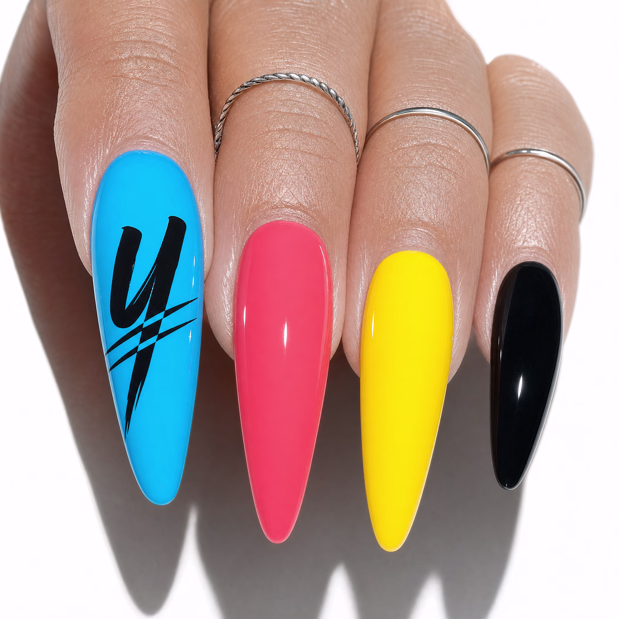
built a crypto protocol that looks like a K-pop label.
calligraphic mark on skin. photocard collectibles. building wraps in Seoul. staking tiers called SIGNAL, IDOL, MARK.
YXNG. case study dropping soon.
Amazing work
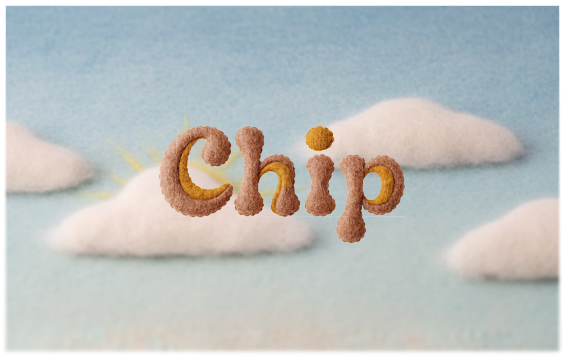
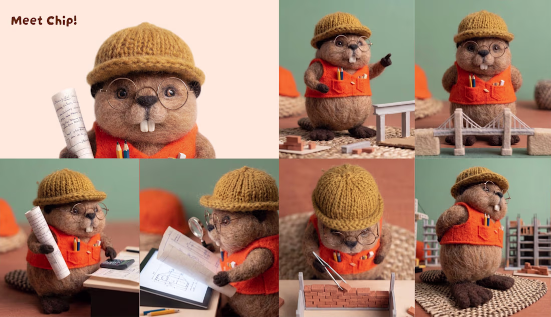
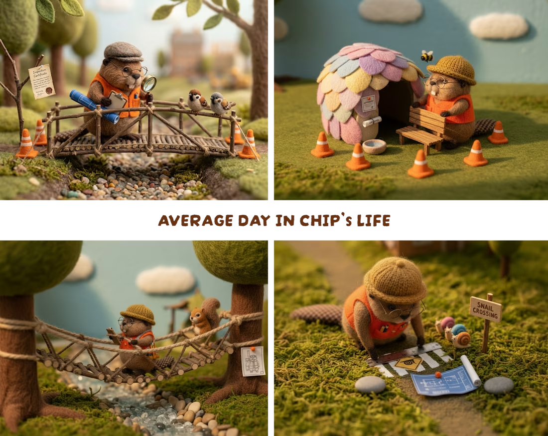
Meet Chip! My entry to the Recraft Challenge.
INVISIBLE TO MOST. ESSENTIAL TO ALL. While the whole world sleeps, Chip designs, builds and maintains the tiny infrastructure that keeps nature running smoothly.
From Acorn houses to snail highways, no detail is too small. Someone has to do the small work.
That Someone is CHIP.
The idea is to have a character that has its own universe. He's not a mascot for a brand, he is the brand.
It started from a single idea of having someone who takes care of the hidden world beneath us. Initially it was to have a beaver who builds things as a mascot for a real estate or a construction company, but It evolved into a whole universe.
I primarily used Recraft 4V.1 and V4.1 pro along with folkcraft style attached to it.
It was really fun to use the exploration mode and then stick to one character to build a whole whole around it that too with precision.
Let me know your thoughts in the comments and good luck to everyone else participating <3
this little chip looks adorable! nice work
Trending
Claude
Claude has entered the design space. How are you using Claude Design?
Contra University
Learn from expert creatives how to earn more using next-gen AI tools.
MagicPath
The canvas is infinite, and exploration is becoming the workflow. How are you using MagicPath?
creativeaiflow
Creative AI workflows are evolving. What tools do you use, and what are their strengths and weaknesses?
freelancerlife
Freelancer life is wins, pivots, and everything in between. What’s yours right now?