The network for creativity
Join 1.25M professional creatives like you
Connect with clients, get discovered, and run your business 100% commission-free
Creatives on Contra have earned over $150M and we are just getting started
Back to feedPost
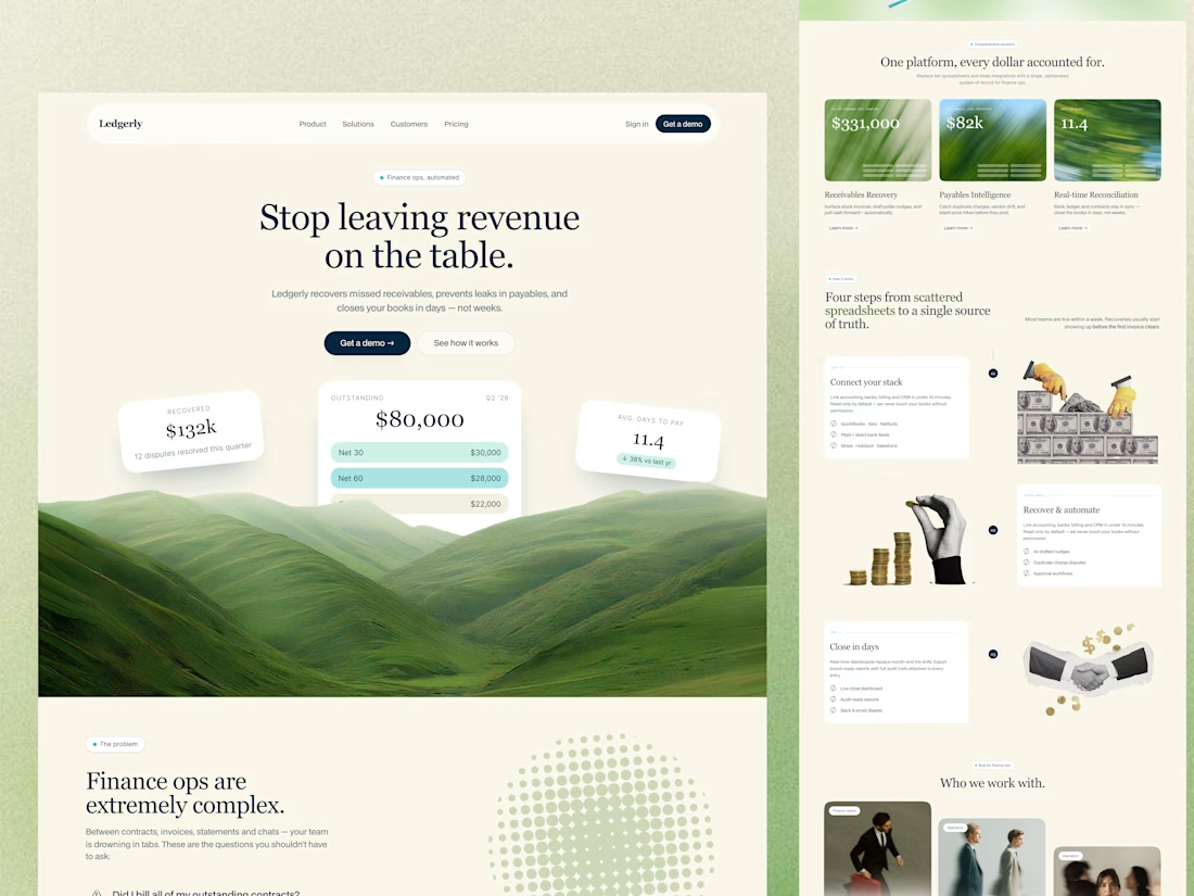
Ledgerly- Fintech landing page exploration
Most fintech websites focus heavily on numbers, dashboards, and technical complexity.
For this concept, I explored a different direction:
Creating a finance experience that feels calm, premium, and visually human.
The idea was simple —
Turn fragmented revenue operations into a clear visual story.
Instead of relying on traditional enterprise-heavy layouts, the experience was designed using:
• Nature-inspired visuals
• Editorial typography
• Minimal financial UI components
• Spacious layouts & softer hierarchy
• Storytelling-focused sections
• Premium SaaS aesthetics with emotional depth
The landscape visuals symbolize growth, clarity, and financial recovery — helping the platform feel more approachable while still maintaining trust.
One of the biggest design challenges was balancing:
Emotion × Financial credibility
Because modern fintech products can feel trustworthy without feeling overwhelming.
Designed in Figma.
Would love to hear your thoughts on emotional storytelling in SaaS & fintech experiences 👇
The network for creativity
Join 1.25M professional creatives like you
Connect with clients, get discovered, and run your business 100% commission-free
Creatives on Contra have earned over $150M and we are just getting started
Related posts
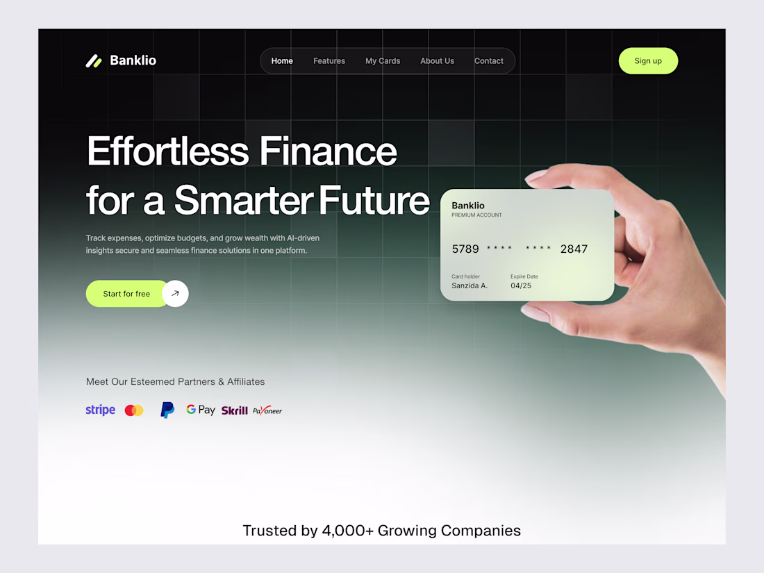
Designed a sleek modern finance platform website for Banklio.
Dark theme UI with premium feel, bold headline, virtual card showcase, and trust signals for effortless finance management and AI-driven insights.
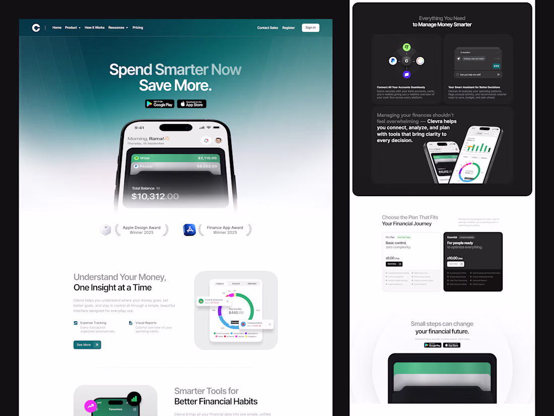
The signature isn't a hero image. It's a live ledger — because in fintech, the UI's job is to prove the money moved.
New Project Coming Soon 🚀
This is a masterclass.
Challenges
View allTrending
Claude
Claude has entered the design space. How are you using Claude Design?
Contra University
Learn from expert creatives how to earn more using next-gen AI tools.
fifaworldcup2026
The World Cup is here and the whole world's watching. How are you designing for the world stage?
creativeaiflow
Creative AI workflows are evolving. What tools do you use, and what are their strengths and weaknesses?
freelancerlife
Freelancer life is wins, pivots, and everything in between. What’s yours right now?