The network for creativity
Join 1.25M professional creatives like you
Connect with clients, get discovered, and run your business 100% commission-free
Creatives on Contra have earned over $150M and we are just getting started
Back to feedPost


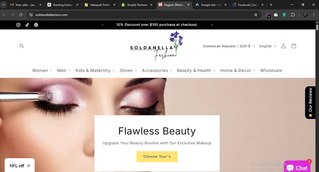


Great job done...you should work on more on the header white space tho
The network for creativity
Join 1.25M professional creatives like you
Connect with clients, get discovered, and run your business 100% commission-free
Creatives on Contra have earned over $150M and we are just getting started

Challenges
View all


Related posts


Our Peak3 website build covered 17 page templates and six CMS collections. At that scale, the questions about publishing deserve as much attention as the finished pages.
A blog post, a whitepaper and a careers entry need different information. Making them editable is only part of the design problem. The person adding the next entry also needs to understand what is missing and what happens when they publish it.
Here’s a hypothetical review I’d run before a CMS handoff: create a whitepaper entry, add the title and cover, then leave out the download file.
Does the editor flag the missing file? Can someone preview what the visitor will see? If the entry can still be published, does it create a download button that leads nowhere?
I’d use that test to decide which fields must be required and which incomplete states need an explanation.

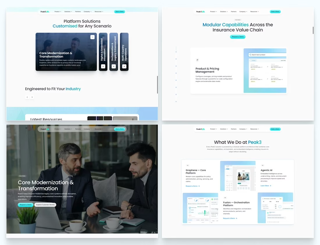

Beautifully executed work


Same animation, one detail changed.
Motion blur or clean.
Which one feels better? 👇
16 voted
53%
14 voted
47%
30 votes
Closed

Blure is more focused and better ❤️❤️

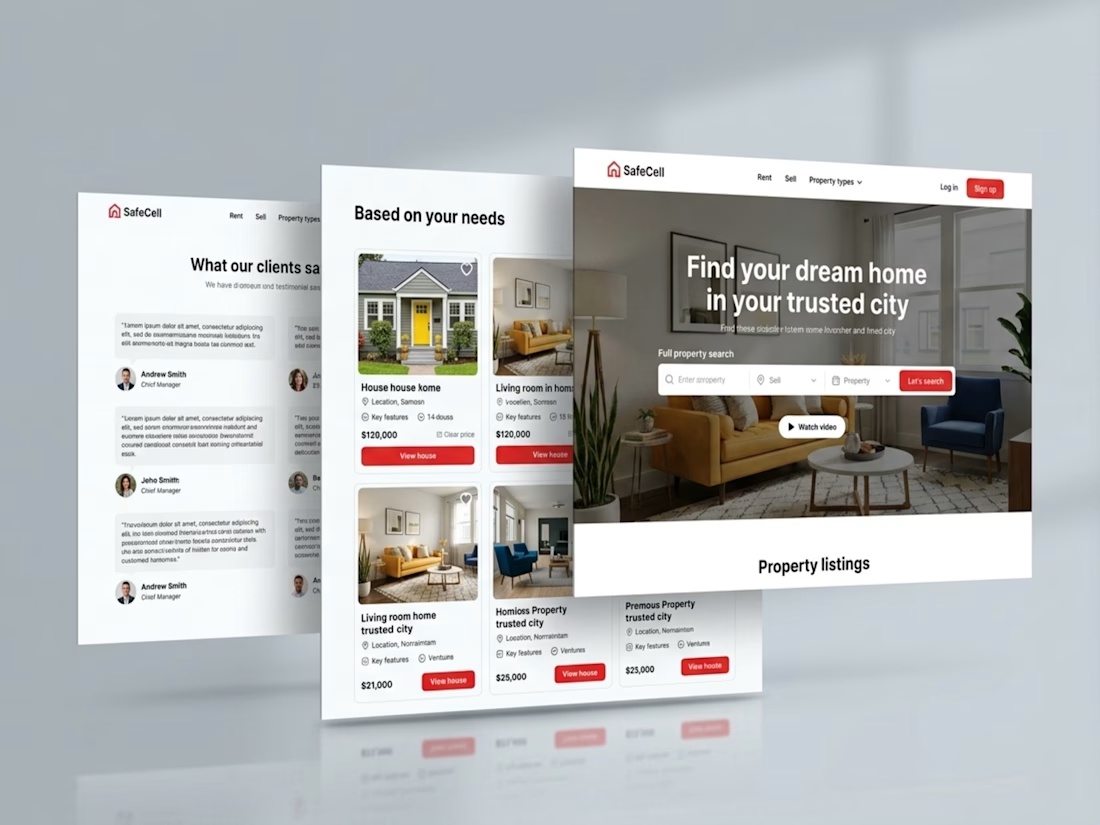
Kajabi Real Estate Website Design & Development
Designed and developed a professional real estate website using Kajabi to help the client present their brand, showcase their services, and create a better experience for potential clients.
The focus was on creating a clean, modern design with clear page layouts, intuitive navigation, and responsive sections that work across devices. I organized the website content to make information easier to explore and incorporated clear calls to action to guide visitors toward the next step.
The finished website gives the client a more polished online presence, communicates their services more clearly, and provides visitors with a smoother browsing experience.
#Kajabi #KajabiWebsite #KajabiDesign #KajabiDevelopment #KajabiRealEstate #RealEstateWebsite #RealEstateWebsiteDesign #RealEstateWebDesign #PropertyWebsite #RealEstateBusiness #RealEstateBranding #PropertyInvestment #RealEstateCoaching #RealEstateMarketing #ResponsiveWebDesign #WebsiteDevelopment #RealEstateLandingPage #RealEstateLeadGeneration #PropertyWebsiteDesign #BusinessWebsite


Impressive Work