The network for creativity
Join 1.25M professional creatives like you
Connect with clients, get discovered, and run your business 100% commission-free
Creatives on Contra have earned over $150M and we are just getting started
Back to feedPost

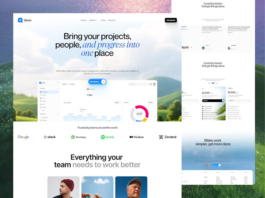
Qloxia - Modern Project Management & Team Collaboration SaaS Design
Complex workflows deserve clearer interfaces.
Qloxia is a project management and team collaboration SaaS concept designed around a simple product promise:
Bring projects, people, and progress into one place.
The experience combines:
• Project management
• Task management
• Team collaboration
• Planning and analytics
• Progress visualization
• Social proof
• SaaS pricing
• Conversion-focused UX
The design direction uses soft visual environments, editorial typography, rounded components, product-led storytelling, and structured content hierarchy to make the platform feel both professional and approachable.
The goal wasn't to make another dashboard-heavy SaaS website.
It was to create an experience where users can quickly understand the product, explore its capabilities, build confidence, and take action.
Building a SaaS product, dashboard, or web application?
Taqwah can help you transform your product idea into a clear, scalable, conversion-focused UI/UX experience - from strategy and UX to polished interface design.
👉 Send us your product idea and let's discuss how we can design the experience around your business goals.


The network for creativity
Join 1.25M professional creatives like you
Connect with clients, get discovered, and run your business 100% commission-free
Creatives on Contra have earned over $150M and we are just getting started

Challenges
View all


Related posts


Engaging website for a New York–based architecture and construction studio, balancing bold typography, immersive imagery and a minimal editorial layout.


A look at the identity we designed for Vetti, a dog health monitoring brand.
There’s a lot of data behind a product like this but the person using it just wants to know their dog is okay.
That’s the balance in the design with a connected dot system that feels precise and warm colors and photography that keep it close to what people care about.
Also, an excellent excuse to spend far too long choosing dog photos.


A or B? 😇👈
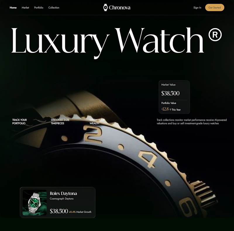
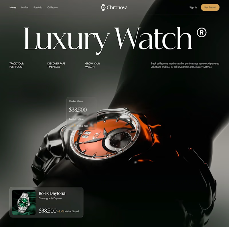
Which design delivers the better luxury feel and overall visual experience?
3 voted
17%
15 voted
83%
18 votes
Closed

Option B feels more luxurious to me—the watch gets a clearer hero moment and the warmer accent adds just enough energy against the dark field. The typography and product scale also make the comparison feel polished.


