The network for creativity
Join 1.25M professional creatives like you
Connect with clients, get discovered, and run your business 100% commission-free
Creatives on Contra have earned over $150M and we are just getting started
Back to feedPost
Taste Test

As a professional, which intro do you think is better?
White as the brand color, or brand followed by white?
1 voted
50%
1 voted
50%
2 votes
Closed
The network for creativity
Join 1.25M professional creatives like you
Connect with clients, get discovered, and run your business 100% commission-free
Creatives on Contra have earned over $150M and we are just getting started











Related posts

Hey everyone! 👋
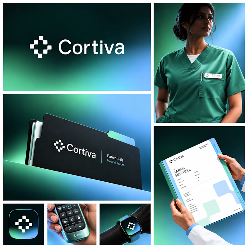
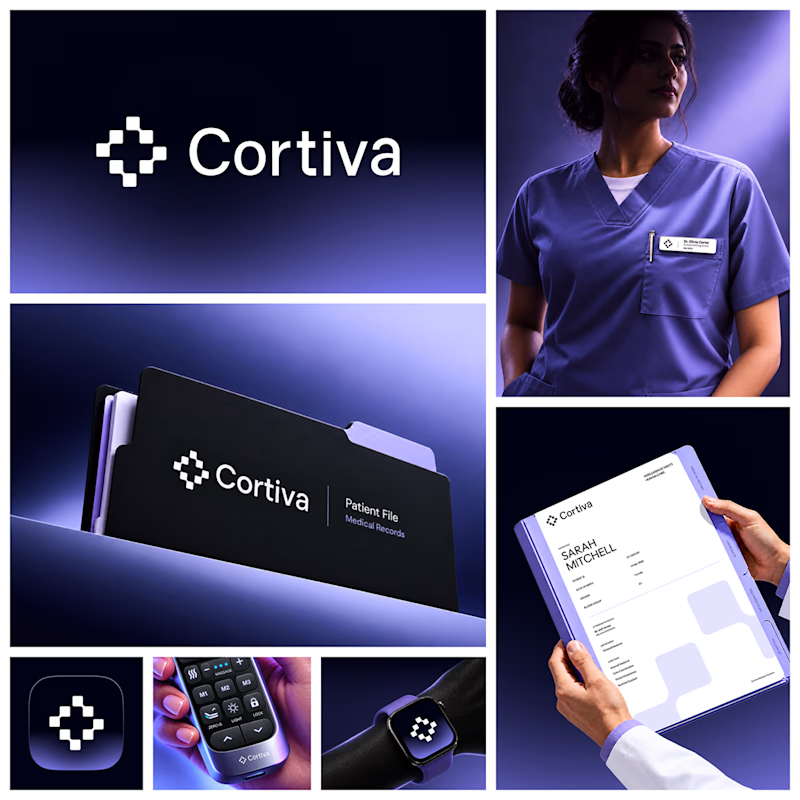
Working on Cortiva, an AI-first hospital branding project.
I've already finalized the color direction, but I thought it would be fun to explore two different moods.
Option 01💚 or Option 02? 💜
Both have their own personality, and I'm curious to see which one you prefer!
Let's see which one wins! 👀
5 voted
33%
10 voted
67%
15 votes
Closed

Both directions are strong, but I'm leaning towards Option 01. The green feels instantly like "care" and trust, which is perfect for a hospital. Option 02 looks more techy and premium. Curious, which mood are you aiming for - clinical and calm, or friendly and modern?


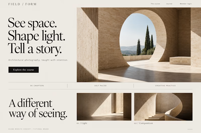
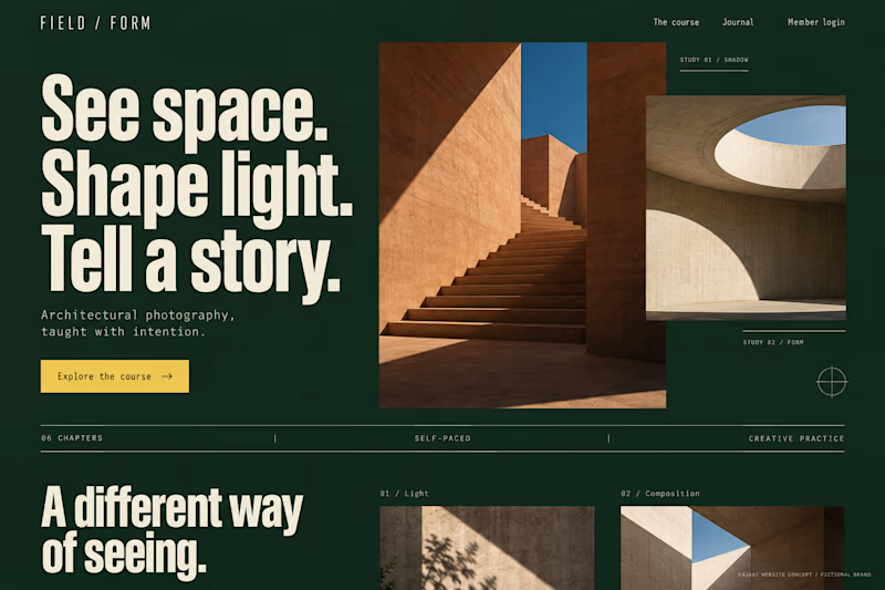
Which Kajabi photography-course design makes you want to explore?
Two original AI-generated concepts for FIELD / FORM, a fictional architectural-photography school. Gallery Study pairs expressive serif type with warm stone and generous space. Field Journal uses forest green, bold condensed type and a layered photo study.
Same course, two directions. Which would you choose, and why?

15 voted
75%
5 voted
25%
20 votes
Closed

Galary study Hits better to me❤️❤️
great job Kraig🔥🔥

The brief was simple. Show a new personalized news feature.
The obvious solution was to show a few clicks in the UI as you choose your topics. Clear, but not very interesting.
So I pulled that moment out of the interface first and turned it into a cloud of topics. You get the idea before you even see the product, then the video drops you back into the real UI and shows where it lives.
I really like these tiny decisions. The feature stays the same, but it feels easier to get and a lot more fun to watch.


Pulling the topic cloud outside the UI makes the feature instantly clearer.