The network for creativity
Join 1.25M professional creatives like you
Connect with clients, get discovered, and run your business 100% commission-free
Creatives on Contra have earned over $150M and we are just getting started
Back to feedPost

A strong brand doesn’t just represent what a business does. It communicates how it thinks.
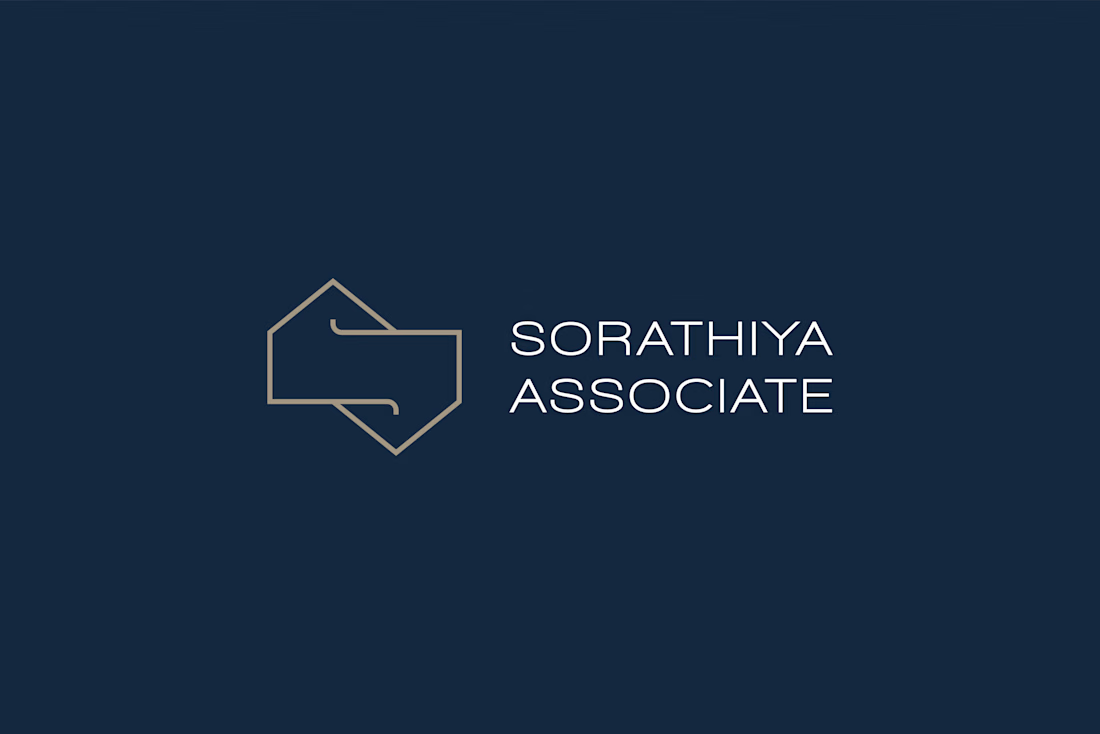
For Sorathiya Associates, we wanted to create an identity that reflects precision, reliability, and engineering expertise.
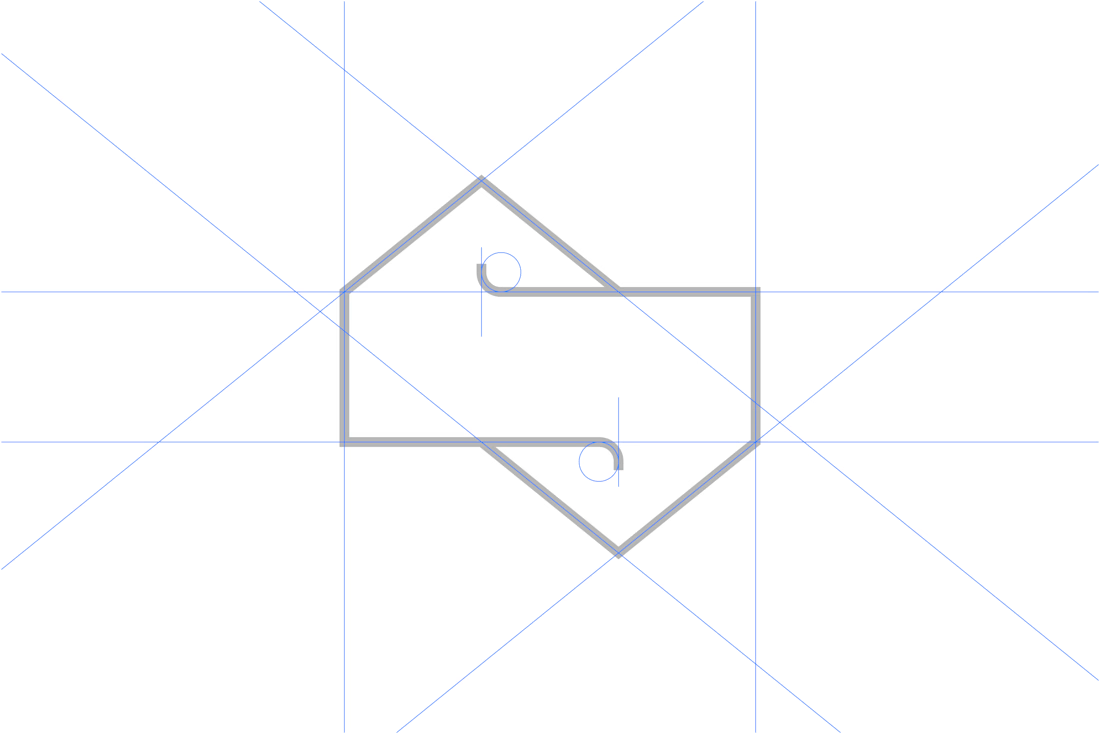
We transformed the letter “S” into a geometric monogram using two inverted house forms, connecting the brand to architecture and the built environment.
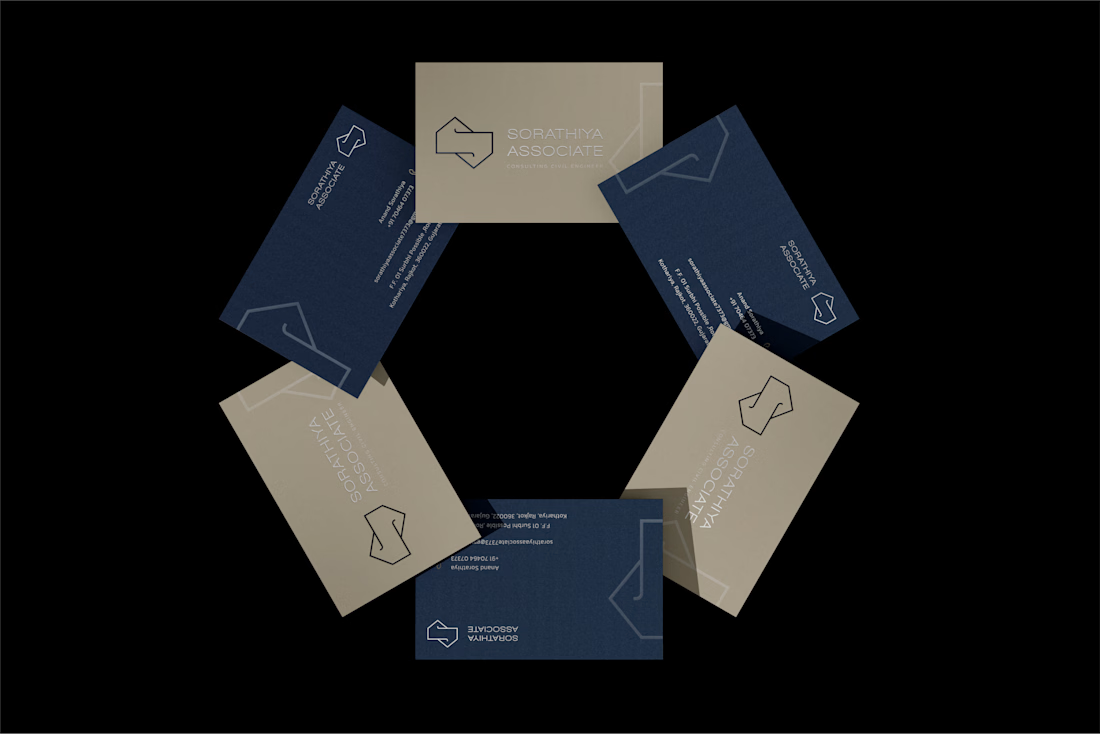
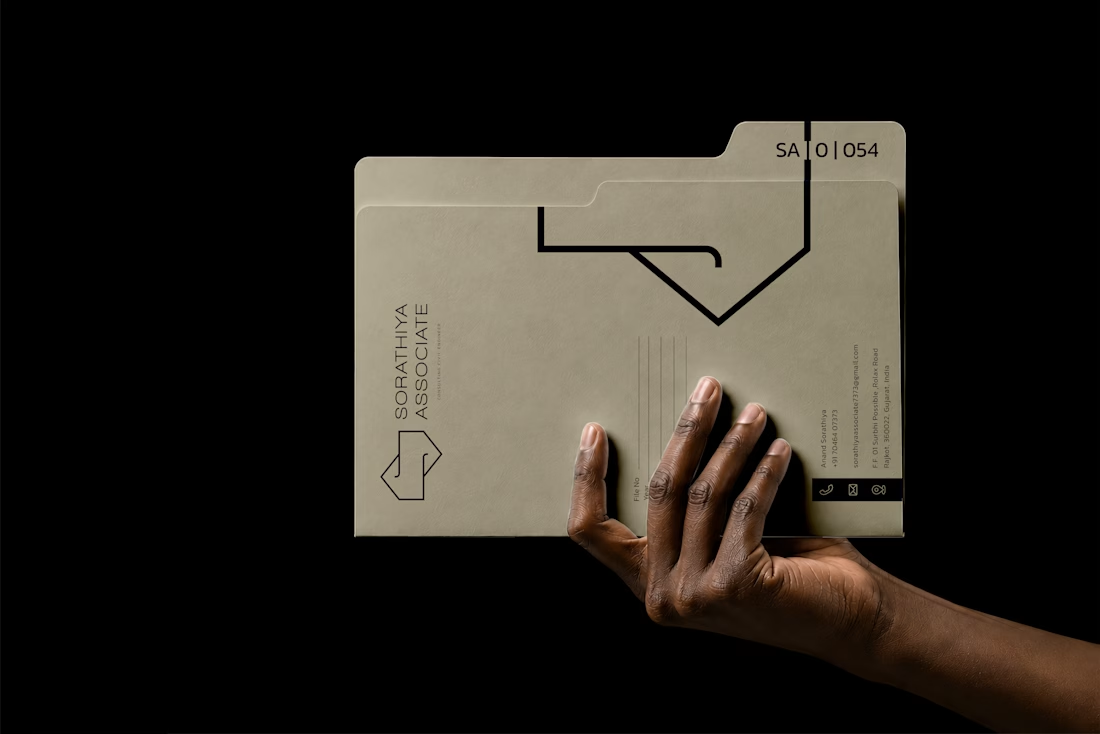
The result is a clean, timeless identity designed to work across business stationery, project documents, and digital platforms.
Simple in form, meaningful in concept.
#LogoDesign #BrandIdentity #Branding #CivilEngineering #GraphicDesign
The network for creativity
Join 1.25M professional creatives like you
Connect with clients, get discovered, and run your business 100% commission-free
Creatives on Contra have earned over $150M and we are just getting started



Related posts

Brand work for HauntChain
I'm loving building this brand and the results so far
A deFi platform with some gamification


That's cute ❤️

A website hero and motion identity concept for Cycle.
The experience takes the viewer through seven historical eras in one continuous forward journey, while the logo, camera path and core composition remain consistent.
The concept explores how a static identity can become a living digital experience through motion, environment and interaction.
Workflow included Spline, Claude via MCP, Midjourney and SeaDance.
Available for brand identity, motion and digital design projects.


I fall in love, It is like Encarta, but 1000% better