The network for creativity
Join 1.25M professional creatives like you
Connect with clients, get discovered, and run your business 100% commission-free
Creatives on Contra have earned over $150M and we are just getting started
Back to feedPost

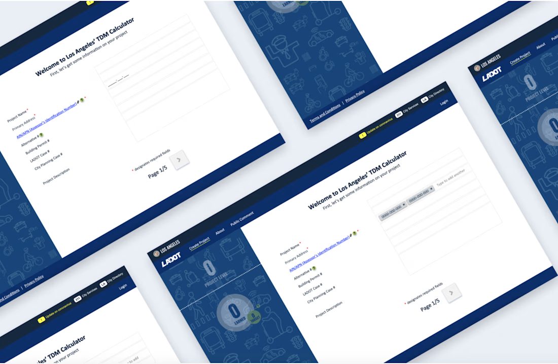
Reducing project rejections by making property submissions easier in the L.A. TDM Calculator
Getting a real estate project approved by the City of Los Angeles involves navigating detailed requirements, and even small mistakes can lead to delays or rejection. The L.A. TDM Calculator was built to help developers meet those requirements, but a key part of the experience wasn’t keeping up with how projects actually work in the real world.
Most projects include multiple properties, each with its own ID number. The tool, however, only allowed users to enter one. This mismatch created confusion, caused errors, and ultimately led to valid projects being rejected.
This project focused on closing that gap, making it easier for users to enter the right information the first time, so they could move forward with confidence.


The network for creativity
Join 1.25M professional creatives like you
Connect with clients, get discovered, and run your business 100% commission-free
Creatives on Contra have earned over $150M and we are just getting started





Related posts

Created these interactive animation variants for a section in my recent web design project.
Which one do you think grabs users’ attention and keeps them engaged?
Linear ✲ or Dotted⚪?

24 voted
52%
22 voted
48%
46 votes
Closed

dotted one

Which hero direction feels right for this founder-focused brand?
While working on the homepage for Sean Parsons, a brand focused on empowering non-technical founders to launch tech startups, I explored two different visual directions for the hero section. Same message, same structure, just a different mood and color system.
Option 1 - Warm Olive. Dark, grounded, and editorial, giving a warm, established, expert feel.
Option 2 - Light Purple. Clean, modern, and vibrant, giving a fresh, SaaS-like, approachable feel.
Would love your honest UX/UI take, which direction feels more trustworthy, engaging, and aligned with a founder-focused brand, and why?
25 voted
69%
11 voted
31%
36 votes
Closed

I like worm Olive most because it has different personality

Cleann🔥

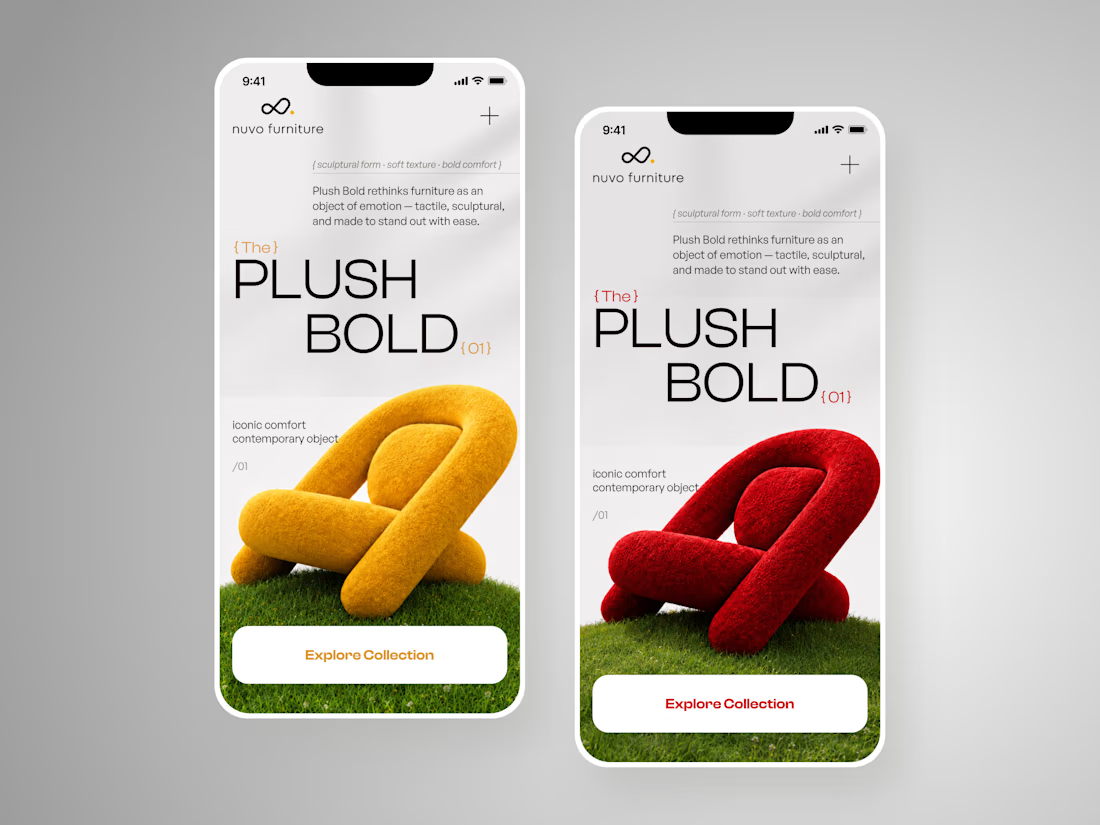
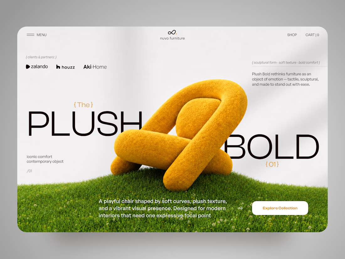
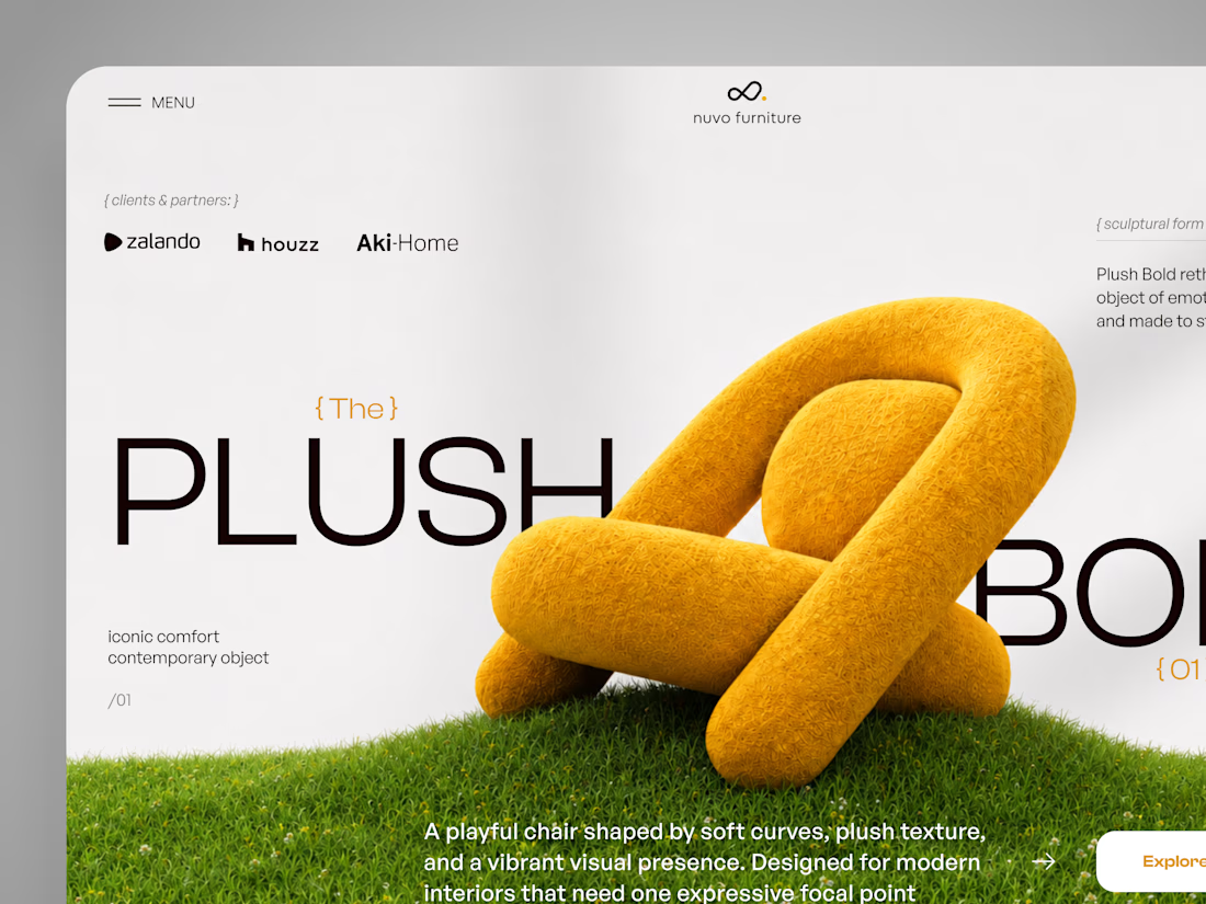
NUVO Furniture — Sculptural Furniture E-commerce Concept 🪑✨
NUVO is a contemporary furniture website concept built around one idea: let the product become the experience.
At the center of the concept is Plush Bold — an expressive statement chair designed to feel more like a...