The network for creativity
Join 1.25M professional creatives like you
Connect with clients, get discovered, and run your business 100% commission-free
Creatives on Contra have earned over $150M and we are just getting started
Back to feedPost


The network for creativity
Join 1.25M professional creatives like you
Connect with clients, get discovered, and run your business 100% commission-free
Creatives on Contra have earned over $150M and we are just getting started



Related posts

Brand work for HauntChain
I'm loving building this brand and the results so far
A deFi platform with some gamification


That's cute ❤️


Is text on album covers really tacky?
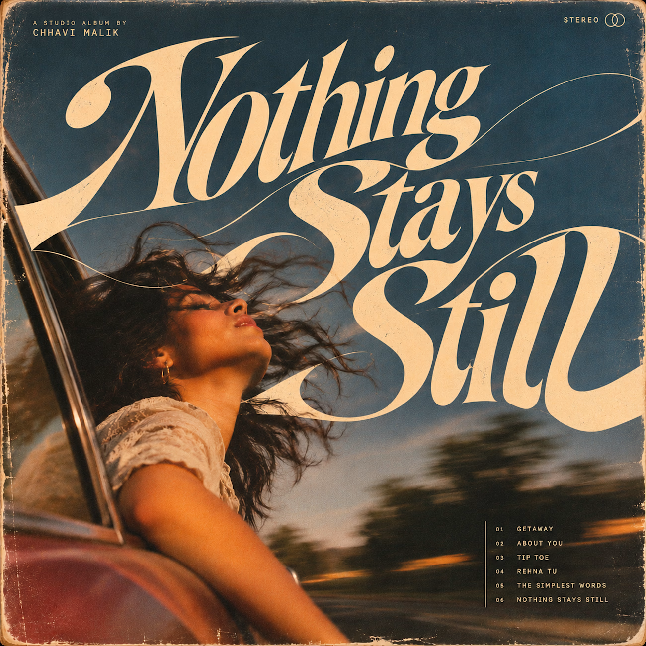
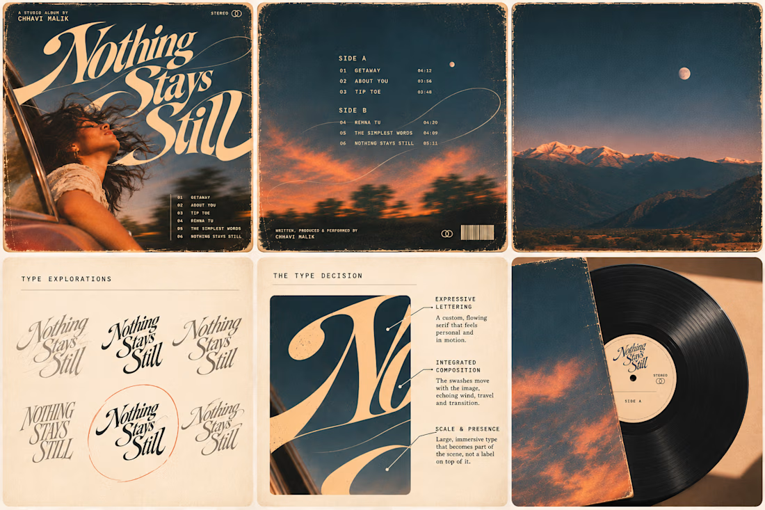
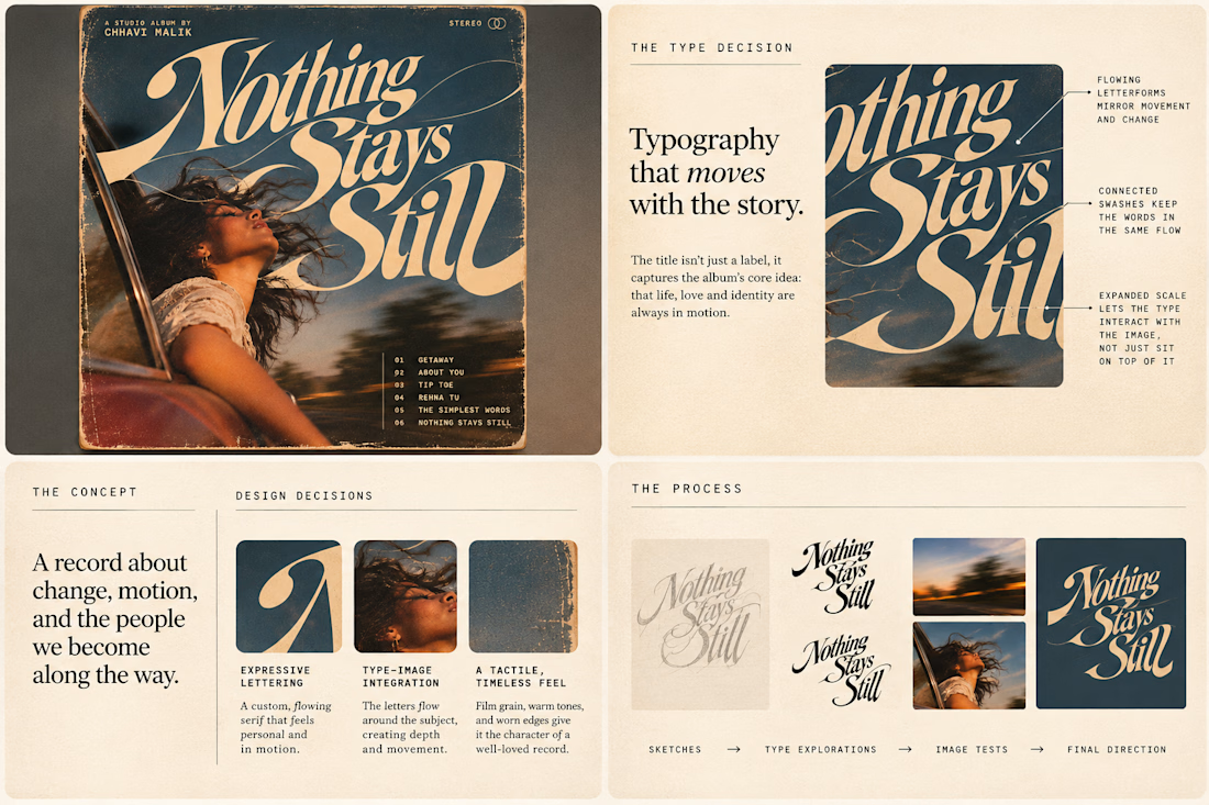
This question has been doing the rounds on X and I have to say, I'm firmly on the other side of that argument. I've always loved seeing typography become part of the artwork rather than just a title sitting on top of it.
So I wanted to put that idea to the test with an imagined album called Nothing Stays Still, inspired by change, fleeting moments and everything in between:)
I played around with the lettering until it felt expressive, a little restless, and inseparable from the photograph.
Because I think badly considered typography is tacky. Typography itself? Give it a chance :)
What's an album cover where the type really makes it for you?


Behind the wall: a homepage concept for Studio Cesare
I’m testing a new landing page for my studio, made with Brik.
A pixel-brick grid covers the screen. Move through it and the bricks fall away to reveal the person behind the work, mid-coffee, slightly off balance. Then the wall closes again.
It’s a small metaphor for how I approach next-generation branding: a strong system on the surface, with a real person and a real point of view underneath.
Exploring this for the studio site launch. Open to feedback, and to new projects 🤝🏼

This is amazing!!