The network for creativity
Join 1.25M professional creatives like you
Connect with clients, get discovered, and run your business 100% commission-free
Creatives on Contra have earned over $150M and we are just getting started
Back to feedPost


The network for creativity
Join 1.25M professional creatives like you
Connect with clients, get discovered, and run your business 100% commission-free
Creatives on Contra have earned over $150M and we are just getting started



Related posts

All I did was copy the Figma page link, paste it into Claude Code, and give it a few instructions. Oh chim! it brought the whole thing to life
What do you think?


Going from a Figma link straight to motion is wild, "oh chim" is the right reaction 😂 Did you connect the Figma MCP, or did Claude Code work it out from the link alone?

A little look at how Nazariya Living stands apart from its category.
On one side, familiar visual conventions. On the other, an identity with its own character, rooted in stories worth keeping.
We chose not to blend in. :)
Which side catches your eye?

3 voted
30%
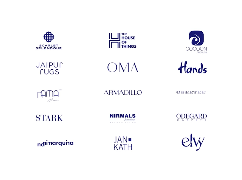
7 voted
70%
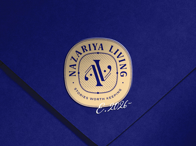
10 votes
Closed

That side with all the competitor logos in one grid is the slide I'd steal for a client presentation. Nothing explains "why this direction" faster than showing the sea of sameness first. The navy seal wins easily after that.


I've just put a new case study live.
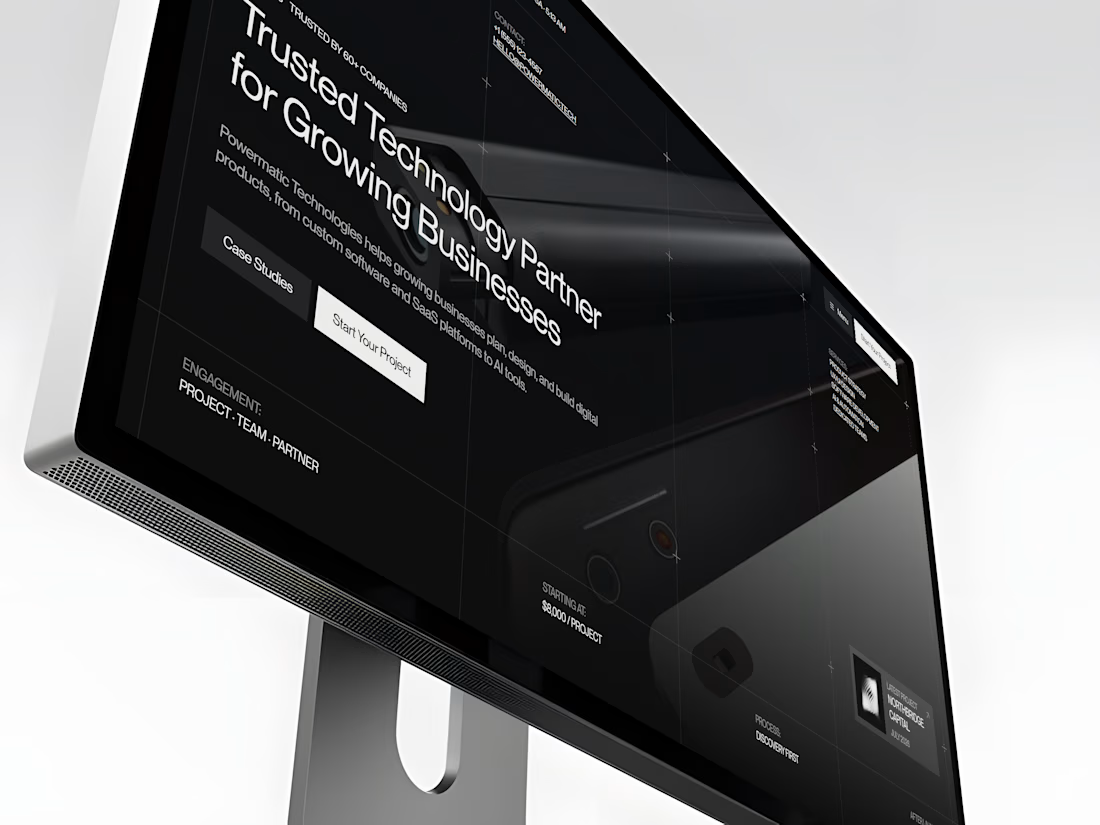
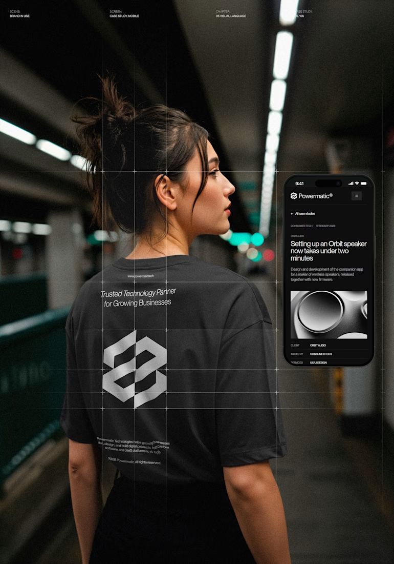
Powermatic Technologies helps growing companies with strategy, design and software. I did the whole project on my own: the logo and identity, the design in Figma, the code and the copy on the site.
The site sits on a four-column grid, and you can see its lines on the screen. Graphite palette with no pure black or white, PP Neue Montreal, and a bit of ASCII art.
The page I'm happiest with is Careers. My first idea was to repeat the home page layout. I dropped it. Now the page opens with the open roles set in 72 px type, with a filter by team. A candidate sees the role, the city and the pay before they scroll.
The menu turns like a drum. You can drag it or use the arrow keys, and it opens on the section you're reading.
It's all hand-written HTML, CSS and JS, no framework. It holds up from a phone to an ultrawide monitor.
The live site is open, so you can click through it yourself.

Nice!