The network for creativity
Join 1.25M professional creatives like you
Connect with clients, get discovered, and run your business 100% commission-free
Creatives on Contra have earned over $150M and we are just getting started
Back to feedPost


Good vs. Great: The 7 Traits of Elite Designers
Ask. They never assume; they lead with questions.
Balance. Craft, strategy, and insight—without compromise.
Expand. They ignore the job spec to do what’s needed.
Narrate. They don’t just design; they captivate and influence.
Tinker. Curiosity-driven side projects are their playground.
Evolve. They are eternal students of the game.
Explore. They leave the design bubble to find real inspiration..


The network for creativity
Join 1.25M professional creatives like you
Connect with clients, get discovered, and run your business 100% commission-free
Creatives on Contra have earned over $150M and we are just getting started











Related posts

A hot take in branding: Should premium always play it safe?
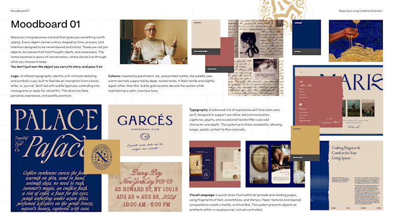
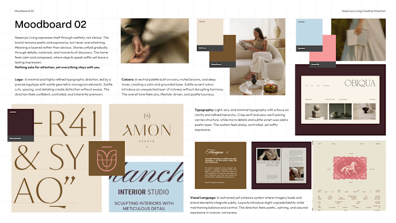
We recently explored two contrasting creative directions for a premium carpet and home décor brand based in Jaipur, India.
Moodboard 01: Challenges category conventions with a maximalist, editorial approach. Inspired by visual journals, printed matter and the stories objects carry.
Moodboard 02: Embraces familiar premium codes. Neutral colours, conventional logo forms and spacious layouts that let the products take centre stage.
Both serve a purpose, but the brand's core idea is “Stories Worth Keeping.”
Which direction would you remember for a brand that sells more than objects, but the stories behind them?
01 or 02?


6 voted
75%
2 voted
25%
8 votes
Closed

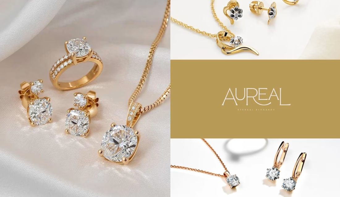
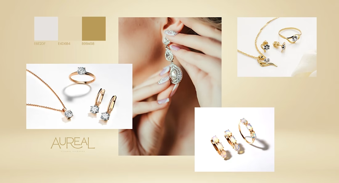
Elegance is in the details. Every brand has a story to tell.
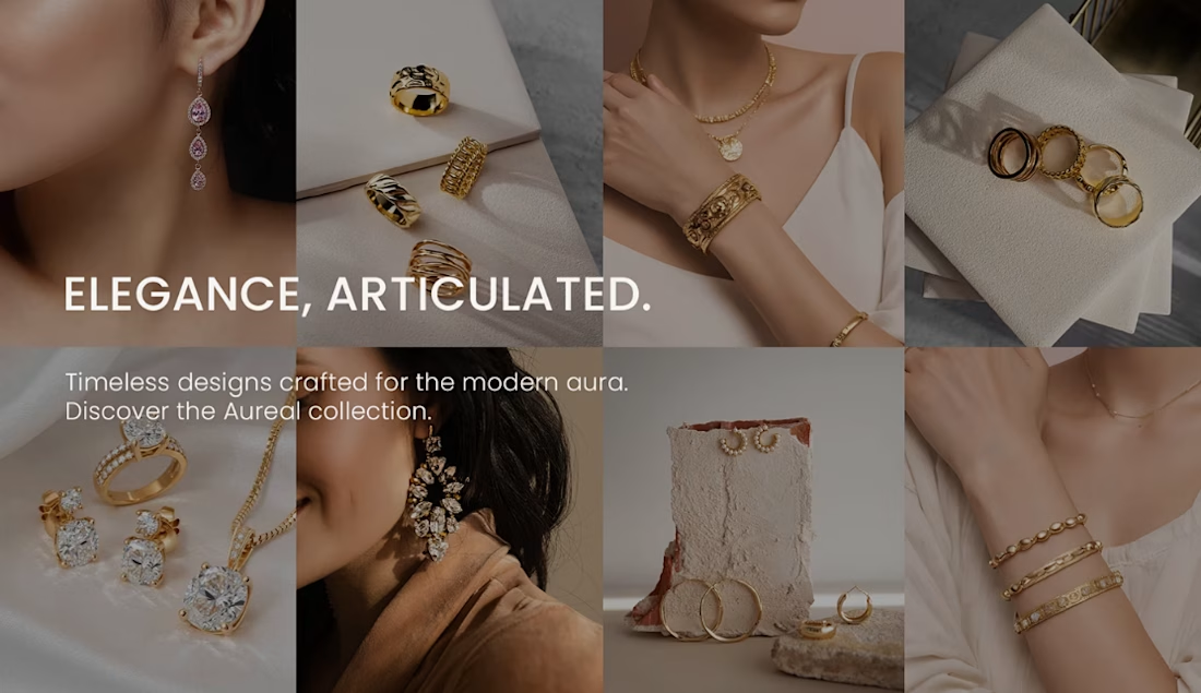
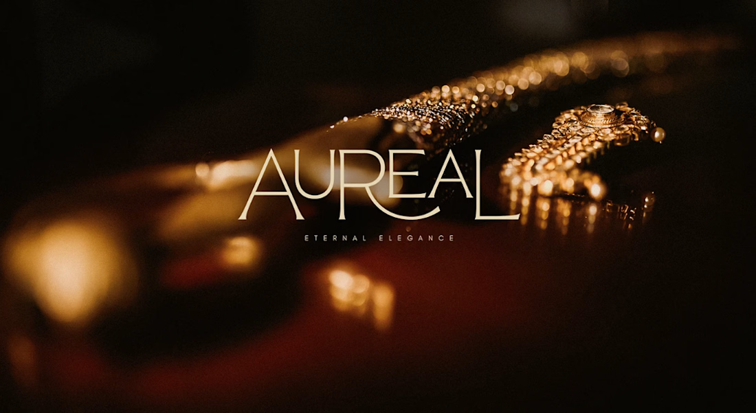
Excited to share our Jewelry Brand Design project! This concept explores how thoughtful design can transform a jewelry brand into a visual experience that feels elegant, memorable, and timeless.
From the visual identity to the overall presentation, we crafted every detail with intention to create a brand that captures attention and leaves a lasting impression.
Let’s talk design! If you were building a jewelry brand, would you go for a minimalist and timeless look or a bold and luxurious aesthetic? Tell us your choice in the comments!
We’d love to hear your thoughts.
Explore the full project on Behance: https://www.behance.net/gallery/246733595/Jewelry-Brand
#JewelryBrand #BrandIdentity #BrandingDesign #GraphicDesign #VisualIdentity #PackagingDesign #LuxuryBranding #CreativePortfolio



Clean, modern, and inspiring. Love it!

Title: Proper Form — Brand Identity & Visual Language
A brand identity for Proper Form built around a more modern, movement-driven take on recovery and healthcare.
The visual system extends the logo into a complete language through color, typography, imagery and layout, creating a consistent identity across different brand touchpoints.
Created by Lepisov Branding in collaboration with @Creative Mints
Logo design: Ilya Gorchanyuk
Creative direction: Dmitry Lepisov
Brand identity: Lepisov Branding × Creative Mints


Using the logo mark as the big graphic across the layouts is smart. The purple to pink gradient gives recovery a more energetic feel.