The network for creativity
Join 1.25M professional creatives like you
Connect with clients, get discovered, and run your business 100% commission-free
Creatives on Contra have earned over $150M and we are just getting started
Back to feedPost
Taste Test
Which one stands out more, Light or Dark? Exploring component design for upcoming framer website 👀
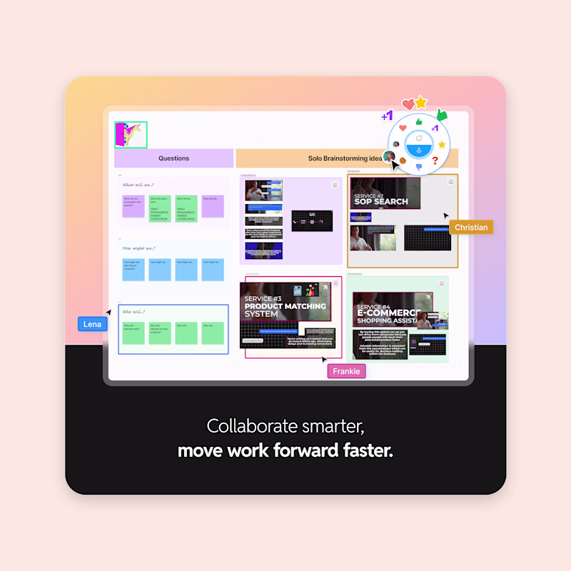
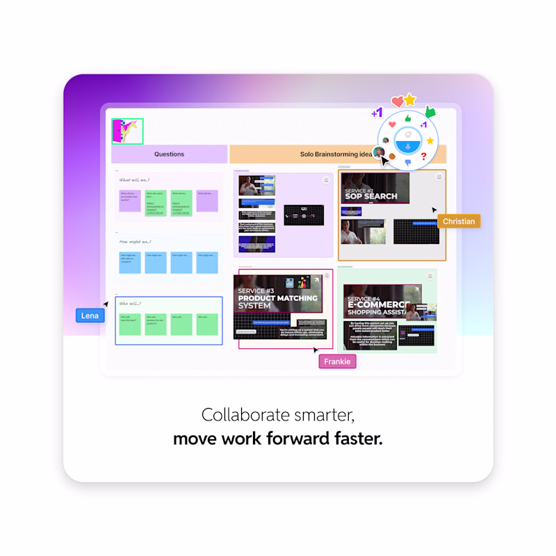
19 votes
Ends in 14h
light has more energy with that warm bg, dark feels more pro. lean light
Great job! both look so fun but I have to side with dark 😄
this dark really stand out
same is good
The dark one looks better!
Both are lovely 🌹
The two looks both good but i will go for the dark.
The network for creativity
Join 1.25M professional creatives like you
Connect with clients, get discovered, and run your business 100% commission-free
Creatives on Contra have earned over $150M and we are just getting started
Related posts
This is what a website looks like before it becomes “design.”
No colors.
No animations.
No fancy UI.
Just structure.
Right now I’m building a new Framer template — and this is the phase most people rush through.
Wireframes.
Where decisions are made:
• what users see first
• how they move
• where they convert
If this isn’t right, nothing else matters.
Design doesn’t fix confusion.
It just decorates it.
Final version dropping in a few days.
If you want early access, comment “template” or DM me 👇
Awesome Design 🔥
I design Framer websites with a strong focus on clarity.
A clean layout isn’t enough if the message isn’t clear.
That’s where structure, hierarchy, and interaction come together.
My approach combines:
— Structured templates (Ginger, INKY, RISE)
— Custom components (motion, interaction, depth)
The goal:
Create websites that are not only visually clean, but truly understandable.
Available for:
— Framer website design
— Template customization
— Custom components
Awesome Design 🔥
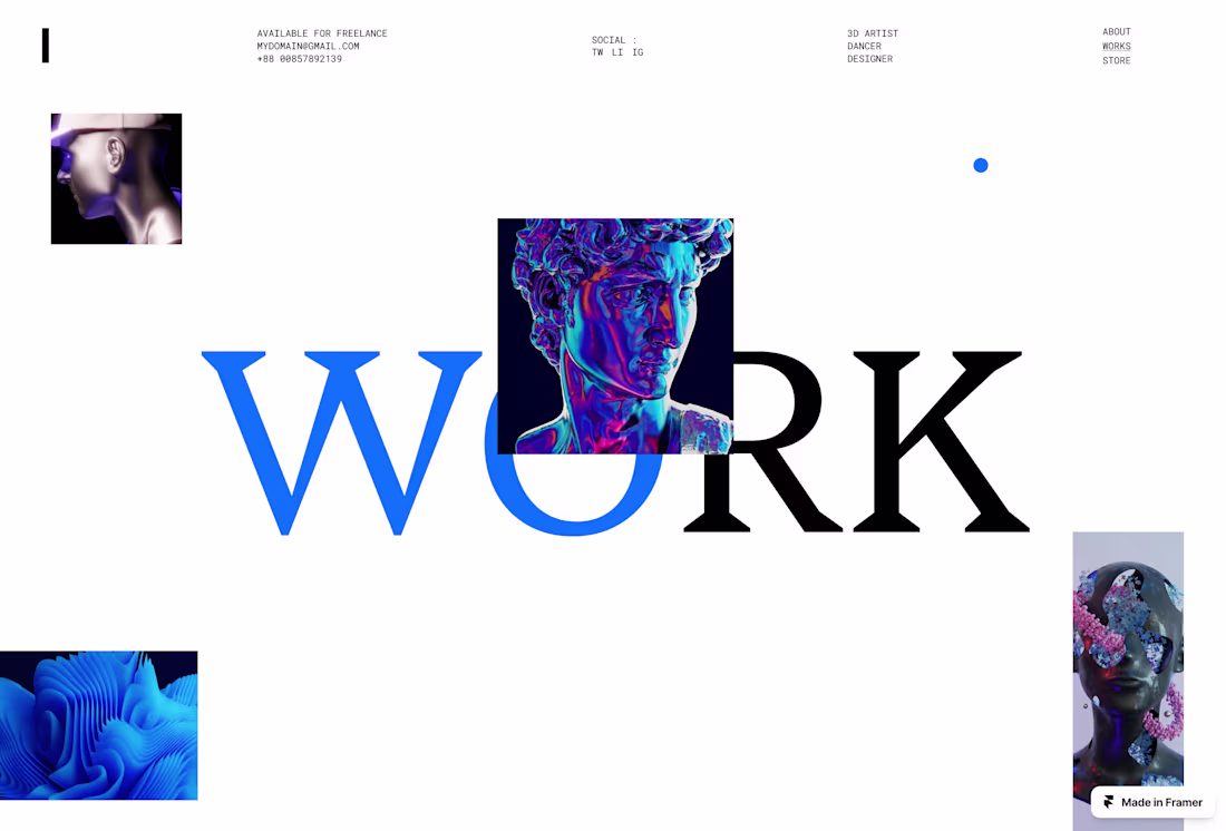
Landing page designed in Framer.
Simple, modern, and built to convert.
Awesome Design 🔥
Trending
Claude
Claude has entered the design space. How are you using Claude Design?
Contra University
Learn from expert creatives how to earn more using next-gen AI tools.
creativeaiflow
Creative AI workflows are evolving. What tools do you use, and what are their strengths and weaknesses?
portfolioreview
The best portfolios tell a story, not just show a grid. Share yours for feedback.
freelancerlife
Freelancer life is wins, pivots, and everything in between. What’s yours right now?