The network for creativity
Join 1.25M professional creatives like you
Connect with clients, get discovered, and run your business 100% commission-free
Creatives on Contra have earned over $150M and we are just getting started
Back to feedPost


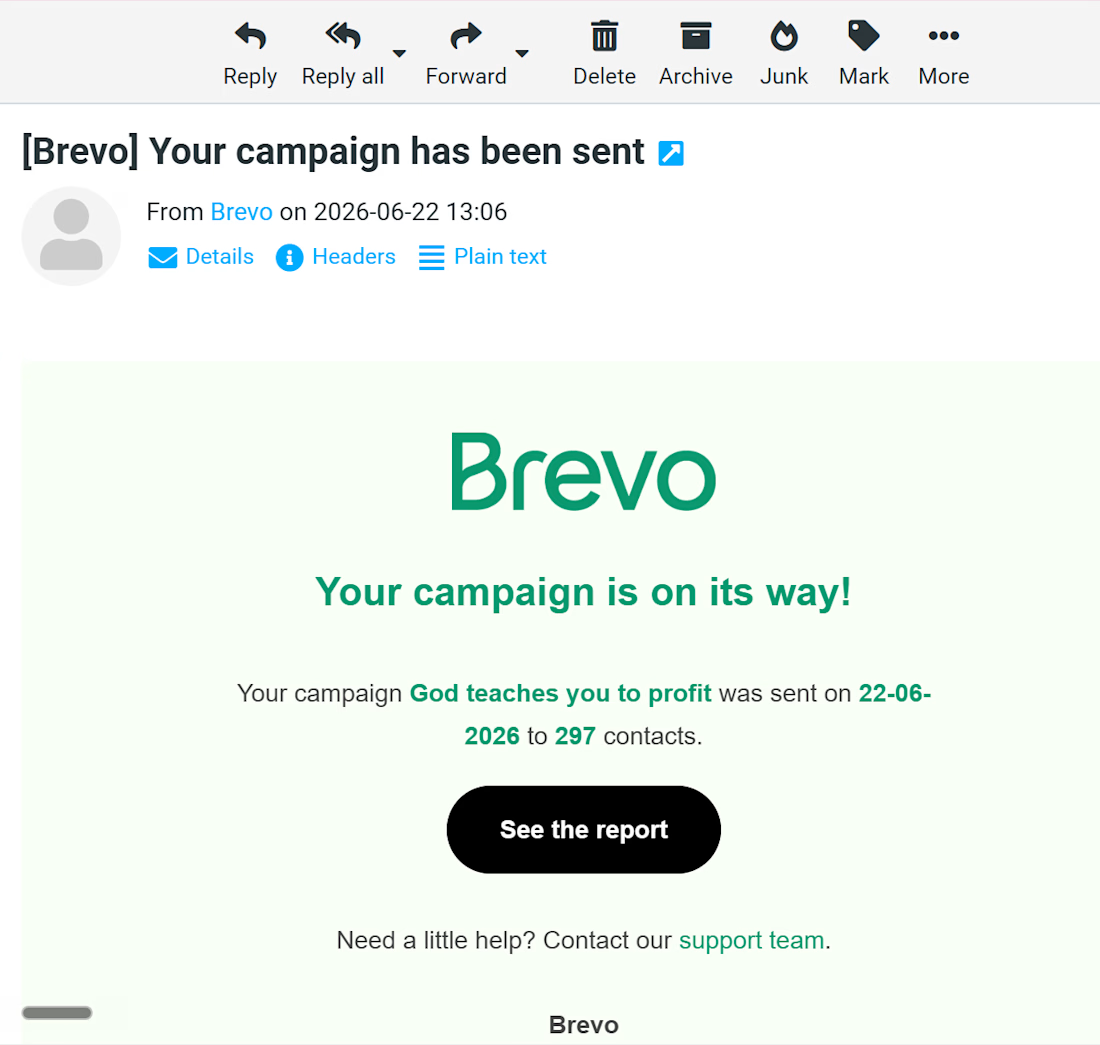
I signed up on Brevo yesterday and set up an email campaign successfully launched for a few contacts of my client🚀
Yesterday, I built and deployed an email campaign using Brevo, handling everything from email design and copy implementation to audience segmentation and campaign setup.
What went into this campaign:
✅ Email design and formatting
✅ Mobile responsiveness testing
✅ Audience segmentation
✅ Campaign scheduling and delivery
✅ Deliverability best practices
✅ Performance tracking setup
Email marketing isn't just about sending newsletters. It's about delivering the right message to the right audience at the right time.
A well-executed email campaign can nurture leads, increase engagement, and drive conversions without relying solely on paid ads.
I've attached a short walkthrough video report along with a screenshot of the campaign:
If you're looking for help with email marketing, automation, customer journeys, or CRM workflows, feel free to connect.
#EmailMarketing #Brevo #MarketingAutomation #EmailCampaigns #CRM #LeadGeneration #DigitalMarketing #EmailCopywriting #MarketingStrategy #Freelancer


The network for creativity
Join 1.25M professional creatives like you
Connect with clients, get discovered, and run your business 100% commission-free
Creatives on Contra have earned over $150M and we are just getting started











Related posts

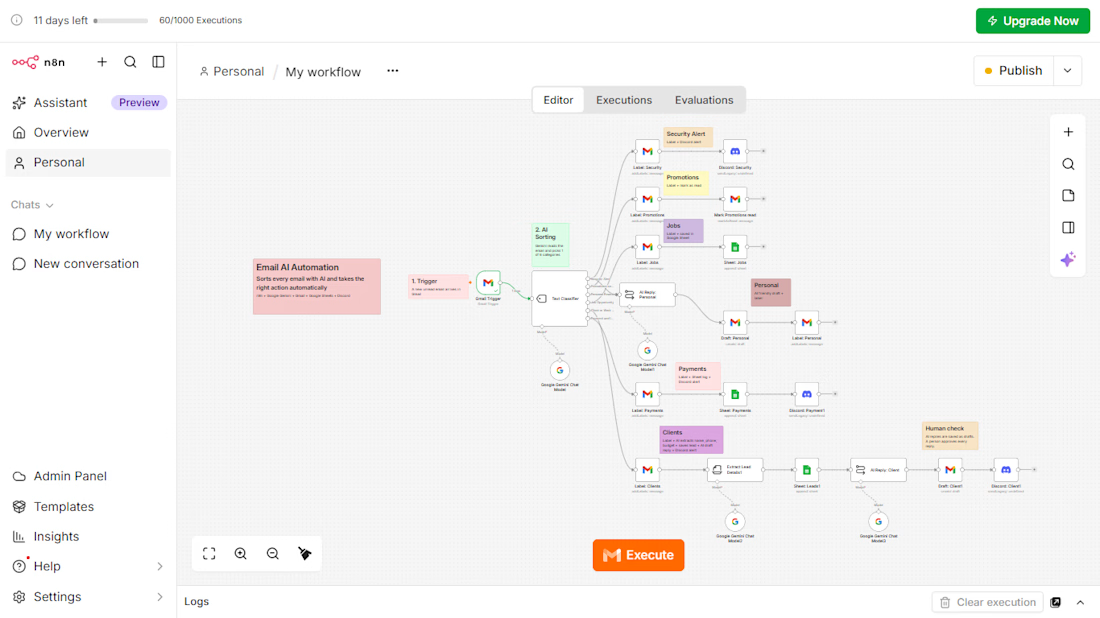
AI Email Automation with n8n and Google Gemini
An AI workflow that reads every incoming email, sorts it into 6 categories, and takes the right action automatically.
The problem: businesses lose time and leads because customer emails are mixed with promotions, job alerts, and security emails.
What I built:
Gmail Trigger that picks up each new email
AI Text Classifier (Google Gemini) with 6 categories: Security Alert, Promotions, Jobs, Personal, Payments, and Client Inquiries
Automatic Gmail labels for every category
Google Sheets log for jobs, leads, and payments
AI information extraction for client emails (name, phone, service, budget)
AI-written reply drafts for client emails, saved as drafts so a person approves every reply
Instant Discord alerts for security, payment, and client emails
Tools: n8n, Google Gemini, Gmail, Google Sheets, Discord
This project is a working demo built on my own inbox. The same system can be adapted to any business email, such as travel agencies, event venues, stores, recruiters, and consultants.


Impressive workflow! I especially like the human approval step for AI-written replies. Automation with the right oversight makes a real difference. 🙌

Open to remote work 👋
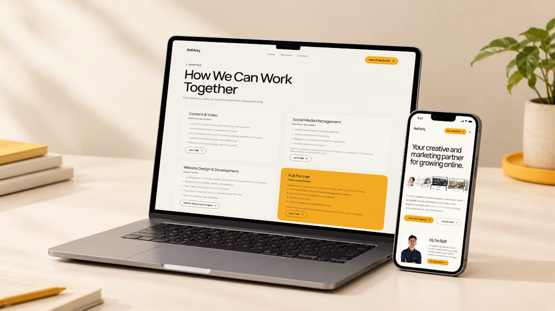
Hi, I'm Rafi, a digital marketer and content creator based in Indonesia.
My focus areas:
• Social media content and strategy
• Short-form video and carousel design
• Content planning
I'm open to remote roles and project-based work. You can see my work here: https://rafiariqmaulana.space/
Feel free to send me a message. Happy to chat.

I like this very much

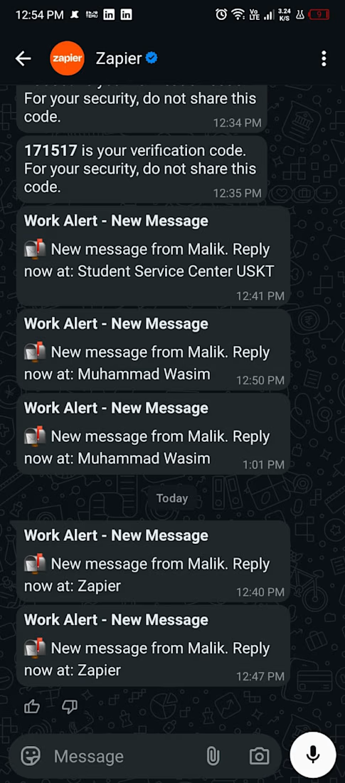
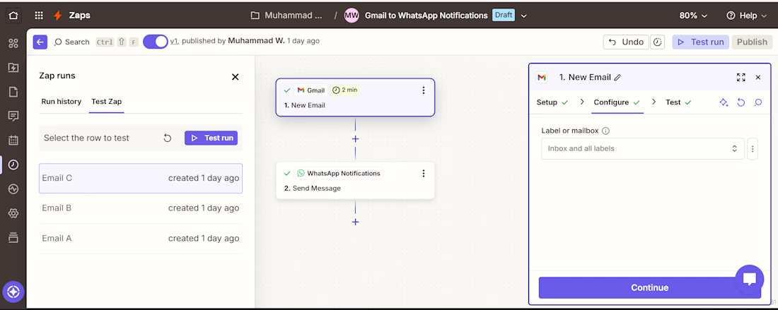
Email to WhatsApp Notification Automation | Zapier No-Code Solution
Built an automated workflow that connects Gmail with WhatsApp Notifications using Zapier. When a new email is received, the workflow automatically processes the email details and sends a WhatsApp notification with the sender information and a direct link to reply.
Key Features:
Gmail → Zapier → WhatsApp automation
Automatic email notifications via WhatsApp
Sender name and email information handling
Direct reply link included in the WhatsApp notification
Automated workflow with field mapping and testing
Reduces the need to manually monitor incoming emails


Smart workflow! Getting email alerts directly on WhatsApp can save time and help businesses respond faster. 🙌