The network for creativity
Join 1.25M professional creatives like you
Connect with clients, get discovered, and run your business 100% commission-free
Creatives on Contra have earned over $150M and we are just getting started

The network for creativity
Join 1.25M professional creatives like you
Connect with clients, get discovered, and run your business 100% commission-free
Creatives on Contra have earned over $150M and we are just getting started








Related posts

New Glass Carousel Component
Now in the Framer marketplace.

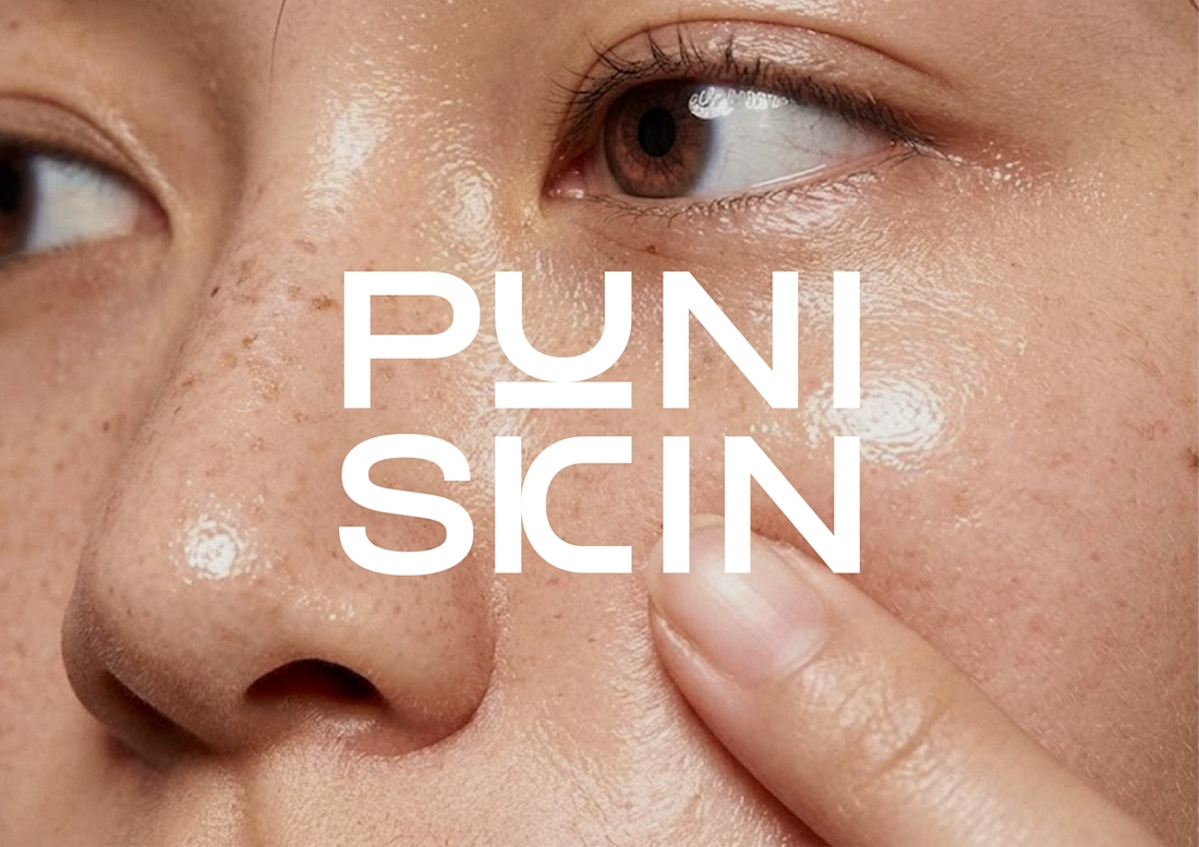
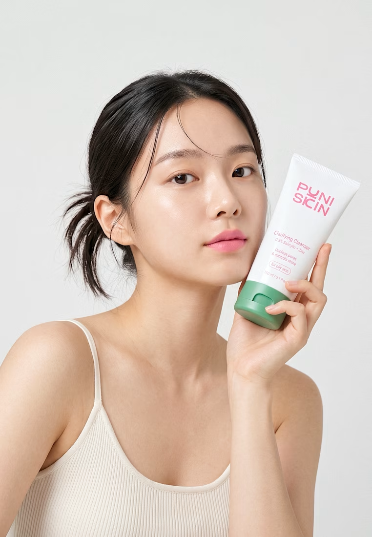
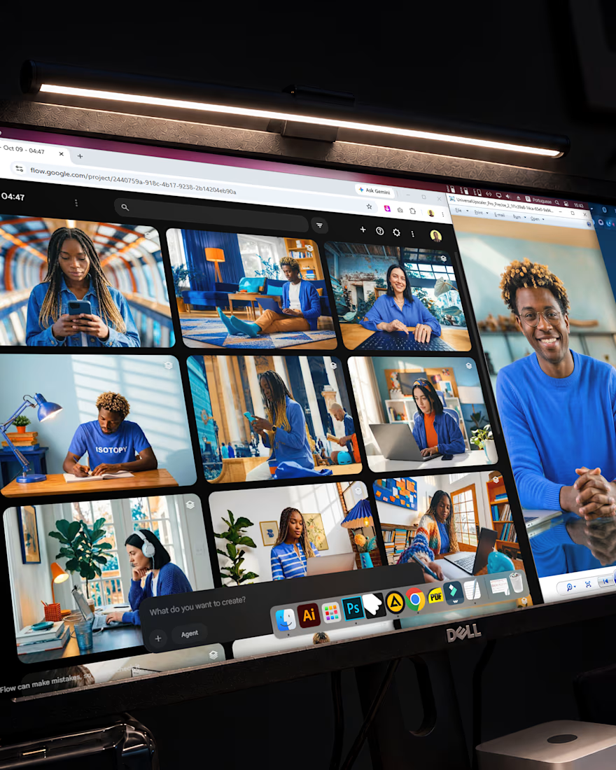
A detail often overlooked when creating visual identities is the photographic style; many designers use stock photo libraries without any clear criteria, incorporating nearly random images into a brand’s designs.
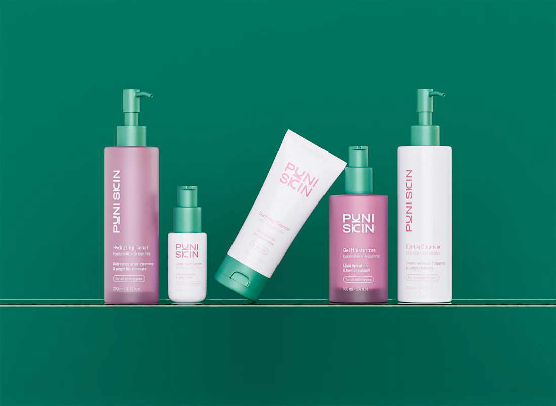
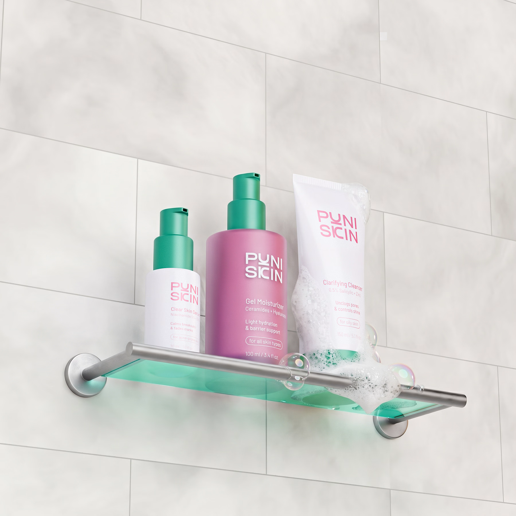
I was recently working on a project and decided to put more focus on the style of the imagery, ensuring it aligned as closely as possible with the brand’s core concept—and these are the results.
I used Nano Banana 2.1, and the outcome was fantastic; the brand now has imagery that is 100% custom-tailored to it.




PUNI SKIN — Brand Identity & Packaging for a Skincare Line
I created the full brand system: a soft, rounded wordmark and a single signature pink balanced with sage green that ties the whole line together. 🔥