The network for creativity
Join 1.25M professional creatives like you
Connect with clients, get discovered, and run your business 100% commission-free
Creatives on Contra have earned over $150M and we are just getting started
Back to feedPost
Taste Test

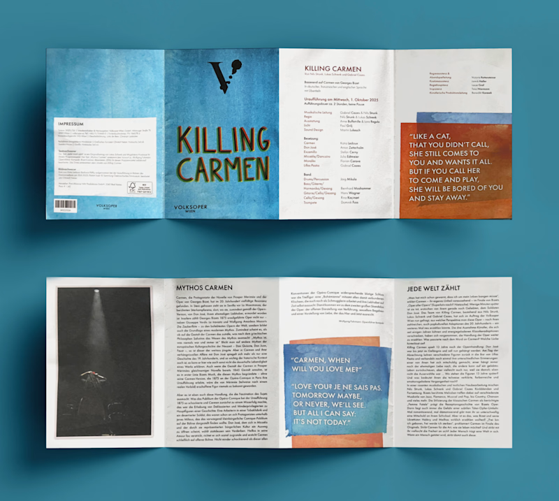
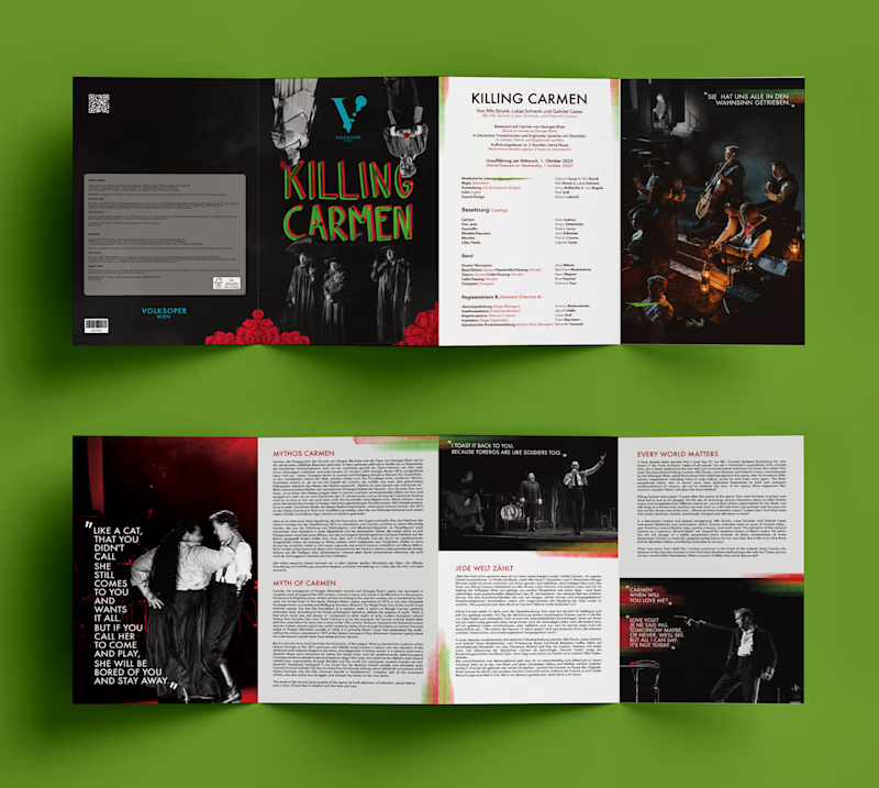
So if you did not know I am a huge musical fan and I watched Killing Carmen in Vienna last year, a brand new musical reinterpretation of the Carmen opera by Volksoper.
However, after purchasing the official play brochure, I was quite disappointed. So as any logical person would do, by using the publicly available resources from their website, I decided to redesign the brochure.
My goal was to create a design that reflected the multilingual, dynamic, and contemporary spirit of the production which turns the informational brochure into a visual keepsake (which is the whole point of purchasing the brochures if you ask me!)
Be brutally honest with me which would you prefer to buy at the theater?
2 voted
40%
3 voted
60%
5 votes
Closed

Re-Make for me. The dark, moody spreads suit the show far better than the pastel original.
Thank you!
The network for creativity
Join 1.25M professional creatives like you
Connect with clients, get discovered, and run your business 100% commission-free
Creatives on Contra have earned over $150M and we are just getting started





Related posts

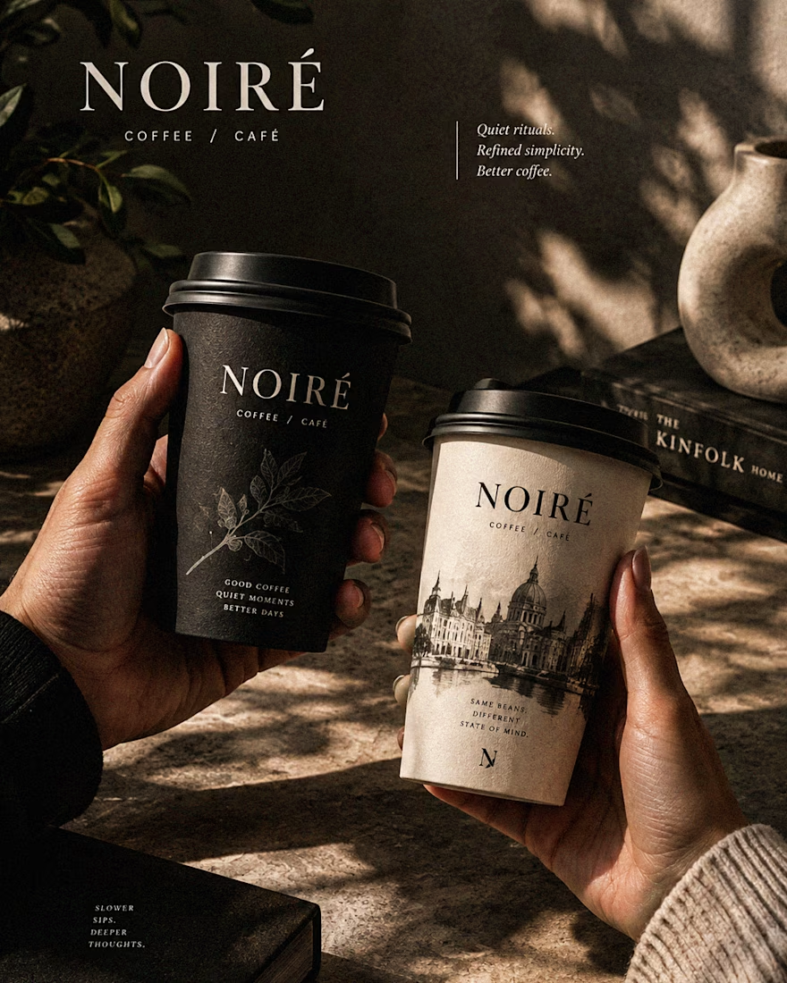
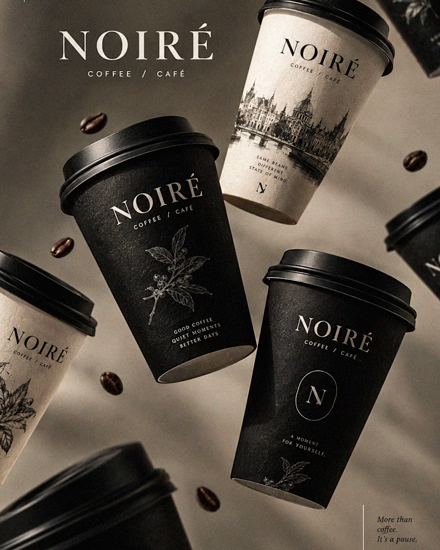
I Just Created NOIRÉ 🔥
A Coffee Brand Built Around the Pause.
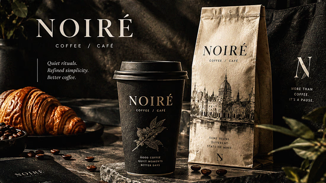
NOIRÉ is a premium café brand built around a simple idea:
Great coffee should feel like a moment of pause, not another part of the
routine.
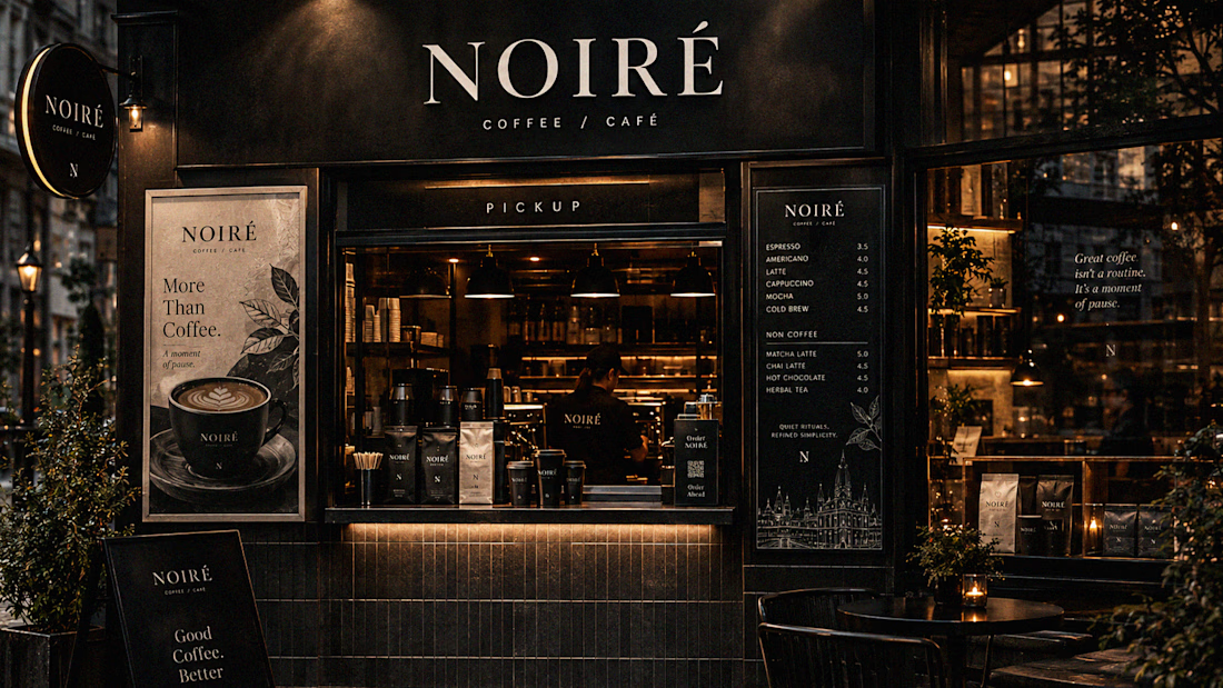
The project explores a complete visual identity, packaging
system, takeaway cups, coffee bags, tote bags, menu design, café applications and lifestyle campaign direction.
Instead of relying on the usual loud coffee aesthetics, I
built NOIRÉ around deep charcoal, warm ivory, soft graphite, refined
typography, subtle botanical illustrations and quiet editorial compositions.
The visual language is intentionally dark, tactile, and understated - giving every touchpoint the feeling of a slow morning, a quiet table, and coffee worth taking your time with.
From the cup in your hand to the café around you, every detail was designed to make the brand feel like a ritual.
Waiting for your thoughts in the comments 🙌🔥
branddesignertastetestBrand DesignGraphic DesignPackaging DesignAdobe IllustratorAdobe InDesignAdobe Photoshop




Okay, I finally joined the typography trend too. 👀
Had to try one myself - so here’s a little typography experiment I’ve been playing with.
Sometimes you just see a trend everywhere and think, okay… my turn. 😂
What do you think - should I make more of these?
Graphic DesignMotion DesignTypographyAdobe After EffectsAdobe Illustratortypographykinetictypographymotiongraphics


TOP!!

Which loader did you guys choose and why? I created the approved version for my client and he loved it.
2 voted
20%
8 voted
80%
10 votes
Closed

Approved feels unique I like it ♥️♥️