The network for creativity
Join 1.25M professional creatives like you
Connect with clients, get discovered, and run your business 100% commission-free
Creatives on Contra have earned over $150M and we are just getting started
Back to feedPost

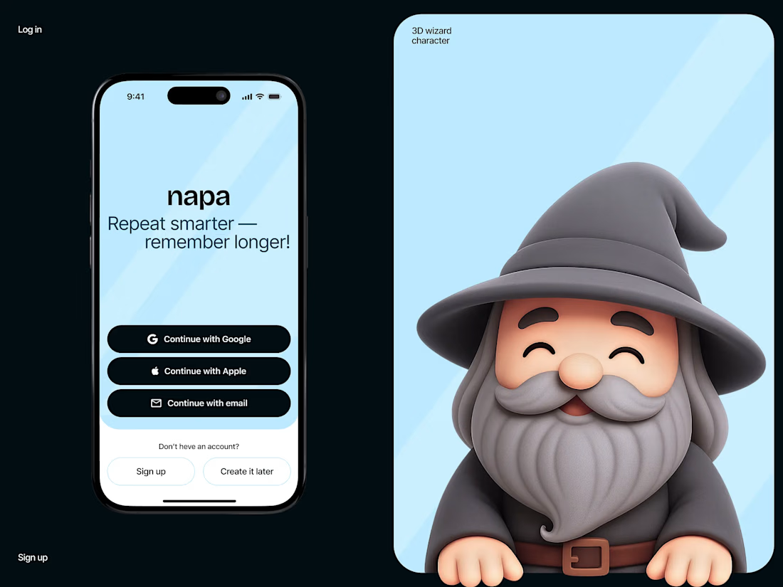
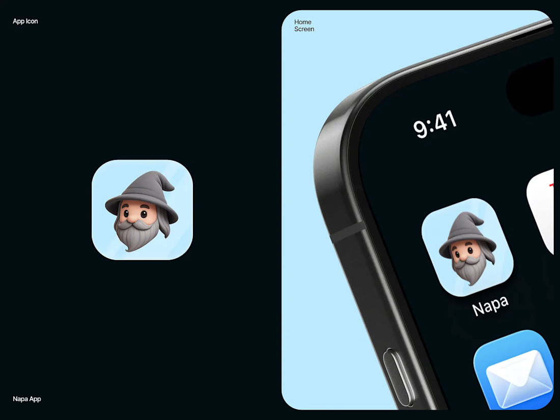
Napa — Mobile UI Design, 3D Character & App Icon
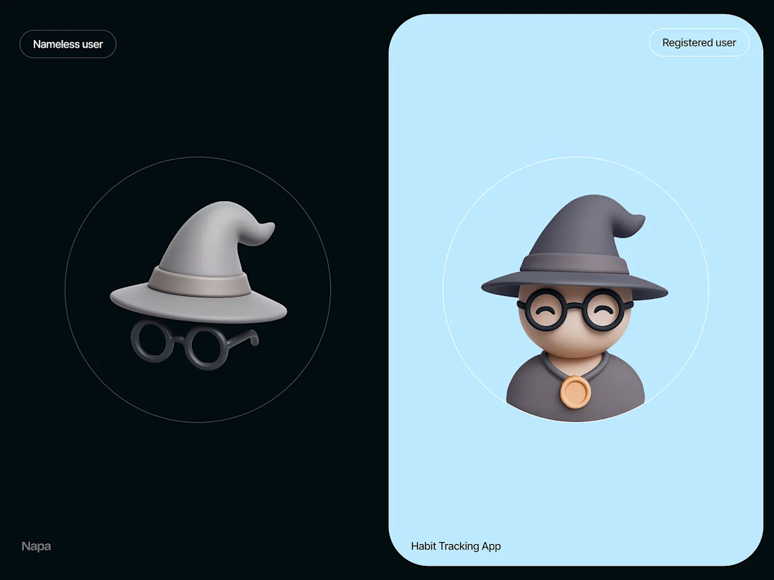
A closer look at three key elements of the Napa habit-tracking app: the sign-in screen with the wizard peeking in. The app icon is designed to be recognizable at any size, and the character system features a masked wizard for nameless users and an open-faced wizard for registered users.
Generated through AI, refined, and integrated as functional UI elements.


The network for creativity
Join 1.25M professional creatives like you
Connect with clients, get discovered, and run your business 100% commission-free
Creatives on Contra have earned over $150M and we are just getting started
Challenges
View all


Related posts

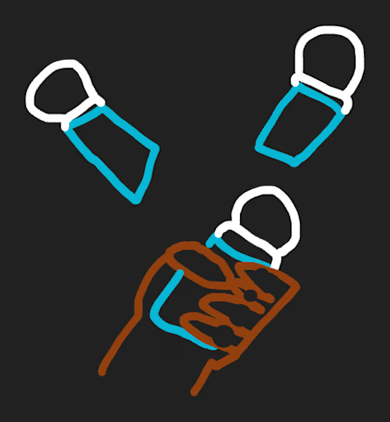
Can AI understand your rough sketches?
ChatGPT just added a new sketch feature to its new Images 2.5 model, so I tried it with extremely simple sketches and short prompts to see how well it could understand my intention.
And honestly, I actually like it!
This can be helpful especially when you already have a specific pose or composition in mind and want to quickly turn that rough idea into something more refined.
If you’re curious, I included a quick process video in the comments.
Do you think this new feature could be useful in your workflow?

So cool


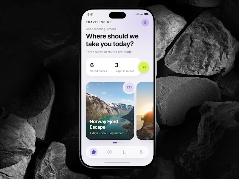
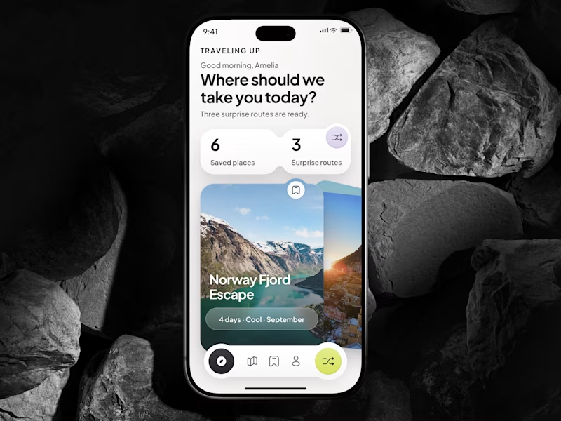
🎴 TASTY TEST 06/30: Which travel discovery experience would you choose?
Traveling Up is probably my first mobile concept outside client work in almost three years. It was inspired by a trip where not knowing the destination was part of the fun.
Same app. Same destination. Two ways to discover it.
🤍 A Clean Carousel
Calmer, lighter, more familiar.
💚 B Immersive Deck
Bigger imagery, stronger overlap, more tactile navigation.
Which one makes you want to swipe and see where the app takes you next?
A or B? 👇
#MobileAppDesign #TravelApp #MobileUX #UIDesign #ProductDesign #AsolDesign
23 voted
49%
24 voted
51%
47 votes
Closed


Can a 30 second doodle really become something you'd ship? 🤨 Apparently with ChatGPT the answer is yes...
I went in skeptical: rough sketch, no love, ran it through the new Images 2.5 model and this came back. Lighting and depth nailed almost instantly, some details still needed a couple markup edits before it felt really good! ✏️
It makes me think, where's the line between a helpful shortcut and cutting corners?


Perfectly realistic