The network for creativity
Join 1.25M professional creatives like you
Connect with clients, get discovered, and run your business 100% commission-free
Creatives on Contra have earned over $150M and we are just getting started
Back to feedPost
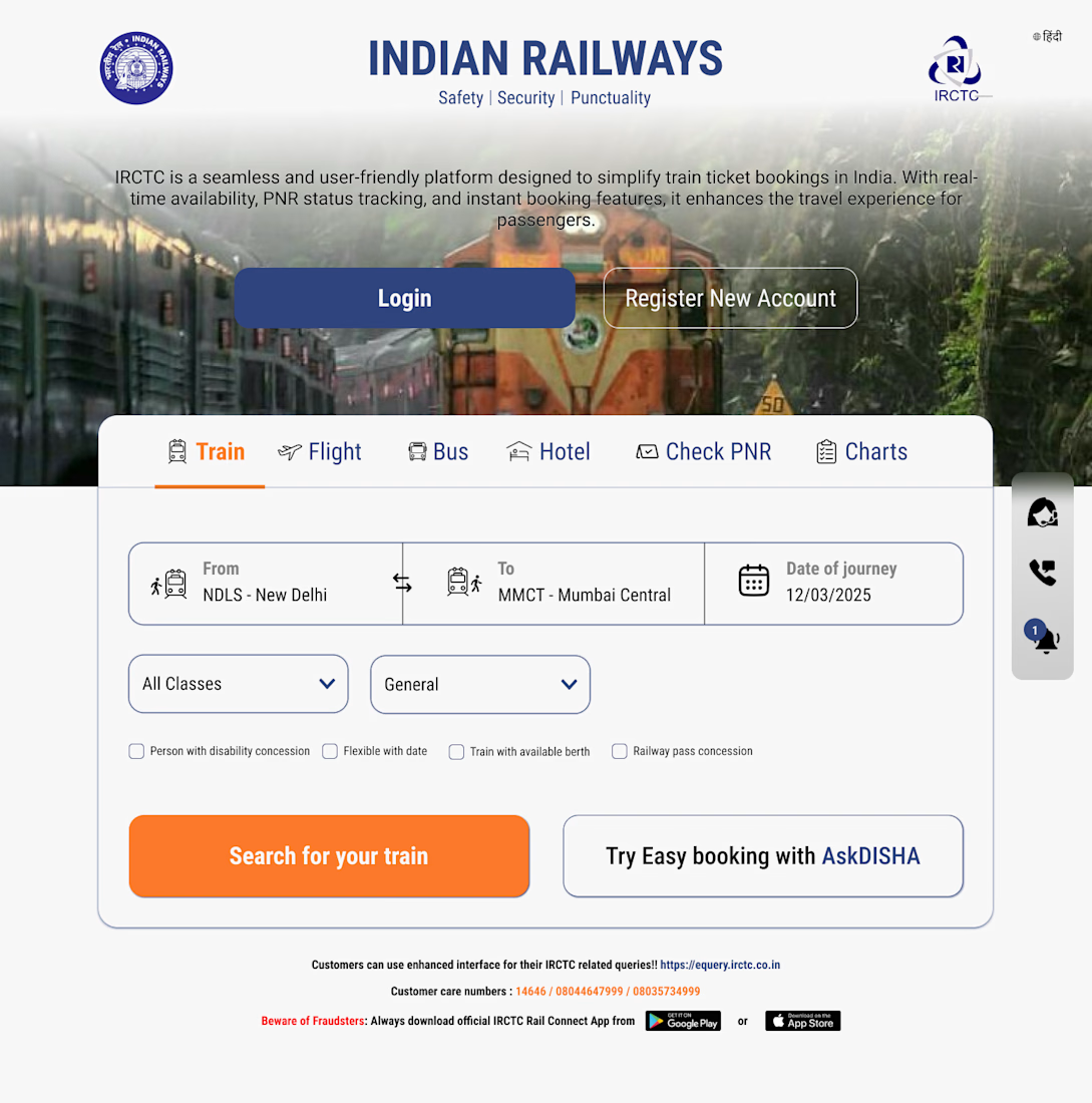
IRCTC Website Redesign
I redesigned the IRCTC homepage to create a cleaner, faster, and more user-friendly experience for train ticket booking.
The existing platform contains a lot of information and multiple actions on a single screen, which can feel overwhelming for users. My goal was to simplify the booking flow while keeping the most important actions immediately accessible.
What I Improved
Created a cleaner visual hierarchy with a stronger focus on the primary booking journey
Simplified the train search section by making “From”, “To”, and “Date of Journey” more prominent
Redesigned the navigation tabs for Train, Flight, Bus, Hotel, PNR, and Charts for quicker access
Added larger, more accessible CTA buttons such as “Login”, “Register New Account”, and “Search for your train”
Improved spacing, typography, and contrast to make the interface easier to scan
Kept the familiar IRCTC branding while modernizing the overall look and feel
Design Goals
The redesign focuses on:
Faster booking experience
Reduced cognitive load
Better accessibility and readability
Mobile-friendly and scalable UI structure
A more modern and trustworthy interface
This concept redesign demonstrates how a government service platform can be transformed into a smoother and more intuitive digital experience without losing its core identity.
The network for creativity
Join 1.25M professional creatives like you
Connect with clients, get discovered, and run your business 100% commission-free
Creatives on Contra have earned over $150M and we are just getting started
Related posts
How it works section for Ember 🙂↕️
Smooth animations with the abstract illustrations, the best 👌🏽
Taking new projects.
Send a DM or book a call - https://cal.com/daniel-design/15min
Loved the Design :)
Client turned this one down for a logo design. Might have to keep it in the back pocket!
I know youre work is solid friend but I am genuinely struggling here. An onion? Spacecraft? Heart?
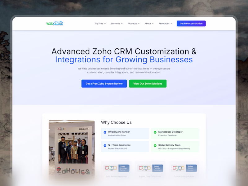
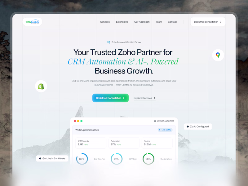
I Re-Designed W3S Cloud, Whichone Better?
0 voted
0%
10 voted
100%
10 votes
Closed
Great
Trending
Claude
Claude has entered the design space. How are you using Claude Design?
Contra University
Learn from expert creatives how to earn more using next-gen AI tools.
MagicPath
The canvas is infinite, and exploration is becoming the workflow. How are you using MagicPath?
creativeaiflow
Creative AI workflows are evolving. What tools do you use, and what are their strengths and weaknesses?
freelancerlife
Freelancer life is wins, pivots, and everything in between. What’s yours right now?