The network for creativity
Join 1.25M professional creatives like you
Connect with clients, get discovered, and run your business 100% commission-free
Creatives on Contra have earned over $150M and we are just getting started
Back to feedPost
Just Pushed the complete redesign for HOFLORE into production!
The brand already had the product and the point of view. The website needed to feel like it belonged to the same world.
We rebuilt the experience around restraint, editorial pacing, and product-first storytelling. Large photography, quiet typography, generous space, and a warmer neutral system give the bags room to carry the page.
The redesign spans the full journey, from collection and product discovery to individual product pages, brand story, values, and the smaller moments that make the experience feel considered.
Luxury without trying too hard to look luxurious.
Feel the experience yourself @ www.hoflore.com
Just a calmer, sharper home for the brand.

Perfect

Thank you!

Lovely!
Thanks so much mate <3
The network for creativity
Join 1.25M professional creatives like you
Connect with clients, get discovered, and run your business 100% commission-free
Creatives on Contra have earned over $150M and we are just getting started

Challenges
View all


Related posts

some visuals from the brand wall for blink
creative direction by me
visual identity by Eva Landaluce
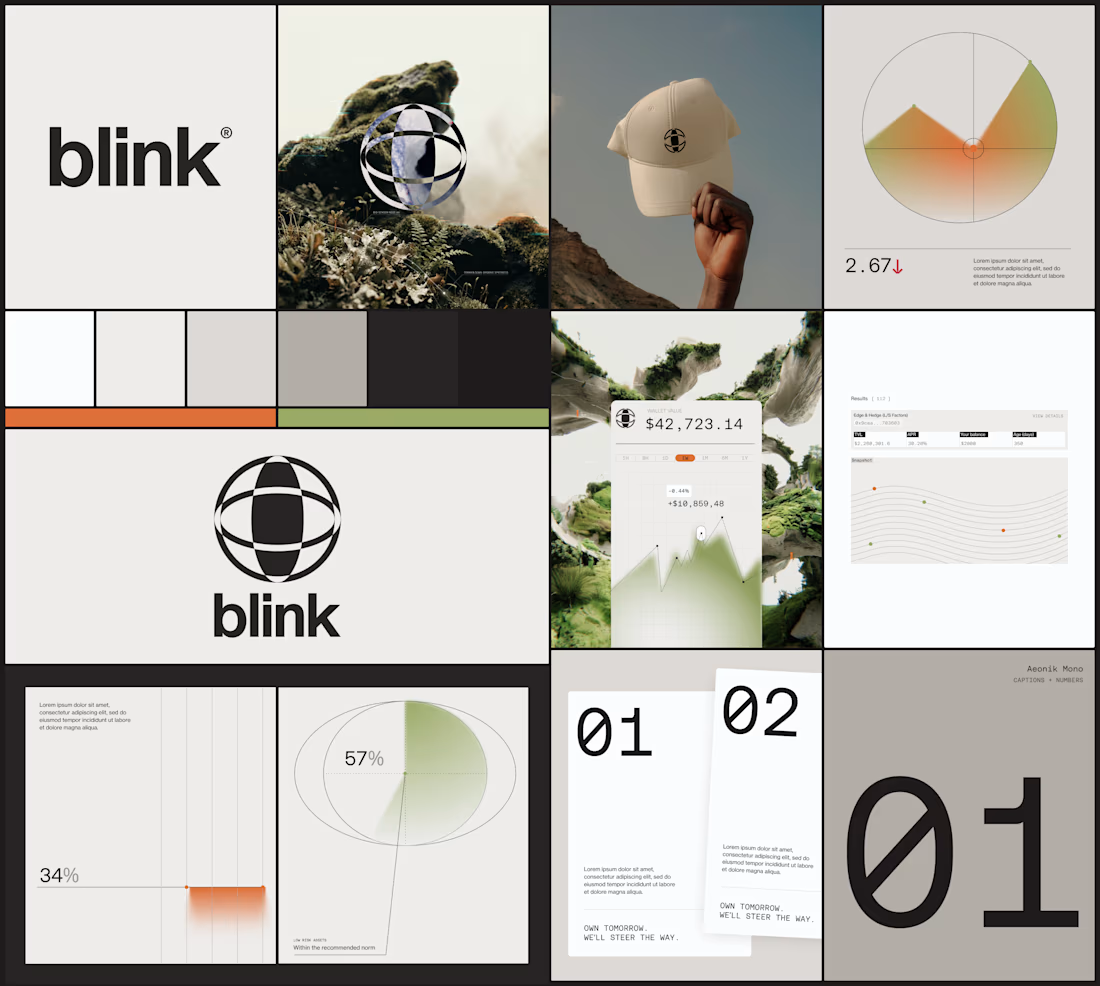

beautiful work!


A modern fintech branding exploration designed to create a confident, trustworthy, and premium financial identity. The project includes a distinctive visual language, refined brand direction, and engaging Instagram Story designs built to communicate financial products in a simple and visually compelling way.

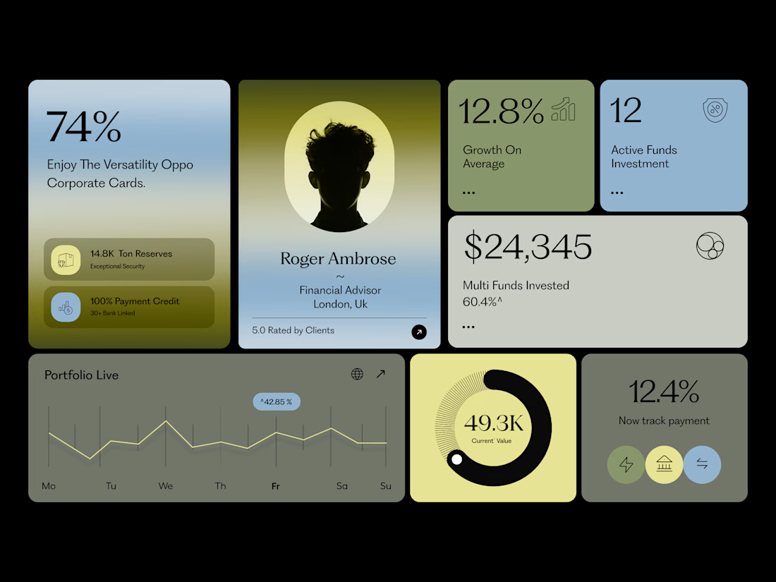

The subtle gradients behind the data cards give this fintech dashboard a highly premium, trustworthy feel.


SAME CONTENT. TWO DIFFERENT EXPERIENCES.
We compared two versions of a service card for a local service business.
A - Everything at once
The detailed description, features, and buttons share the same emphasis. The information is there, but it takes longer to find what matters.
B - What matters first
The service name, short value statement, rating, price, and booking action follow a clear sequence. Less searching, more confidence in the next step.
Hierarchy doesn’t remove information. It helps reveal it at the right moment.
Which version feels clearer to you - A or B?

15 voted
22%

53 voted
78%

68 votes
Closed


Visual hierarchy is the difference between cognitive friction and conversion velocity. Version B wins because it respects user attention scannability drives immediate confidence, while cluttered details in A only delay the primary action. Clean structural prioritization always outperforms dumping raw information.