The network for creativity
Join 1.25M professional creatives like you
Connect with clients, get discovered, and run your business 100% commission-free
Creatives on Contra have earned over $150M and we are just getting started
Back to feedPost
Hey, I designed this website using Google AI Studio, Antigravity, and coding. It’s still in progress, but 85% is completed Alhamdulillah. Let me know your feedback.


Thank you
The network for creativity
Join 1.25M professional creatives like you
Connect with clients, get discovered, and run your business 100% commission-free
Creatives on Contra have earned over $150M and we are just getting started





Related posts

A recent SaaS website design project done for a modern healthcare platform.


love the project. honestly this is impressive

Same prompt. Two builders.
One site made with Lovable, one with Google AI Studio. A Flemish still-life snack brand, gilt frames, GSAP scroll, the works.
Which one is better?
33 voted
67%

16 voted
33%

49 votes
Closed

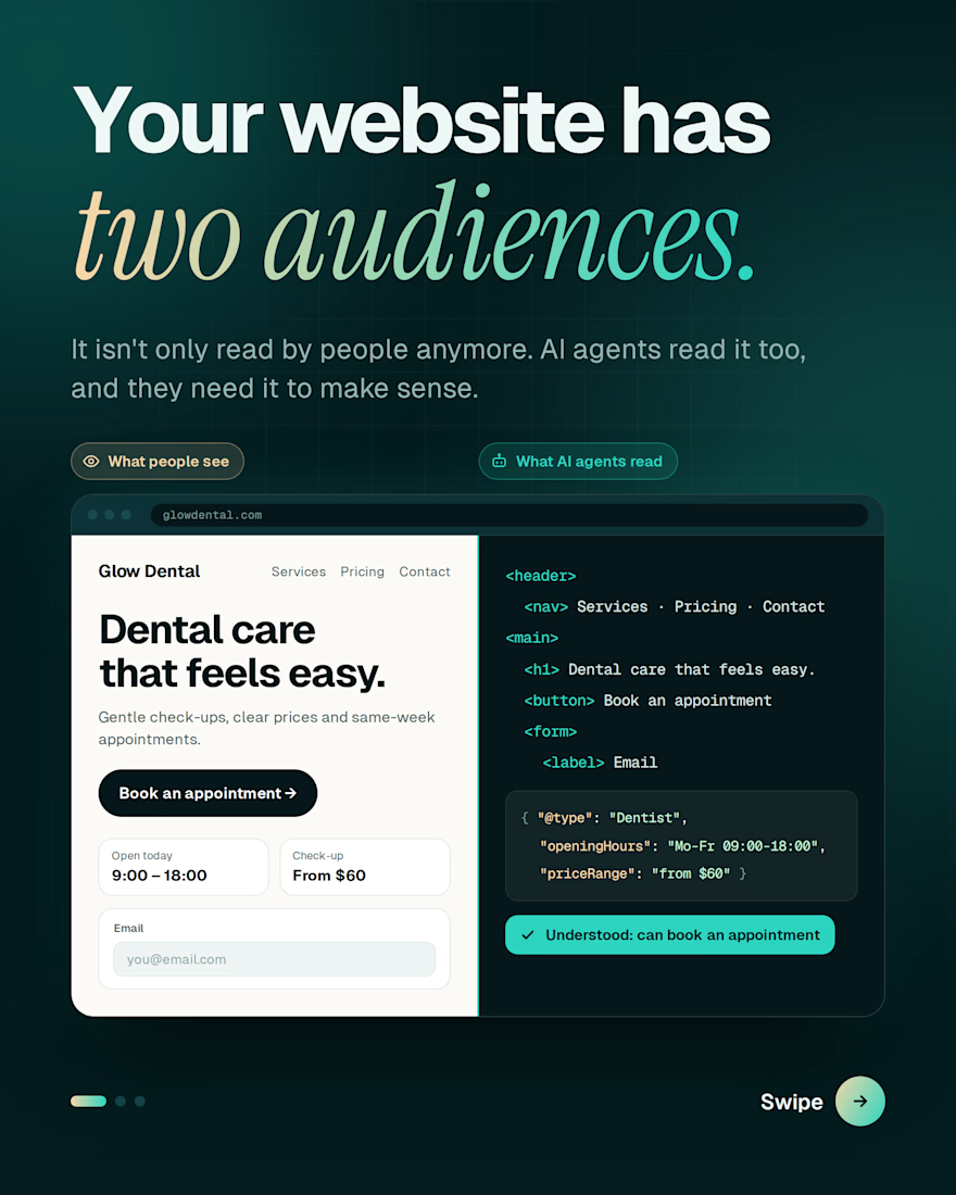
Your website isn't only being read by people anymore. AI agents are reading it too.
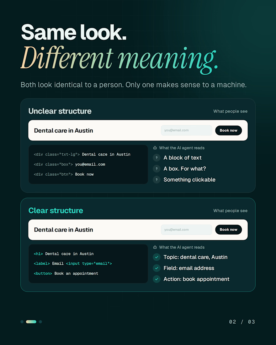
When someone asks an AI assistant to find a dentist, compare prices or book an appointment, that assistant visits websites and tries to make sense of them. It doesn't see your design. It reads your structure.
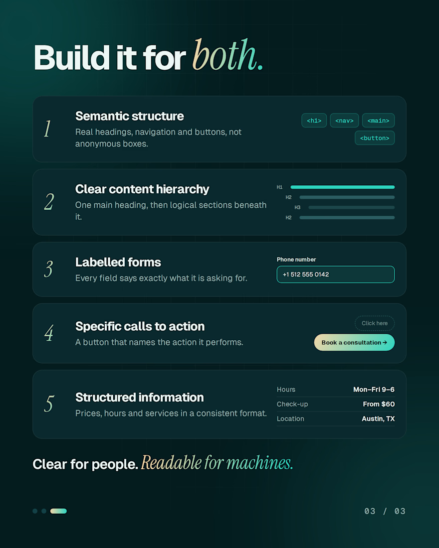
A page can look perfect to a person and still be a puzzle to a machine. What makes the difference:
→ Real headings, navigation and buttons
→ One clear content hierarchy
→ Form fields with proper labels
→ Buttons that name the action
→ Prices, hours and services in a consistent format
Build for both audiences and your site stays clear for people and readable for machines.
Is your website ready for both?


Buttons that name the action is the one most sites still get wrong. Clean split in the carousel too.


