The network for creativity
Join 1.25M professional creatives like you
Connect with clients, get discovered, and run your business 100% commission-free
Creatives on Contra have earned over $150M and we are just getting started
Back to feedPost

Bright Line Renovations — Home Renovation Website ... READY TO SELL
It took me 5 days to bring this one to life — from wireframing the trust-building structure to sourcing every single image that had to feel warm, styled, and aspirational, not like empty rooms with new cabinets.
The brief was simple in words but hard in execution: build a website that makes a stranger trust a contractor with their home before they ever pick up the phone. That meant leading with real before/after proof, breaking up every section with detail shots (countertops, fixtures, finishes), and making sure the whole site felt as premium as the work it's representing.
7 fully built pages — Home, Gallery, How It Works, Services & Pricing, Success Stories, About, and Contact — each one image-rich, detailed, and structured around one goal: turning ad clicks into booked estimates.
Ready to sell at a very reasonable price — perfect for renovation contractors, home services businesses, or design-build studios who want a site that actually converts, not just looks nice. Message me if you'd like to see it live or grab it for your own brand. 🏡 its editable you can edit it for your own brand


The network for creativity
Join 1.25M professional creatives like you
Connect with clients, get discovered, and run your business 100% commission-free
Creatives on Contra have earned over $150M and we are just getting started





Related posts

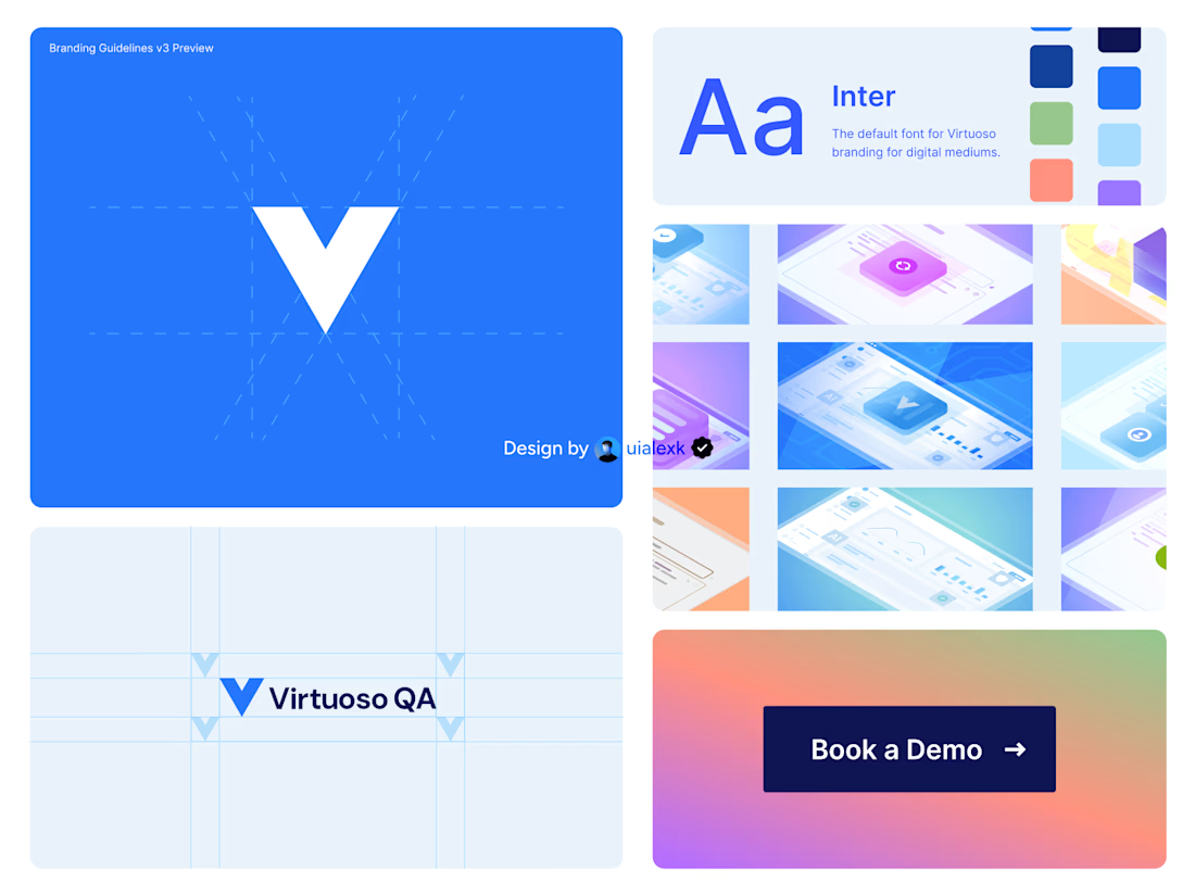
Branding v3 for Virtuoso
This design evolution, made an impact to the brand growth's by:
- Increasing website conversions
- Having consistent brand presence across digital mediums
- Increase brand awareness
See full case study here

One of the best designs I’ve seen today. Really solid work

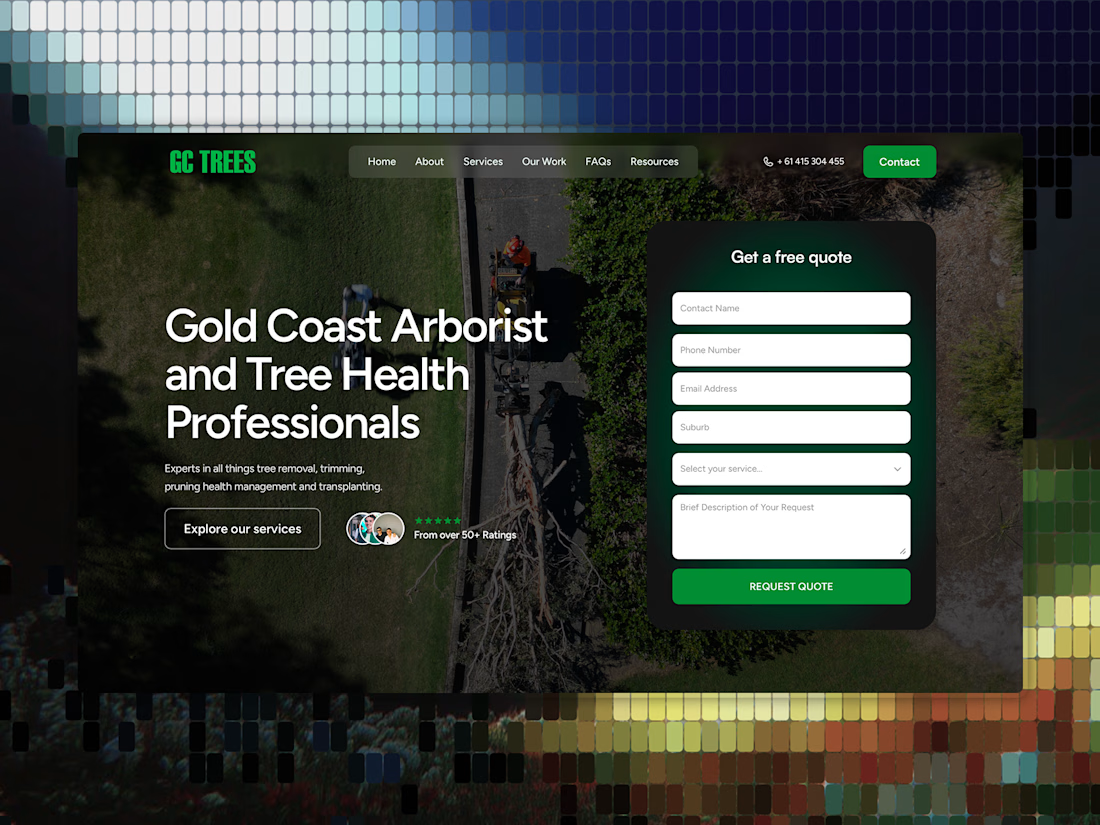
Client wanted a refresh, not a full rebuild. So we restructured it around the new logo and brand, moved the form right into the hero, built new pages and led with what actually converts.
The goal wasn't a new look. It’s making the existing site work harder.

form moved into the hero instead of a call cta, right call

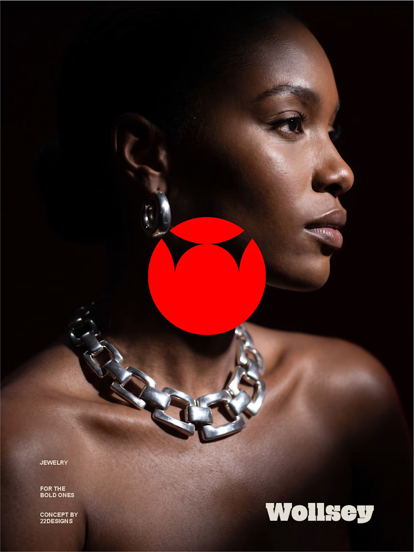
WOLLSEY - Jewelry for the Bold Ones
Wollsey is a jewelry brand built on one idea: bold jewelry should never blend in.
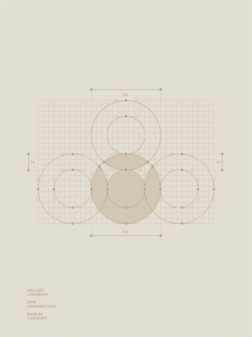
The identity centers on two interconnected principles; presence and permanence. The symbol takes the form of a solid, self-contained mark: a circular silhouette holding a crown-like negative space at its center, representing a piece of jewelry as an object of its own weight and status, not an accessory borrowed from someone else's trend cycle.
This concept carries through the entire visual system. The custom wordmark is built in a bold, condensed sans — compressed, confident letterforms that read as a stamp rather than a script, echoing the same solidity as the symbol itself.
The color palette pairs deep matte black with a controlled, high-impact red, balanced by warm cream and stone tones across packaging and supporting materials — a system built for contrast and attention rather than quiet luxury.
Full casestudy is coming soon
jewelrylogojewelrybrandidentityLogo DesignBrand DesignGraphic DesignAdobe IllustratorAdobe PhotoshopCorelDraw


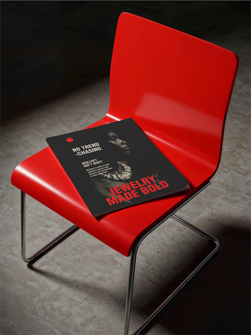
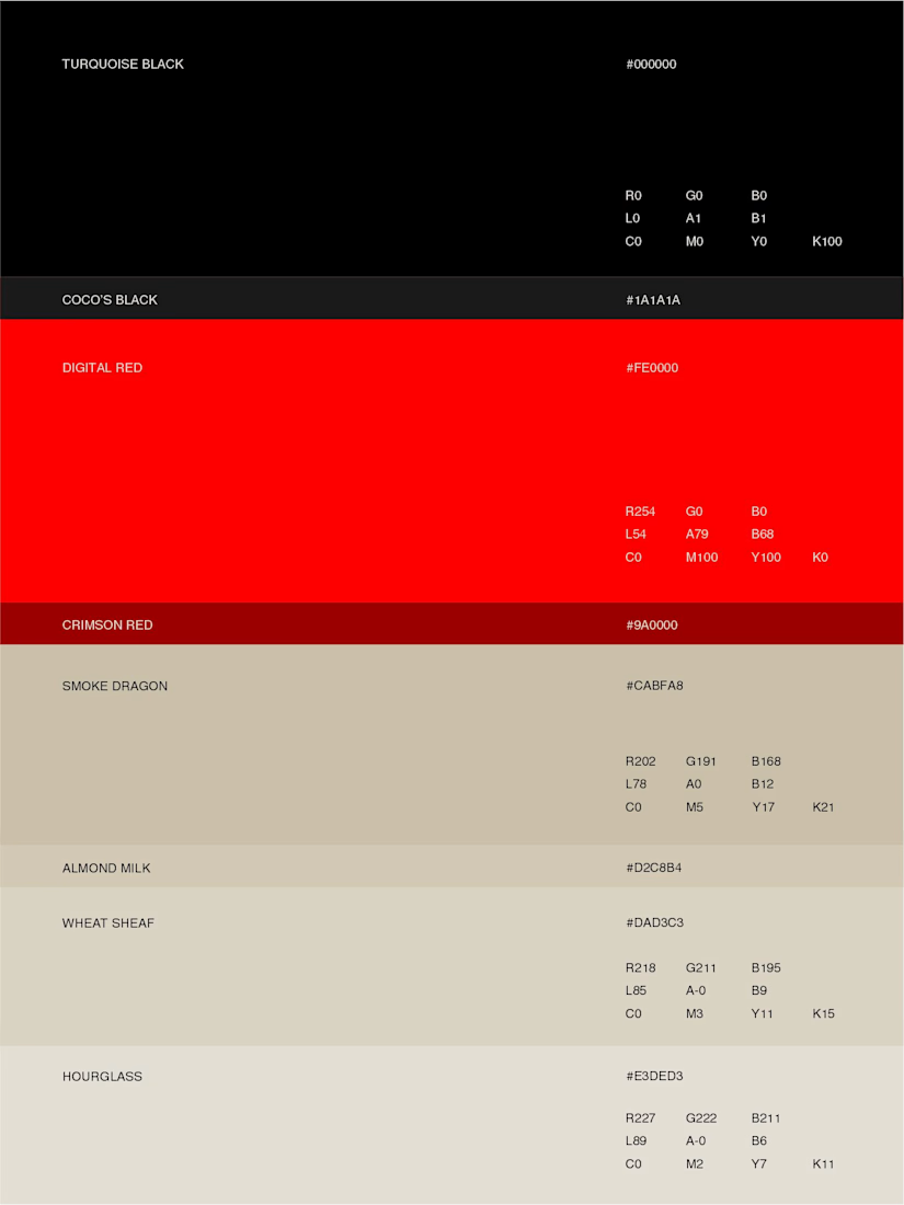

Bold jewelry should never blend in is the perfect one-line brief, and that solid red mark on the chained editorial shot backs it up completely. Jewelry Made Bold on the lookbook ties it all together. Presence and permanence really come through in the whole system.