The network for creativity
Join 1.25M professional creatives like you
Connect with clients, get discovered, and run your business 100% commission-free
Creatives on Contra have earned over $150M and we are just getting started
Back to feedPost

This has been one of those fun build, no thought.


NEW PAID PROJECT
Raymond Asogwabolt.new
The network for creativity
Join 1.25M professional creatives like you
Connect with clients, get discovered, and run your business 100% commission-free
Creatives on Contra have earned over $150M and we are just getting started



Related posts

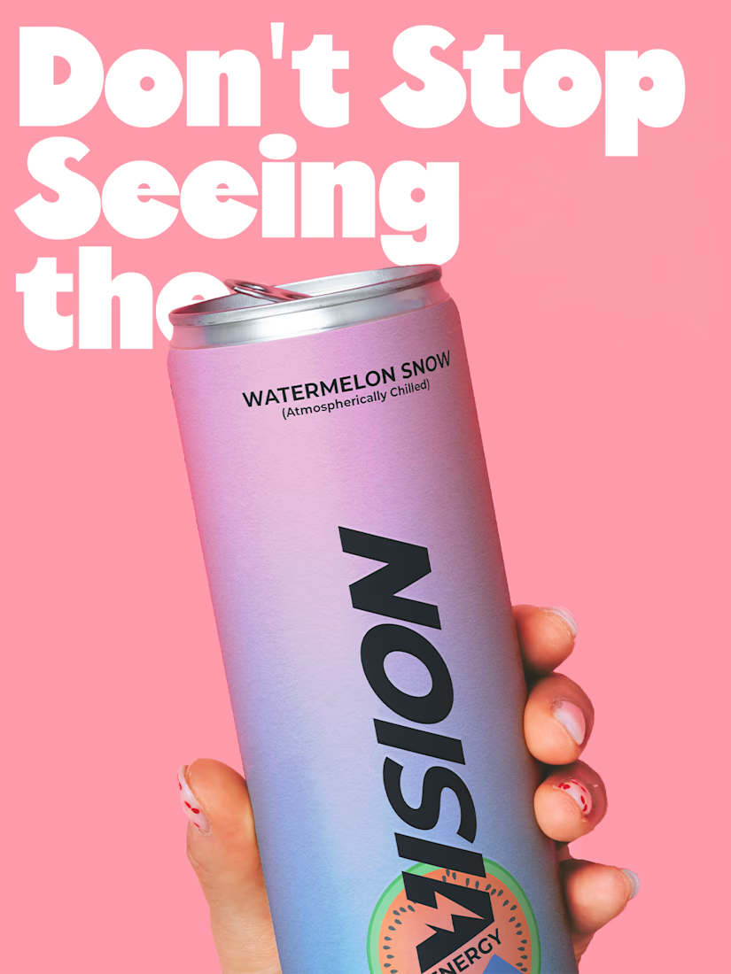
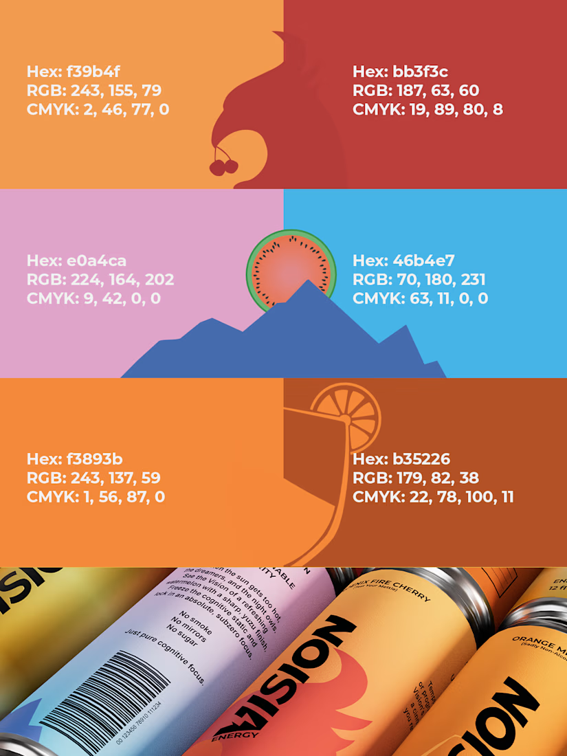
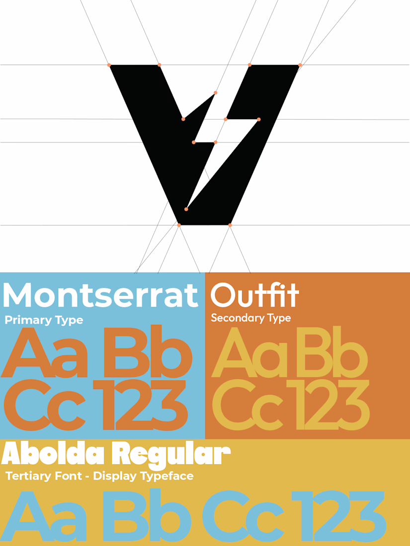
Two timeless types (with an energetic, younger sister font), gradients with bold colors, and playful minimalist designs were the focal point for my brand VISION. I really wanted to push and see what the balance of fun, colorful, and playful along with quiet, focused, and stabilizing felt like for an energy drink company. So everything from the type to the packaging on a six pack had to be fine tuned as much as the 3D spec did.
See the VISION.
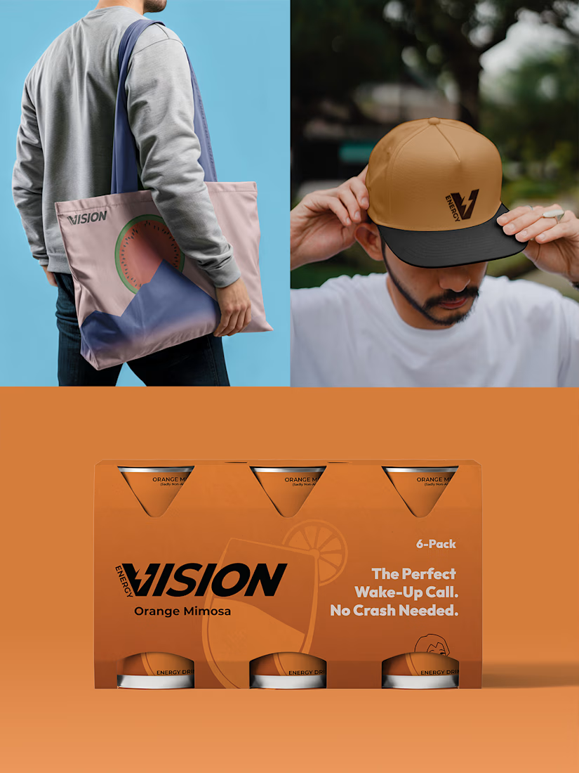

this is amazing visual color brand .

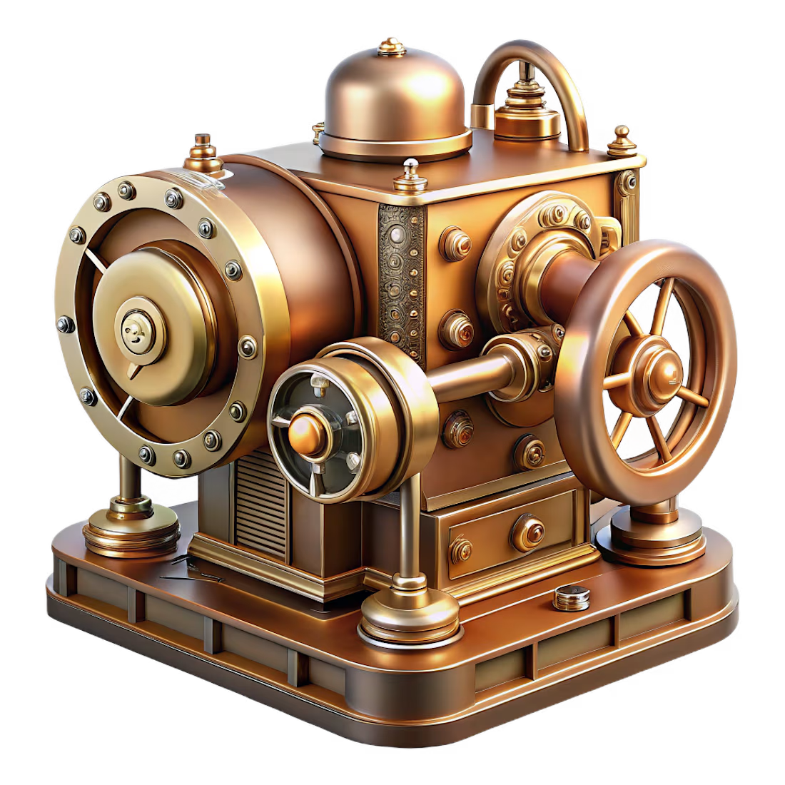
My submission for the #recraftstyleschallenge. Created an intricate retro-futuristic mechanical archive device using Recraft's Plastic 3D style.
#recraftstyleschallenge #recraft