The network for creativity
Join 1.25M professional creatives like you
Connect with clients, get discovered, and run your business 100% commission-free
Creatives on Contra have earned over $150M and we are just getting started
Back to feedPost

This project challenged me in many ways. The process involved multiple iterations, layout adjustments, and constant refinement, but I continued nonetheless — and enjoyed seeing the concept gradually come together.
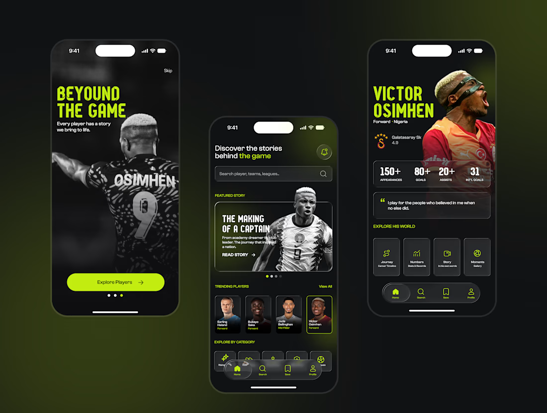
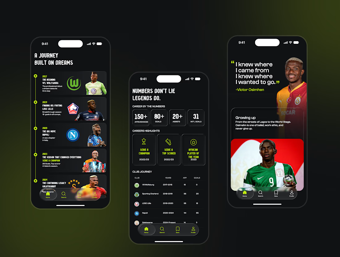
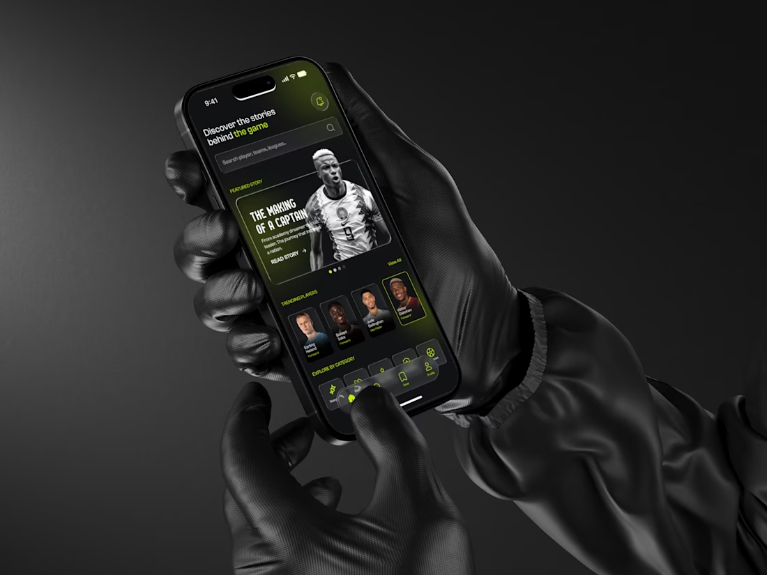
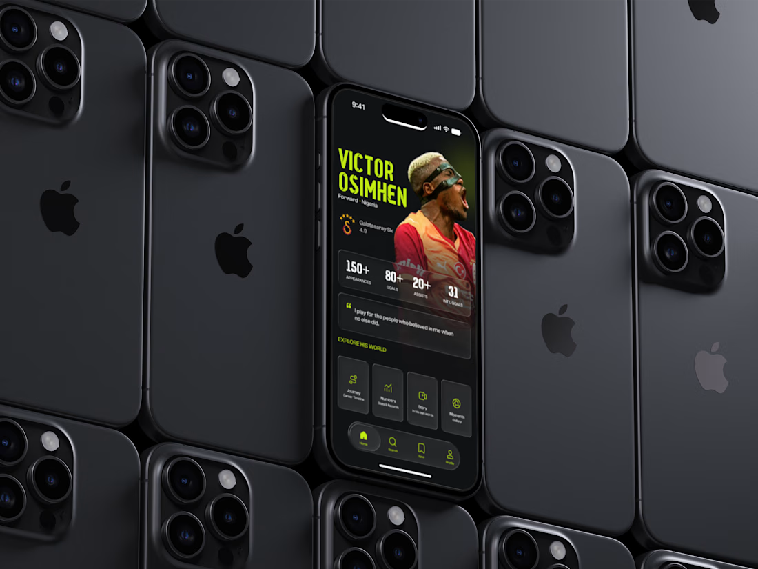
BEYOND is a football storytelling experience that goes beyond traditional player statistics.
Instead of focusing only on goals, assists, and trophies, the concept explores the stories behind the players: their journeys, breakthroughs, achievements, career-defining moments, and personal stories.
The experience includes:
⚽ Player discovery
🛣️ Career journeys
📊 Statistics and achievements
📖 Personal stories
📸 Memorable moments
The goal was to create an immersive experience where users don't just view a player's profile — they explore their story.
BEYOND — Beyond the numbers. Beyond the game.
Available for work
I'm currently open to freelance UI/UX design, product design, mobile app design, and creative collaborations.
If you're building a product or have an idea you'd like to bring to life, I'd love to work with you.
📩 msonterijever
twitter is still too long
Got you — here's a much shorter X/Twitter version:
This project was tedious, but I kept going.
Introducing BEYOND ⚽️ — a football storytelling experience that goes beyond stats to explore players' journeys, stories, achievements, and defining moments.
Beyond the numbers. Beyond the game.
✨ Available for UI/UX & Product Design work
📩 msonterijever@gmail.com
#UIDesign #UXDesign #Football

The network for creativity
Join 1.25M professional creatives like you
Connect with clients, get discovered, and run your business 100% commission-free
Creatives on Contra have earned over $150M and we are just getting started





Related posts


Professional work

A few things we’ve been working on this month.
Different industries, different problems, but the same goal: making complex products feel simple, clear, and trustworthy.
Fintech → Investment Banking → Geospatial AI
More projects are still in progress.
Full case studies coming soon.






This is the kind of work I enjoy seeing — simple, focused, and actually thought through.

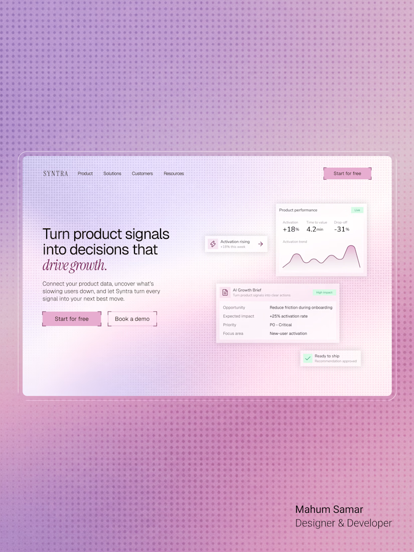

The italic accent on "drive growth" ties the headline together nicely. Soft gradient keeps the cards readable.