The network for creativity
Join 1.25M professional creatives like you
Connect with clients, get discovered, and run your business 100% commission-free
Creatives on Contra have earned over $150M and we are just getting started
Back to feedPost
Why do award-winning websites often lose the conversion race to real-world businesses? 📉
It sounds absurd, but it’s the truth.
The primary goal of any website is to build a well-lit path for the user—guiding them effortlessly from the first second to the final click, with clear signs and obvious directions along the way.
When we build over-engineered, "award-level" pages, that path suddenly goes pitch-black for the average user. We end up forcing them to overthink simple actions.
The biggest problem? You can’t predict every single UX friction point upfront. Real conversion optimization only comes months later after analyzing heatmaps and analytics reports. Until those reports arrive, an over-complicated website is just actively bleeding leads and sales.
Right now, I am working on a highly interactive personal project for myself that features a subtle 3D animation. But my objective there is strictly to showcase my technical skillset as a developer.
A business website has a completely different job—to capture attention and drive the user toward one final, decisive action.
What are your thoughts on this? Do clean, simple websites still beat complex, award-heavy designs, or do we need to start preparing for a completely new generation of interfaces?
Let me know in the comments! 👇
#Webflow #UXUI #ConversionRate #WebDevelopment #B2BMarketing #WebDesign
The network for creativity
Join 1.25M professional creatives like you
Connect with clients, get discovered, and run your business 100% commission-free
Creatives on Contra have earned over $150M and we are just getting started
Related posts
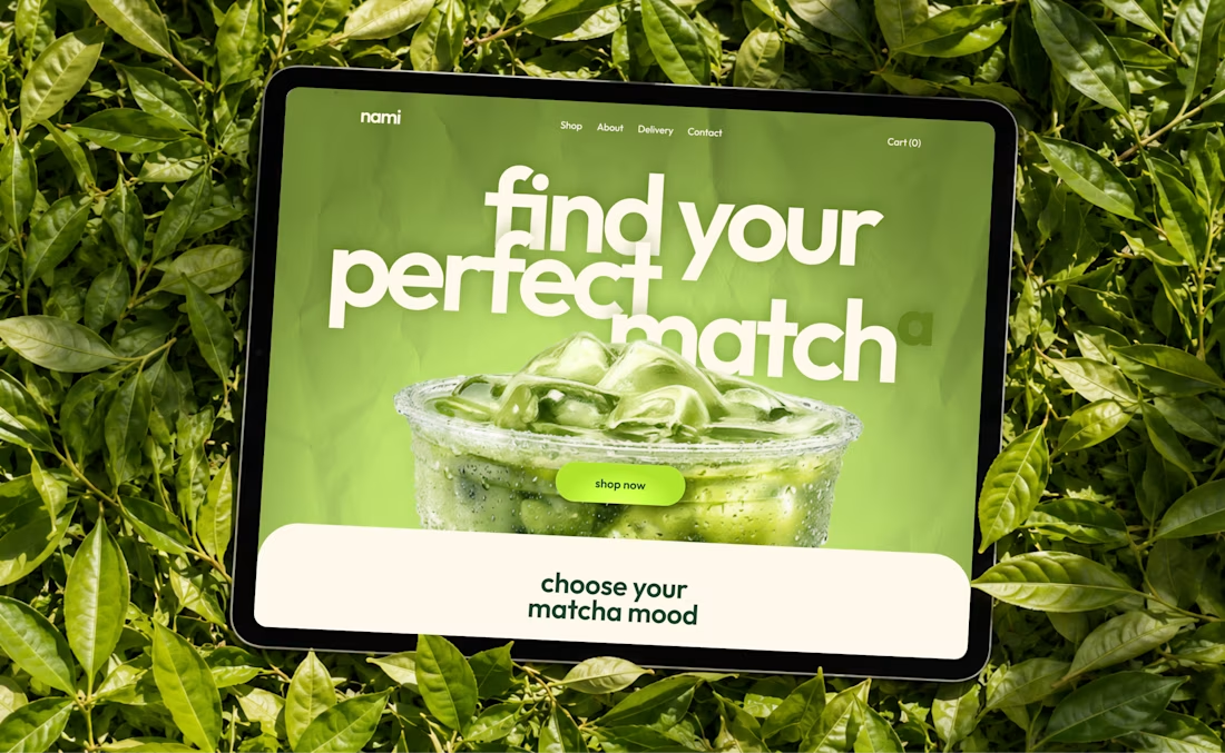
Just dropped a new matcha e-commerce concept 🍃
Curious to hear your thoughts on the experience and visual direction!
Looks great!
June was made easy. July is already easy with @Contra HQ . Thank you for trusting us with your projects.
Amazing
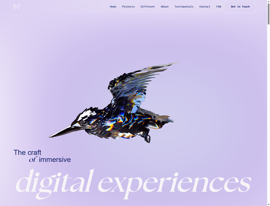
Look what we’re cooking up again 🔥
Dark ambient web3 vibe, totally dope. Coming soon.
👀 Ready to explore our new case study?
That's Nice
Trending
Claude
Claude has entered the design space. How are you using Claude Design?
Contra University
Learn from expert creatives how to earn more using next-gen AI tools.
fifaworldcup2026
The World Cup is here and the whole world's watching. How are you designing for the world stage?
creativeaiflow
Creative AI workflows are evolving. What tools do you use, and what are their strengths and weaknesses?
freelancerlife
Freelancer life is wins, pivots, and everything in between. What’s yours right now?