The network for creativity
Join 1.25M professional creatives like you
Connect with clients, get discovered, and run your business 100% commission-free
Creatives on Contra have earned over $150M and we are just getting started
Back to feedPost

🚀 New UI/UX Case Study – Nido Scout | Real Estate Analytics Dashboard
Excited to share one of my latest UI/UX design concepts—a modern Real Estate Analytics Dashboard designed to simplify property analysis and investment decisions.
The dashboard allows users to analyze property listings, visualize portfolio performance, compare locations on an interactive map, and explore curated property recommendations—all from a clean, intuitive interface.
✨ Design Highlights
• Modern and minimal dashboard layout
• Interactive property analysis workflow
• Real-time portfolio overview & key metrics
• Map-based property comparison experience
• Featured property recommendation cards
• Soft color palette with strong visual hierarchy
• Responsive, user-centered interface
My goal was to create a dashboard that makes complex real estate data easy to understand while maintaining a premium and engaging user experience.
💬 I'd love to hear your thoughts and feedback!
#UIUX #UIDesign #DashboardDesign #WebDesign #RealEstate #ProductDesign #Figma #UXDesign #UserInterface #UserExperience #SaaS #DesignInspiration #AnalyticsDashboard #CreativeDesign #Portfolio


The network for creativity
Join 1.25M professional creatives like you
Connect with clients, get discovered, and run your business 100% commission-free
Creatives on Contra have earned over $150M and we are just getting started
Related posts

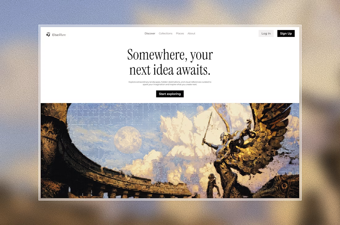
What if a Landing page could feel less like a Landing page and more like opening a door to another world?
I'm exploring this idea with Elsewhere, a visual discovery concept built around extraordinary landscapes, hidden places, and inspiration worth getting lost in.👀

Would be a gread concept


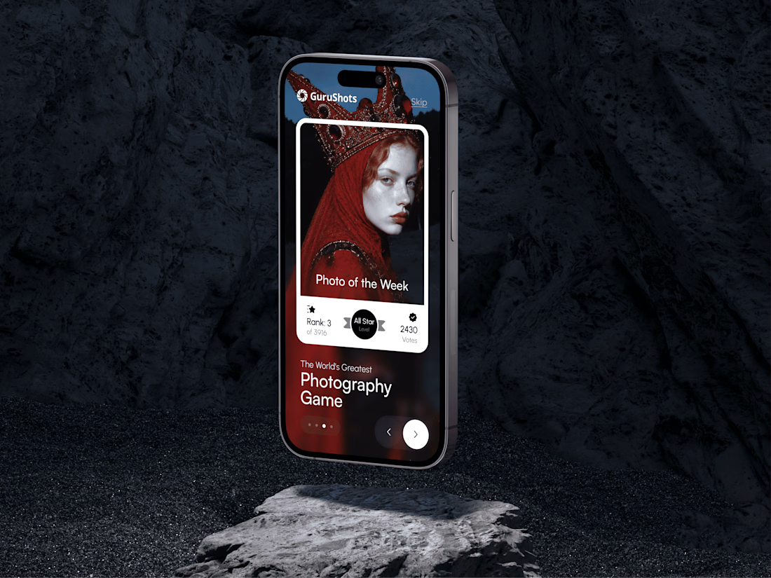
A new day, a new design to share! 📸
This time it is a photography challenge app that brings creativity and competition together through contests, voting, and gamification. What do you think of this one? ✨



Designed a premium audio e-commerce storefront for VickMix 🎧
From the bold headphone hero section to product listings, audio technology highlights, and a clean product-focused layout, every section is designed to showcase the products and make browsing effortless.
What do you think of this design? Would you keep the minimalist look or make it more colorful? 👇


I'd keep it minimal. The grey palette lets the headphones do the talking.