The network for creativity
Join 1.25M professional creatives like you
Connect with clients, get discovered, and run your business 100% commission-free
Creatives on Contra have earned over $150M and we are just getting started
Back to feedPost
Taste Test

What should you do when you end up with a difficult passenger, seated next to you, on your long flight?
0 voted
1%
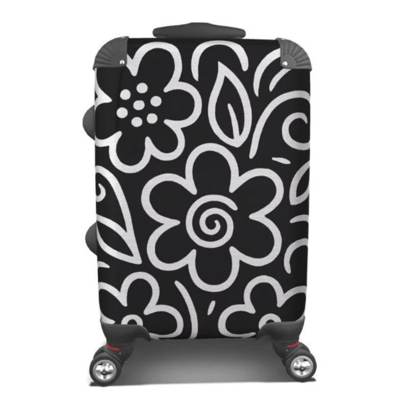
0 voted
1%
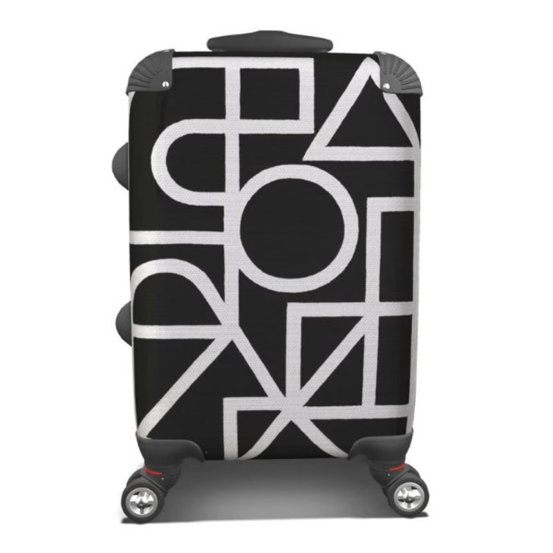
0 votes
Closed
The network for creativity
Join 1.25M professional creatives like you
Connect with clients, get discovered, and run your business 100% commission-free
Creatives on Contra have earned over $150M and we are just getting started



Related posts

Same lettering, two color directions. Which one would you pick?
I got nostalgic this week looking at this lettering design. About 8 years ago I was deep into it and drew every day. Little by little I lost that rhythm, and now I only do it once in a while for gifts and small things.
Back then I could spend a lot of time choosing colors and comparing options. A taste test like this would have saved me so much time. 😅 I keep wondering how much I would have improved if I had never stopped practicing.
Is there something you used to practice a lot and would love to get back to? I had my lettering, illustration AND tufting phase.
37 voted
61%
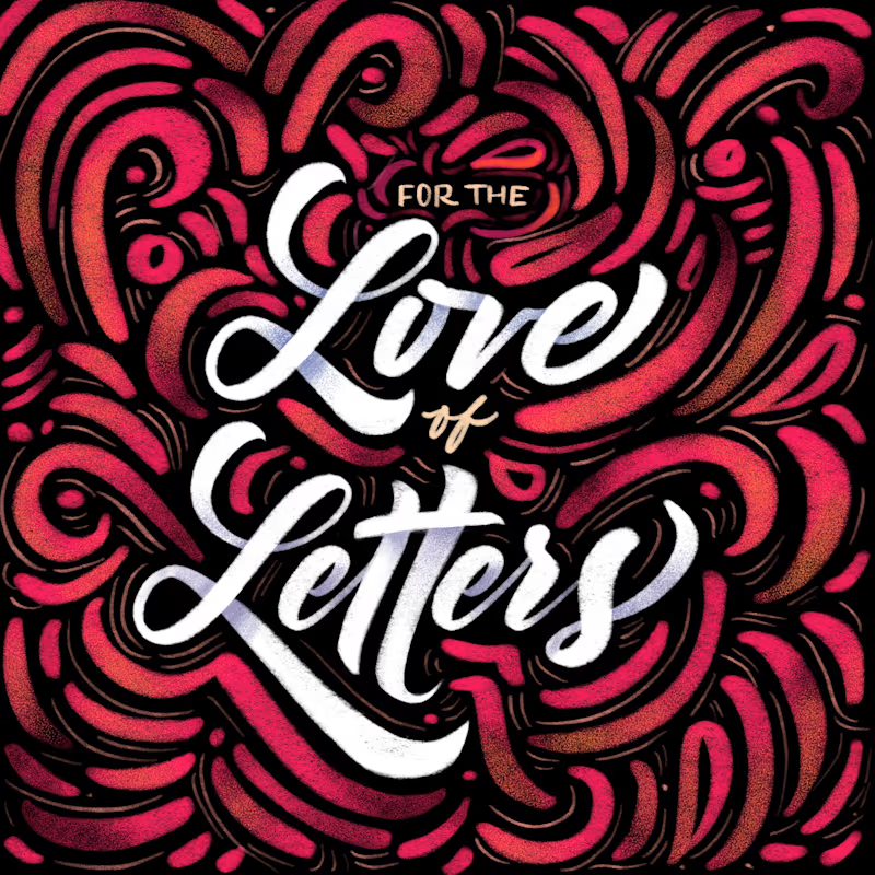
24 voted
39%
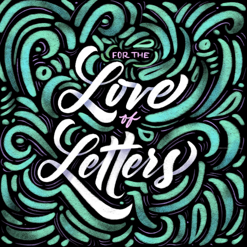
61 votes
Closed


8 years later and the lettering still holds up

Can you tell the difference?
How I reverse-engineered Apple’s motion (Frame-by-Frame, No AI)
Apple’s Creator Studio animation isn't magic. It’s an obsession with easings and micro-interactions. I spent a couple of weekends manually reverse-engineering 15 seconds of it 1:1, without any AI shortcuts.
Spent 3–4 hours on the first second alone due to the density of details.
There are no secrets. You just have to master the fundamentals, rhythm, and rigorous execution.
Need elite-level motion for your tech product or brand? My books are open. Drop me a message to discuss your next video.

3 voted
38%
5 voted
62%
8 votes
Closed


Which one is Fable 5.2 xhigh?
Frontend Skill enabled.
6 voted
50%
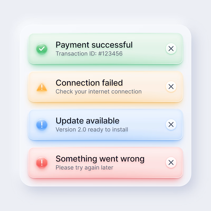
6 voted
50%
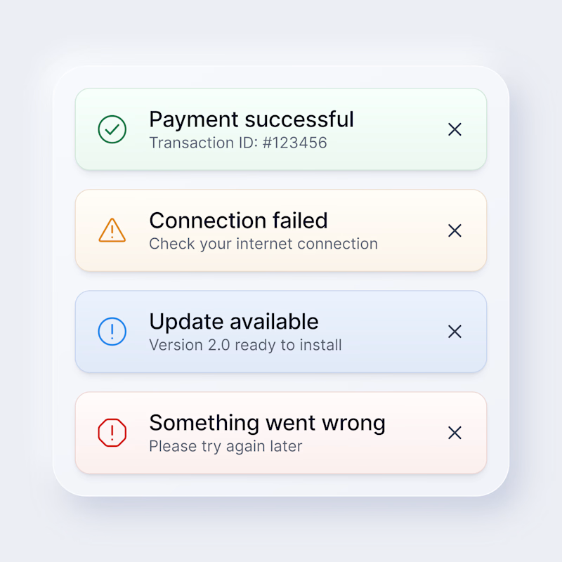
12 votes
Closed
hard to tell, which one is it?