The network for creativity
Join 1.25M professional creatives like you
Connect with clients, get discovered, and run your business 100% commission-free
Creatives on Contra have earned over $150M and we are just getting started
Back to feedPost

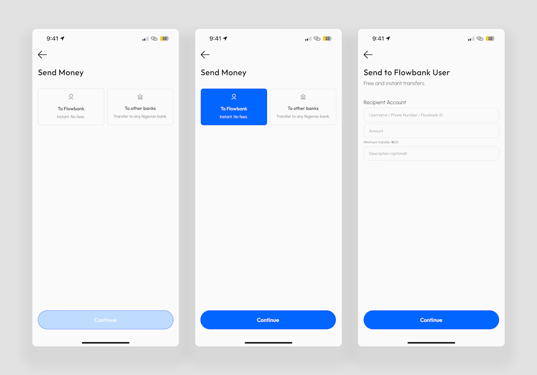
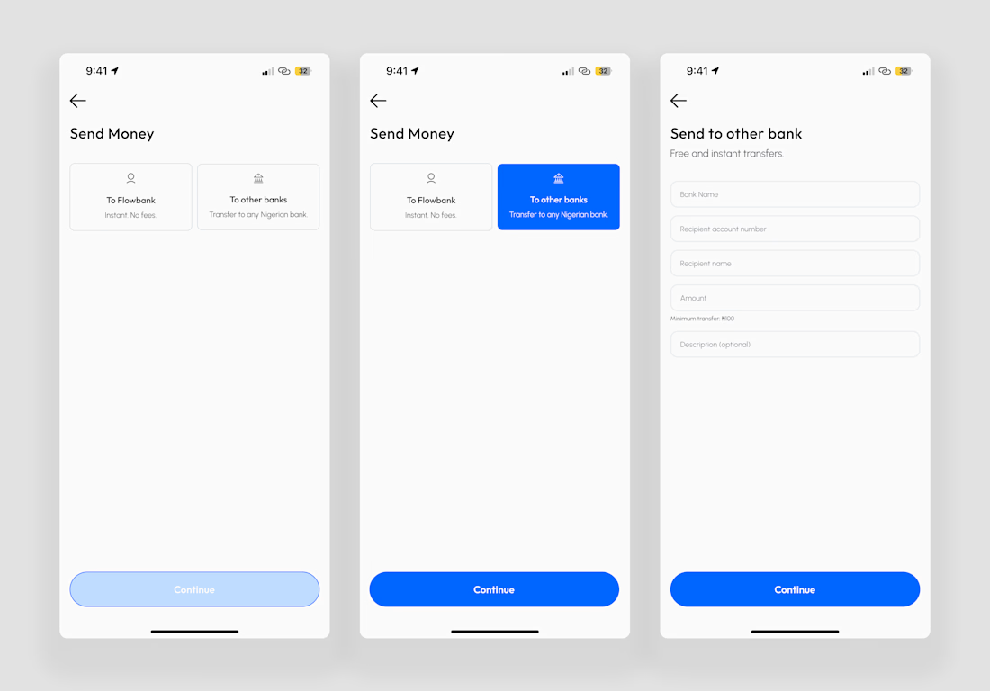
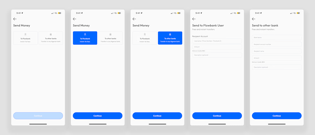
I redesigned a Send Money flow and the goal wasn’t speed.
It was clarity at every step 👇
Sending money is a high-trust action.
One wrong tap = anxiety.
So the focus was:
Clear paths, Fewer decision per screen, No surprises
The network for creativity
Join 1.25M professional creatives like you
Connect with clients, get discovered, and run your business 100% commission-free
Creatives on Contra have earned over $150M and we are just getting started







Related posts

Built something that isn’t client work for a change.
Flowkidz. Short games that teach kids design, websites, AI, code and internet safety.


Shopping UX hits different when motion meets sound.
Built a fully animated shopping experience prototype with satisfying sound effects for every interaction. Sound ON 🔉

bro this feels so smooth, that sound effect on search is such a nice touch


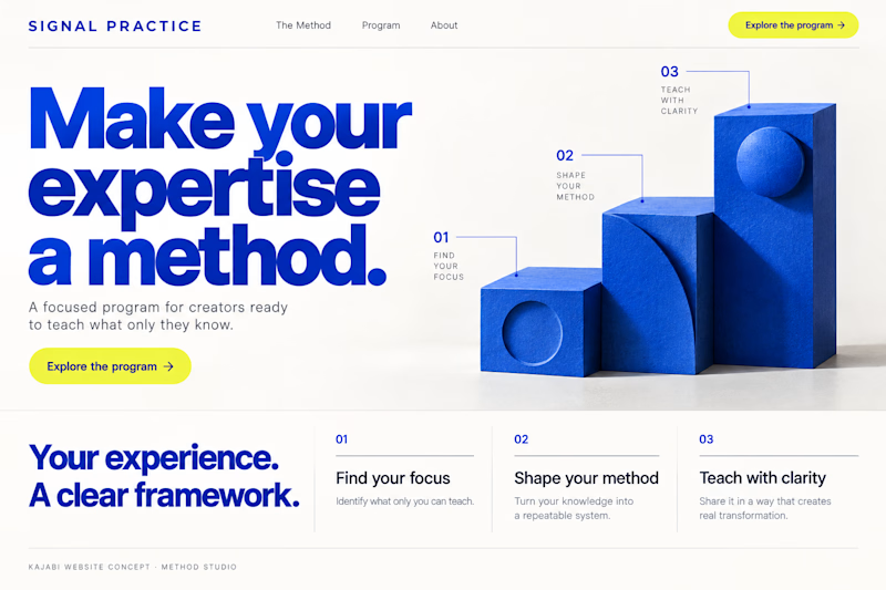
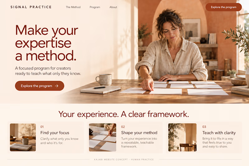
Which Kajabi direction makes a signature program feel more compelling?
Signal Practice is a coaching brand for established creators turning their expertise into a teachable method. Two original AI-generated website redesign concepts: Method Studio pairs cobalt geometry with a clear framework; Human Practice brings warmth, tactile imagery and a personal feel.
Same offer, two first impressions. Which would you explore—and why? Concept work, not a client build.

15 voted
54%
13 voted
46%
28 votes
Closed

Human practice looks good