The network for creativity
Join 1.25M professional creatives like you
Connect with clients, get discovered, and run your business 100% commission-free
Creatives on Contra have earned over $150M and we are just getting started
Back to feedPost

Most interior design sites default to "beautiful," "elegant," "timeless" — words that could describe literally any studio.
So instead, for this concept ("Liora," a residential interior design studio), the headline leans into something more personal: interiors designed around how someone actually lives, not just how a room looks in a photo.
Built entirely in Framer, with the same care I try to put into every detail
Would love to hear what you think, and happy to talk shop if you're working on something similar.


The network for creativity
Join 1.25M professional creatives like you
Connect with clients, get discovered, and run your business 100% commission-free
Creatives on Contra have earned over $150M and we are just getting started











Related posts

I've been working on Cervia, a @Framer website for a single product.
A good single-product site combines the landing page and the store in one page, so the call to action is the purchase itself. Visitors learn what the product is, see why it’s better, and add it to the cart without leaving the page.
The challenge is making one page do both jobs. It has to look like a landing page, with room to explain the product and show it well, and still work like a store product page, with the price, colors and Add to cart always close at hand.
Every extra step between arriving and paying loses some buyers, so I kept the steps to a minimum.

This is so well put Heron! 🔥 Single-product site logic is spot on - landing + store in one page removes friction, CTA is purchase itself. No wandering around. Visitors learn what it is, why it's better, add to cart without scrolling through 5 pages - that's conversion gold!...




The Nation AI card on the hero is a nice touch. It shows the platform working before the visitor reads a single word. The Real people. Real products. Real income. strip gives the AI pitch a human anchor.

Would you buy this?
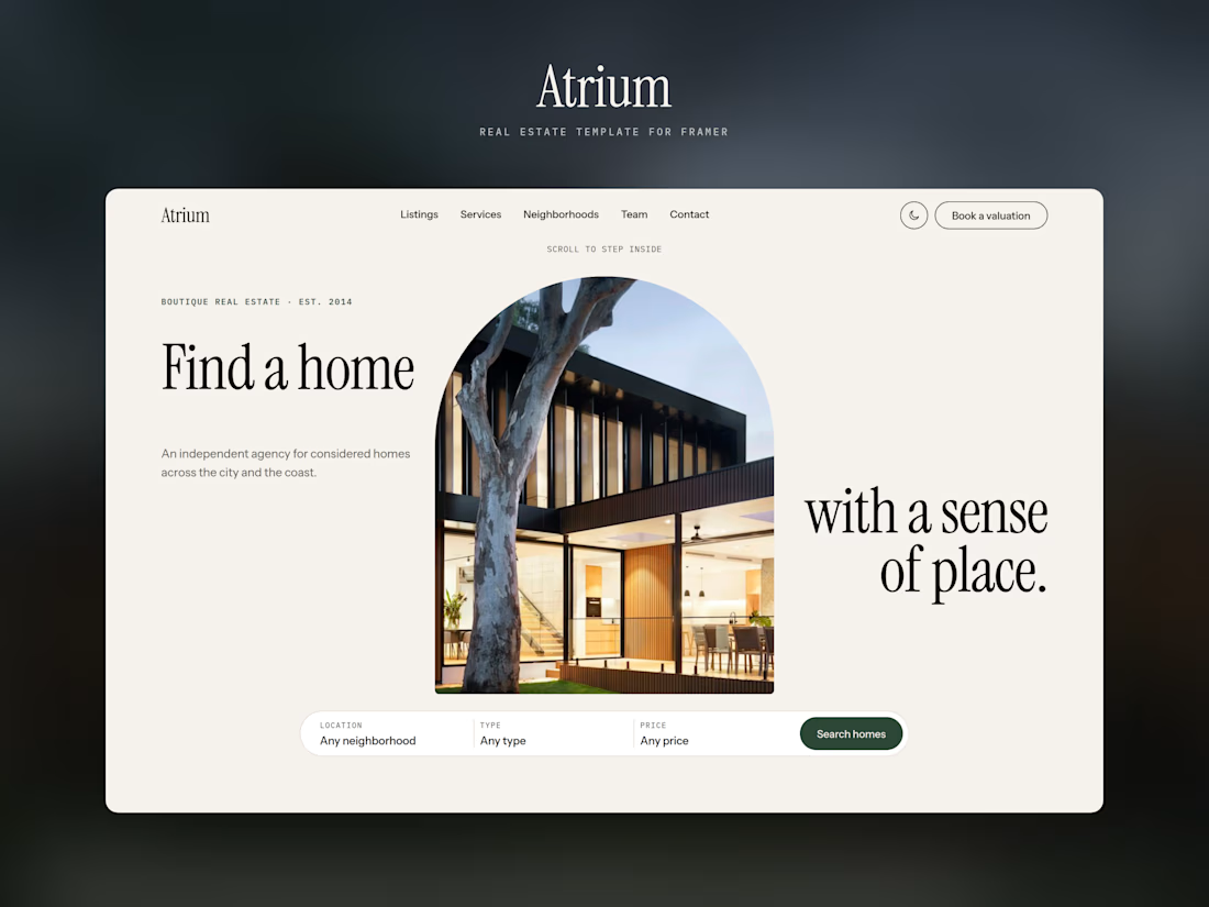
Atrium is a real estate template for Framer, built for boutique agencies that want their homes to look as good online as they do in person.
Arch-shaped hero and photos throughout
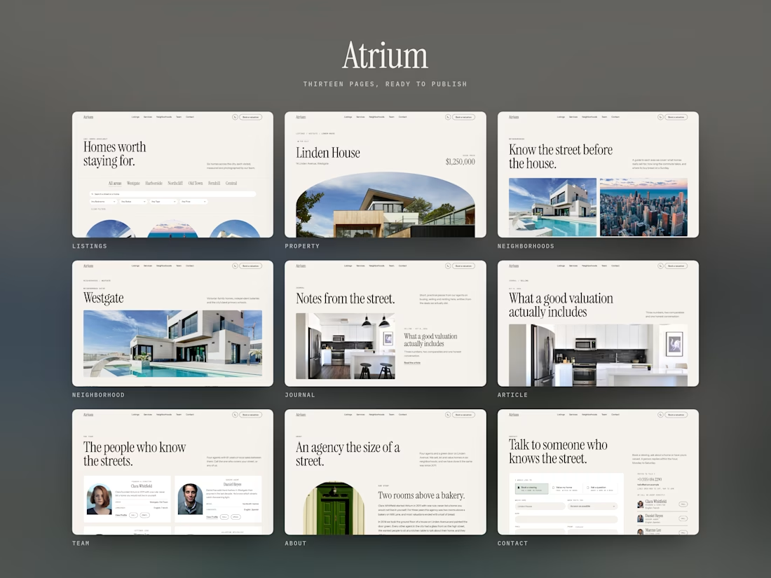
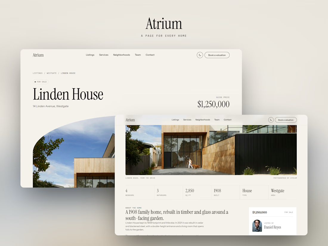
Listings, agents and neighborhood guides, all run from the CMS
Floor plans that draw themselves, plus a built-in mortgage calculator
Light and dark, in one click
Fully responsive, with an animated phone menu
13 pages, ready to launch in a day.
Live preview: atrium-estate.framer.website
Product link: Atrium-estate
Framer Template page: Framer-Atrium
Be honest, what would you change? 👇

Clean And Modern Work.