The network for creativity
Join 1.25M professional creatives like you
Connect with clients, get discovered, and run your business 100% commission-free
Creatives on Contra have earned over $150M and we are just getting started
Back to feedPost
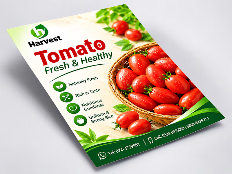
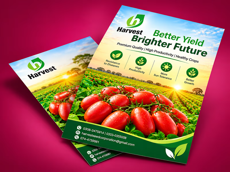
Taste Test
Which agricultural flyer design do you prefer for Harvest:
"Fresh & Healthy Product Focus"
"Better Yield & Brighter Future Field View"
Let me know your thoughts!
#GraphicDesign #FlyerDesign #Branding #PrintDesign #AgriculturalDesign
1 voted
50%
1 voted
50%
2 votes
Closed

I'd go with Option 1. The tomato basket on a clean background reads in one second, Option 2 is prettier but the headline fights the field. Is the flyer aimed at buyers or at farmers?

Thanks, Ivan! It’s aimed at everyday buyers, so I wanted fresh produce to be the hero. Your note on the headline fighting the field is spot on.
For everyday buyers Option 1 is the right call. A small line like "Fresh from the farm" under the basket would keep the hero and still tell the story.
Great idea, Ivan! A short line under the basket keeps the hero and adds the story. I’ll try it on the next version.
The network for creativity
Join 1.25M professional creatives like you
Connect with clients, get discovered, and run your business 100% commission-free
Creatives on Contra have earned over $150M and we are just getting started



Related posts

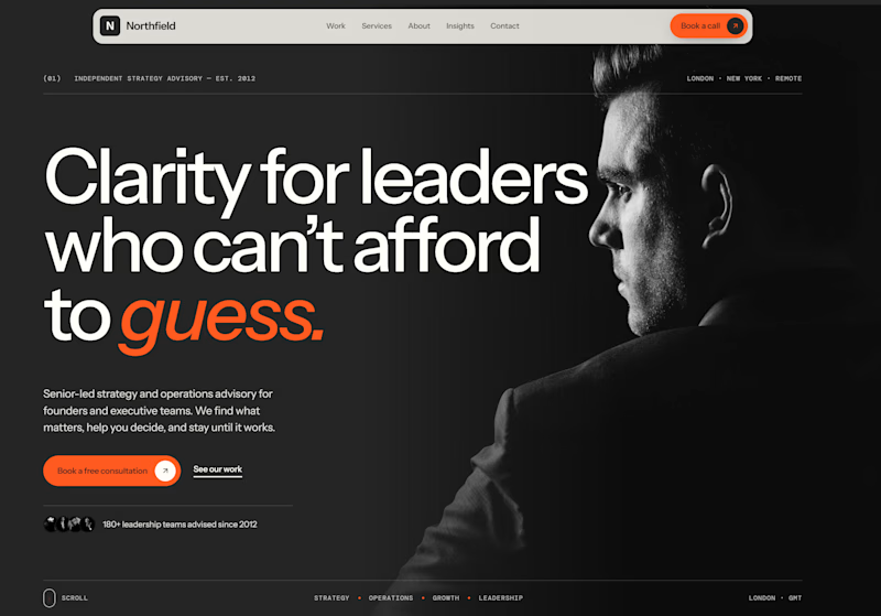
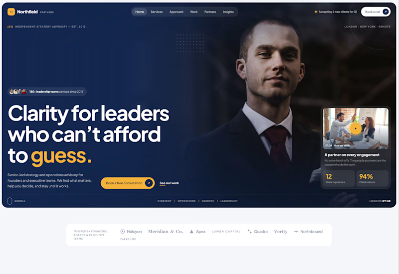
Exploring two different hero directions for a new project.
Same message, two completely different visual approaches.
Which one makes a stronger first impression?
A or B? Curious to hear your thoughts!

36 voted
90%
4 voted
10%
40 votes
Closed

Both are strong. I lean towards the dark version, because the orange accent on the italic "guess." pops and the profile portrait gives it a more editorial, confident feel. The navy one reads a bit more corporate, which could suit a more conservative audience. Nice exploration!

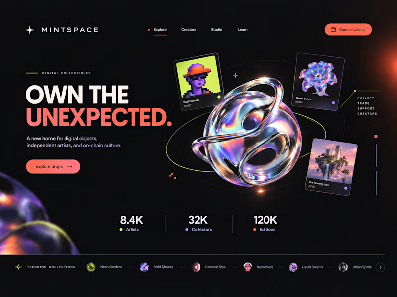
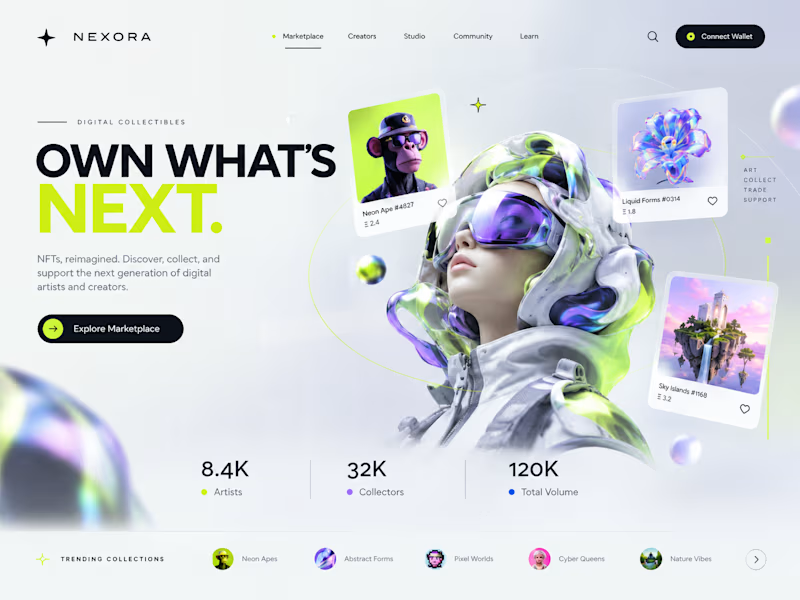
Two directions. One NFT marketplace.
Which visual direction would you choose?
🖤 A — Dark & Futuristic
🤍 B — Bright & Minimal
Both explore the future of Web3, but with completely different visual identities.
Drop your vote in the comments: A or B?
#UIUXDesign #WebDesign #NFT #Web3 #ProductDesign

10 voted
29%
25 voted
71%
35 votes
Closed

Strong design, well done

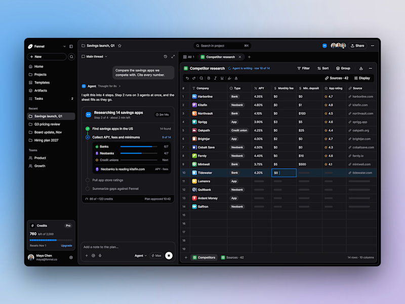
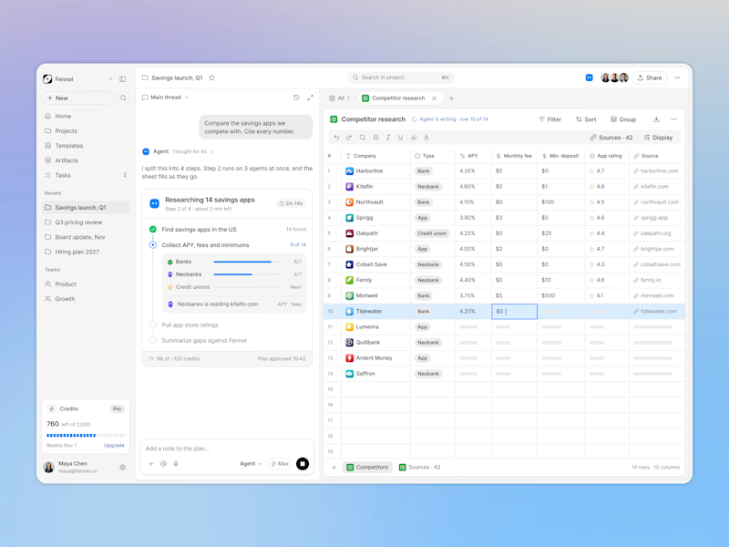
Designed an AI research workspace where the agent plans the work and fills a sheet with cited sources as it goes.
Same screen, two modes. Which one would you work in all day? 👀

13 voted
72%
5 voted
28%
18 votes
Closed

Keeping the research plan and cited results side by side is a useful way to make the agent’s work easier to inspect. I’d lean toward light mode for reading the table in daylight. How do you distinguish a verified source from one that still needs review?