The network for creativity
Join 1.25M professional creatives like you
Connect with clients, get discovered, and run your business 100% commission-free
Creatives on Contra have earned over $150M and we are just getting started
Back to feedPost

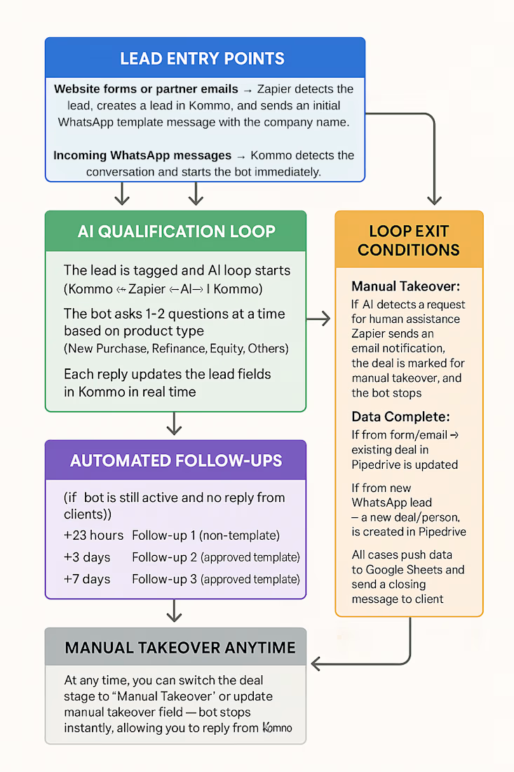
I craft cohesive, enterprise-grade digital systems for SaaS & tech brands. From unified art direction across 30+ pages to copy-aware layouts and Figma motion prototyping, I build scalable Webflow-ready designs—smartly backed by custom AI & workflow automation. Let’s connect!


The network for creativity
Join 1.25M professional creatives like you
Connect with clients, get discovered, and run your business 100% commission-free
Creatives on Contra have earned over $150M and we are just getting started





Related posts

👋 I'm new to Contra and I did my first post without realizing I hadn't even introduced myself!
Hey I'm Katya, I'm an AI Systems Architect, marketer and yoga teacher.
I build AI systems that bring in business and handle the work behind it. A voice agent that calls new leads back within seconds and books the appointment. A pipeline that traced 16,900+ leads to the ads that brought them. Listing videos made from the photos a real estate agent already has.
The marketing side came first. I built the multi-channel campaign for Jay Shetty's launch (22 million followers). After that I discovered the tech world and when AI came along, I realized I'm a builder at heart and never looked back! Building is so much fun 🤍
Here's what I've shared:
My first post: on building a fully AI-made YouTube video, end to end, because I'm camera shy 🙈 https://contra.com/community/MP9mFRuT-im-building-my-first-fully-ai-made
Last thing, if you're building with AI video or automation, I'd like to see what you're working on
And if you're hiring: I may be new to Contra but definitely not new to this work. Reach out for AI agent builds, apps, websites or anything in between.
P.s The video below is my AI avatar. My profile video is the real me :)


Nice Portrait....Has everything from a great pose, great composition and lighting and perfect environment setting.

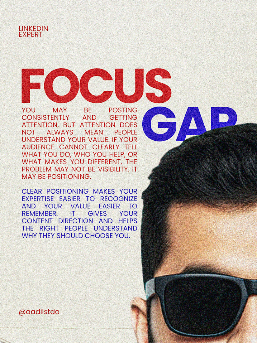
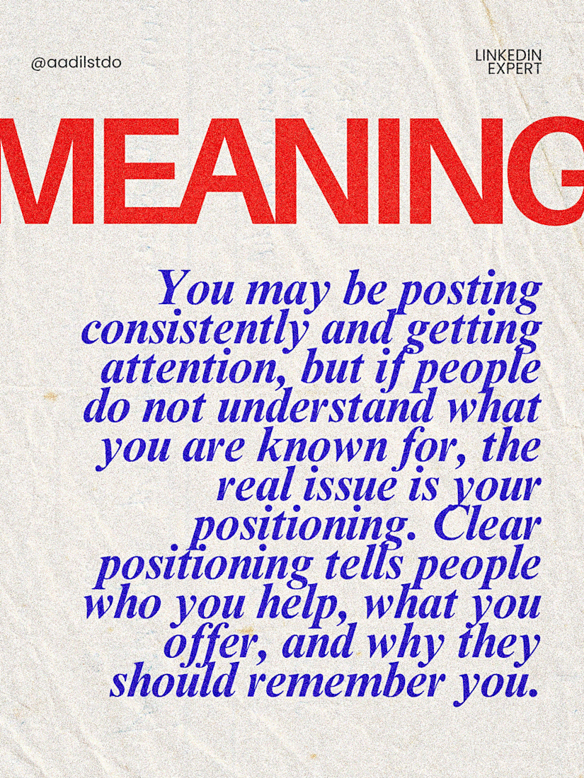
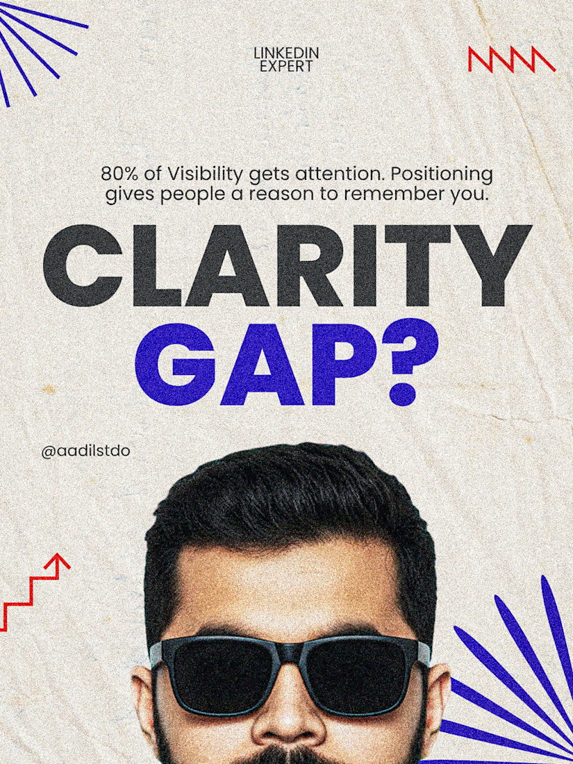
BEFORE it shows your post to a single STRANGER.
And most headlines tell it nothing.
The system is called 360Brew.
It doesn't just read your post.
It reads your profile, your last posts,
and the reader's history.
Then it asks one question:
"Who is this person an expert for?"
No clear answer?
No stranger reach.
That matters more than ever.
Per 2026 algorithm studies, only ~31%
of a LinkedIn feed comes from people you follow.
The other ~69% is interest-based.
Strangers. Your future clients.
Two more numbers worth knowing:
→ 8 on-topic posts out of 10 beat 6 out of 10
by roughly 30% in reach.
→ Your profile now counts as proof.
If your headline says "Helping people grow,"
the AI can't place you anywhere.
So posting more won't save you.
→ Rewrite your headline:
"I help [who] get [result]."
→ Make your About and banner say the same thing.
→ Keep 8 of every 10 posts on that one problem.
(Yes, it feels boring.
Boring is how the AI learns you.)
Being known for one thing
beats being liked for ten.
Paste your headline in the comments.
I'll tell you what LinkedIn probably thinks you do.




Premium Websites, AI Automation & Digital Systems — My Portfolio


Love the vibe of this!