The network for creativity
Join 1.25M professional creatives like you
Connect with clients, get discovered, and run your business 100% commission-free
Creatives on Contra have earned over $150M and we are just getting started
Back to feedPost

Does anybody else feel all brands have started to look the same?
The network for creativity
Join 1.25M professional creatives like you
Connect with clients, get discovered, and run your business 100% commission-free
Creatives on Contra have earned over $150M and we are just getting started








Related posts

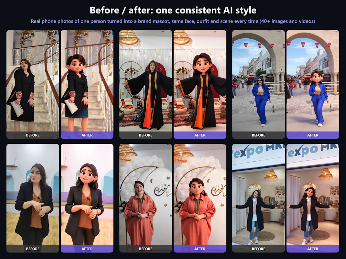
One real person, one consistent 3D brand mascot.
For our showroom brand L'expo MKR, I turned real phone photos of our host Rihem into a 3D character and kept the same face, outfit, light and real location across 40+ images and short videos.
How I keep an AI set consistent:
Lock a reference board and 2-3 hero frames first
Generate every frame from those references
Grade everything in Photoshop to one look, then check side by side
Result: a full month of on-brand posts and reels in days, without a 3D studio.
Want a mascot or AI product shots for your brand? Send me a photo.

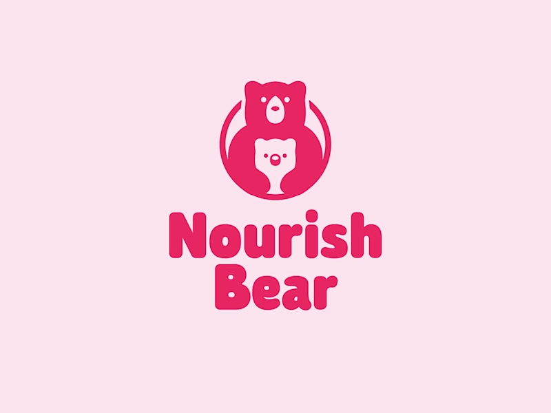
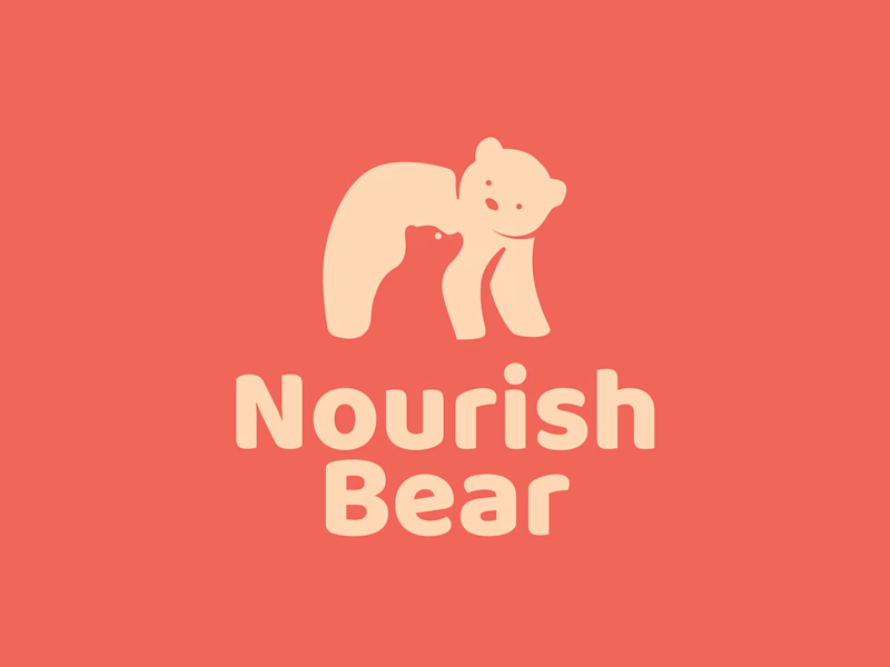
Which logo seems better to you for a kids' food product brand?
They sell millets porridge and we have started with the logo and will move on to the packaging in the next phase, I am still yet to hear from the client regarding these two options, but thought of taking the thoughts from the community as well.
I am personally leaning towards the logo on the right, the coral background would love to know what you think.
4 votes
Ends in 1d

Ye le Jani is Nourish Bear wali post ke liye:
Love this one Keshav! The bear mama + baby cub mark is so warm and perfect for a kids' millets brand. It instantly communicates care and nourishment. The rounded type and that pink palette makes it super friendly and shelf-ready. Great direction for packaging too!

Something new is taking shape ✨
I'm working on a brand built around one simple idea: furniture and spaces that fit the way you actually live. Pieces designed around your space, made to order, and smart enough to make every corner work a little harder.
It's still early, so no big reveal yet. Just a small peek at what's cooking.
Quick question: has a name ever looked great in one and failed in the other? How did you fix it?
