The network for creativity
Join 1.25M professional creatives like you
Connect with clients, get discovered, and run your business 100% commission-free
Creatives on Contra have earned over $150M and we are just getting started
Back to feedPost

Album packaging for Lisa's "Angel Static." Poster, CD, disc, vinyl. Kept the same design system from the Jennie concept but gave it its own feel. Two down, two to go.
#GraphicDesign #AlbumArt #PackagingDesign #Blackpink #Lisa #ConceptArt #MusicDesign
The network for creativity
Join 1.25M professional creatives like you
Connect with clients, get discovered, and run your business 100% commission-free
Creatives on Contra have earned over $150M and we are just getting started




Related posts

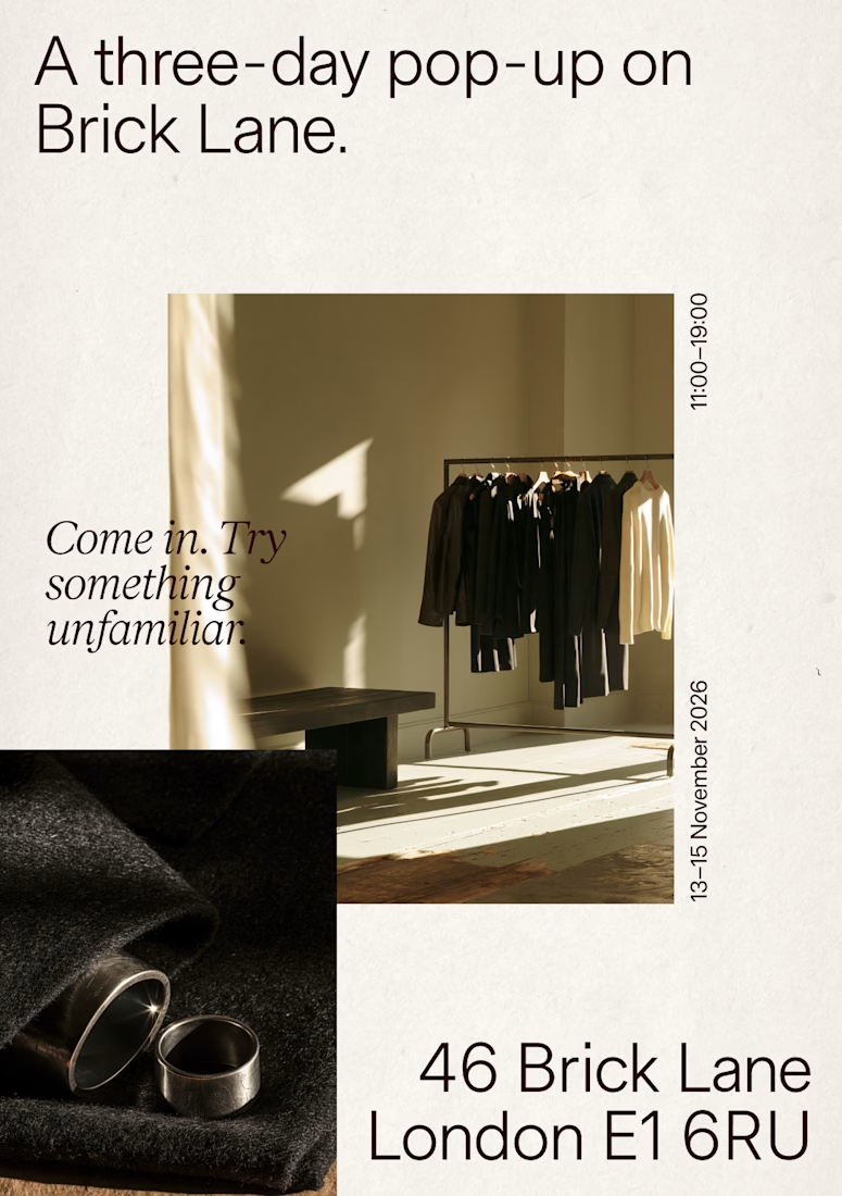
Recent poster designs.





Great work


A little packaging design I've been working on.
I love how much personality you can bring to a product through color, typography, and the smallest details.
For me, packaging is never just about making something look good. It's about creating something that feels right for the brand and the people it's meant for.
Would love to know what you think. What catches your eye first when you see a product on the shelf?


Designed a website concept for AI powered platform.
I wanted to give it a clean, minimal with a custom isometric illustration in the hero section.
Which version do you like better?
19 voted
59%

13 voted
41%

32 votes
Closed
