The network for creativity
Join 1.25M professional creatives like you
Connect with clients, get discovered, and run your business 100% commission-free
Creatives on Contra have earned over $150M and we are just getting started
Back to feedPost

Buying a digital download should leave no doubt about what arrives or when.
If the same page also says “printed to order”, I’d separate those delivery details by product format. That’s one of the things I check in a product-page review, alongside the mobile layout and the next step for the buyer.
There’s a fictional example report on my site:
https://morrowvale-studio.netlify.app/
A one-page review starts at US$25: annotated screenshots and specific copy/layout suggestions. Send me your public product link here on Contra and I can confirm the scope.
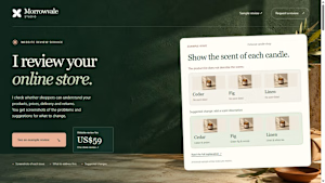
morrowvale-studio.netlify.app
Online store reviews — Morrowvale Studio
I check product information, prices, delivery and returns. Get screenshots of the issues and suggested changes. US$59 for one store.
The network for creativity
Join 1.25M professional creatives like you
Connect with clients, get discovered, and run your business 100% commission-free
Creatives on Contra have earned over $150M and we are just getting started



Related posts

Designed a new website in Shopify for ES Beauty Lab.
The menu is built around skin concerns, so shoppers get from the homepage to the right range in one tap, and the free-shipping threshold sits in the header.
Do you organise your Shopify menu by product type or by problem solved?
esbeautylabshop.com


To your question: by problem solved. Shoppers know their skin concern before they know product names, and the close-up face circles make the choice instant. I'd add a small product type filter inside each concern page.


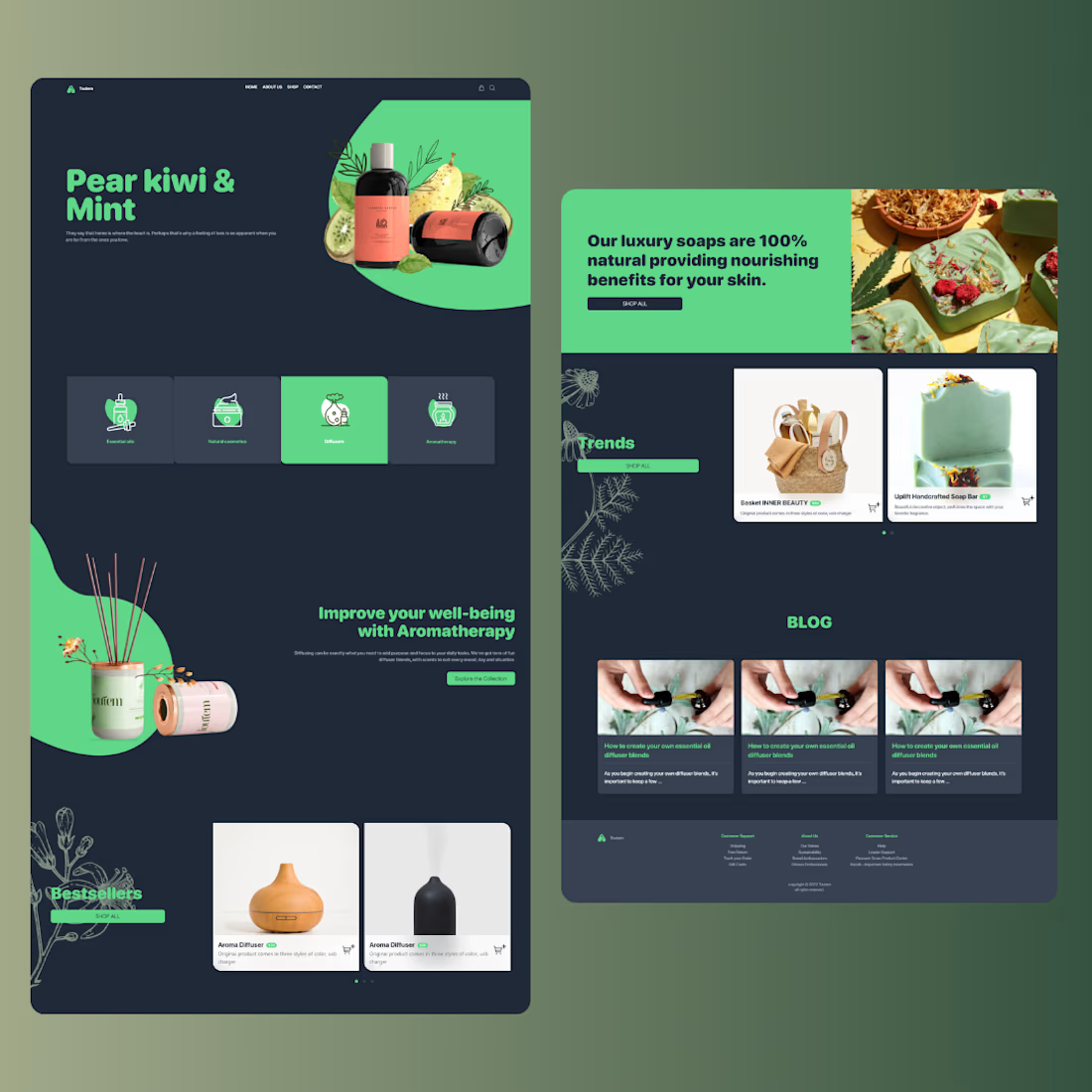
Bright green blobs on dark navy make the products glow, and the leaf drawings add an organic touch. The small body text on navy looks tiny though, a bit bigger would help on mobile.


A bold, modern landing page for a creative agency, built around immersive visuals and strong typography. We’d love to hear your thoughts!


