The network for creativity
Join 1.25M professional creatives like you
Connect with clients, get discovered, and run your business 100% commission-free
Creatives on Contra have earned over $150M and we are just getting started
Back to feedPost
For the #envatochallenge, I created AMARÉLLA using Envato Elements as my master toolkit. Here is how my human choices elevated the AI:
- The Logo: I used Envato Fonts for inspiration, then customized the letters with organic, leaf-like curves over a raw circular stamp to give it a human touch.
- The Packaging: The first flat box dieline had messy, clashing text. I redesigned it by adding clean panel lines, turning the product name sideways, and adding pretty plant drawings at the base for perfect balance.
- The Bottles: I rejected plastic and designed a heavy, custom stone-and-clay flask.
- The Videos: I used our Envato model photo as a reference and directed the AI to generate raw, slow-motion, black-and-white clips. Keeping the bottle quietly in the background allowed us to capture real, honest human emotion without issues.
- The Sound: I tied it all together with a warm, minimalist acoustic track from Envato Music.
- Toolkit: @envato Elements (Fonts, Stock Images, Music, Image Gen, Image Edit, and VideoGen)
Secondary Tools: Canva

My workflow

Thank you 🔥🔥

Love the logo and the color palette!
Thank you 🔥🔥
The network for creativity
Join 1.25M professional creatives like you
Connect with clients, get discovered, and run your business 100% commission-free
Creatives on Contra have earned over $150M and we are just getting started











Related posts

Hey everyone! 👋
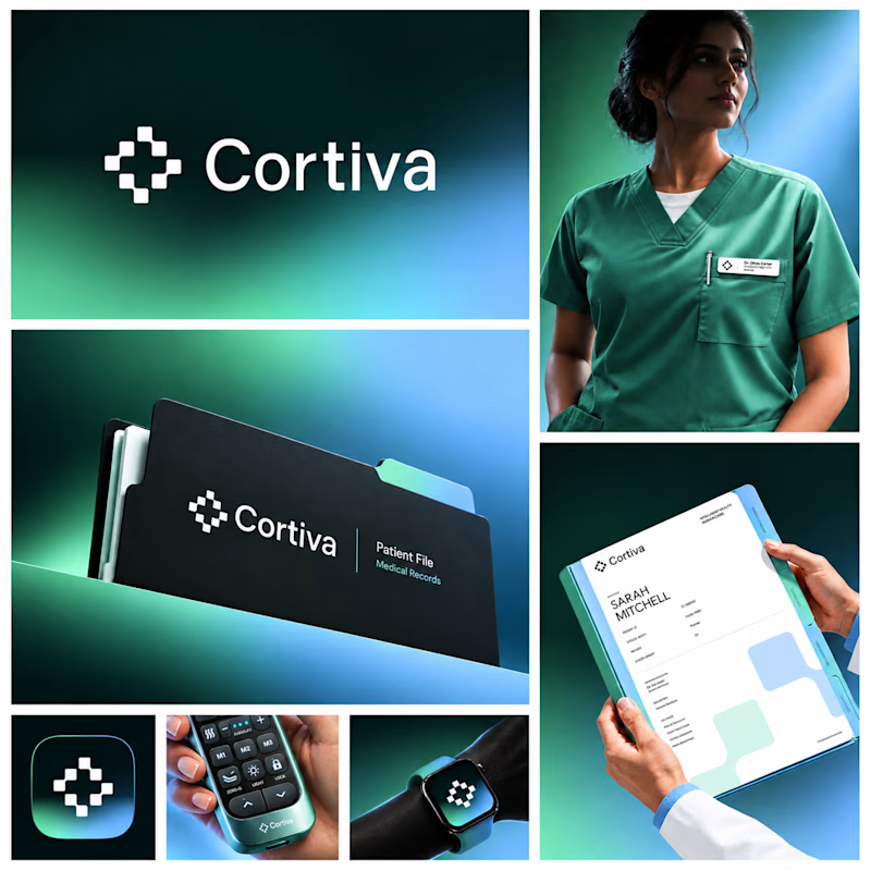
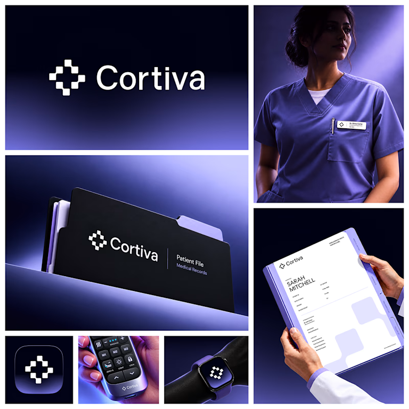
Working on Cortiva, an AI-first hospital branding project.
I've already finalized the color direction, but I thought it would be fun to explore two different moods.
Option 01💚 or Option 02? 💜
Both have their own personality, and I'm curious to see which one you prefer!
Let's see which one wins! 👀
5 voted
33%
10 voted
67%
15 votes
Closed

Option 01 for me. Green gets to "care" faster in a hospital setting, while the violet pulls the whole system toward a tech product. Since the identity is AI-first, I'd be curious whether you want patients to read it as clinical or as friendly first.




Clean and confident work! The green gradient with the mark feels very modern for fintech - trustworthy but not boring. The app screens look really polished. Curious how you landed on this mark, does it represent growth / movement?


Approved logo for a mental health and daily habit app built for seafarers and offshore workers.
Can't wait to share more.