The network for creativity
Join 1.25M professional creatives like you
Connect with clients, get discovered, and run your business 100% commission-free
Creatives on Contra have earned over $150M and we are just getting started
Back to feedPost
Bleu Cleaning Local Business Website Project done
A clean, trust-focused website design for a home and office cleaning service, made to help visitors find a cleaner and book in less than a minute.
The Problem was
Most cleaning websites lose customers before they book. Visitors don't trust strangers in their space, prices are hidden, and booking takes too many steps.
Solution I deliver
I designed Bleu's Website around one goal: get visitors to book faster.
Instant booking: A postcode search and Book Online button in the hero start the booking straight away.
Trust from the first scroll: A "40,000+ properties" statistic, a project gallery, and client testimonials prove reliability.
No pricing surprises: Every service shows a clear price, with "no hidden fees" stated upfront.
Doubts answered: Eco-friendly products, a satisfaction guarantee, easy rescheduling, and an FAQ remove the last reasons to hesitate.


The overall execution is incredibly polished. It’s clear that a lot of thought went into both the big-picture layout and the smaller interaction details.

Thanks for your appreciate.

❤️❤️❤️❤️

This is lovely and beautiful 😍
Thanks dear

This is so well composed.

Very good work 👍

Minimal work, I love it :)

Great layout! Very clean and professional design 👏
Thanks

Great work on the details.
Thanks
The network for creativity
Join 1.25M professional creatives like you
Connect with clients, get discovered, and run your business 100% commission-free
Creatives on Contra have earned over $150M and we are just getting started











Related posts

A clean and modern food delivery app concept designed with a focus on simple navigation, clear layouts, and a smooth user experience.
Designed in Figma.
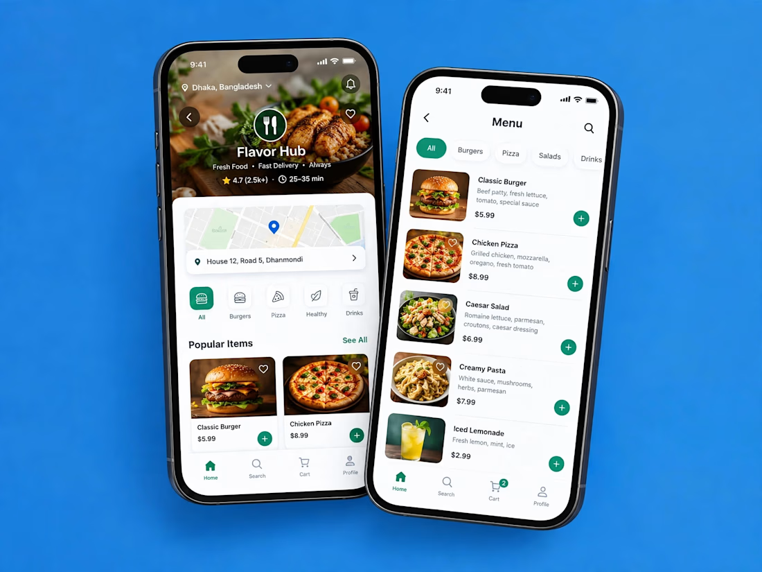

Love how clean and intuitive this feels, the navigation looks super smooth and the layout is really well balanced

𝐈𝐧𝐭𝐞𝐫𝐚𝐜𝐭𝐢𝐯𝐞 𝐅𝐥𝐨𝐫𝐚𝐥 𝐒𝐡𝐨𝐰𝐜𝐚𝐬𝐞 𝐖𝐞𝐛𝐬𝐢𝐭𝐞
I designed and developed this visually focused website in Framer, built around a clean dark interface, bold floral imagery, and smooth interactive transitions.
The goal was to create a website that feels more like an immersive digital showcase than a traditional static page. Each section highlights the content with strong typography, minimal UI elements, refined spacing, and motion that keeps the experience engaging without making it feel overloaded.
I focused on creating a premium visual flow where users can explore different flower varieties through an elegant and modern interface.
For this project, I worked on:
• Modern UI/UX design
• Framer development
• Interactive transitions
• Dark-themed visual system
• Responsive layouts
• Typography and visual hierarchy
• Image-focused content presentation
• Smooth motion and micro-interactions
The final result is a modern, responsive website that combines strong visuals with smooth interactions to create a memorable and polished browsing experience.
Tools Used: Framer, Figma, Photoshop, GSAP, LottieFiles


@Sadam Ashraf Love the clean design and smooth interactions! The dark theme paired with the floral visuals gives it a really premium feel. Great work! 👏


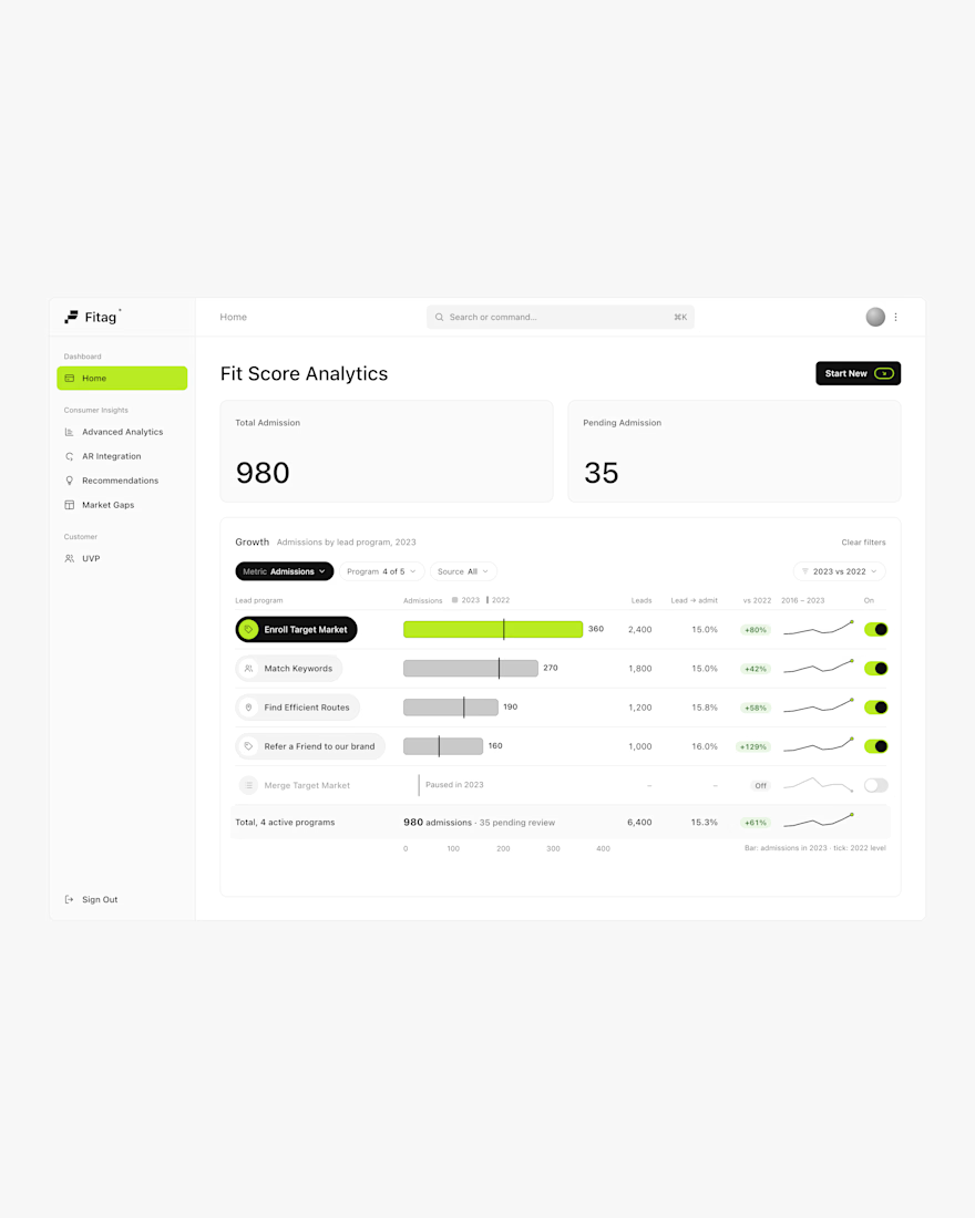

Nice Work