The network for creativity
Join 1.25M professional creatives like you
Connect with clients, get discovered, and run your business 100% commission-free
Creatives on Contra have earned over $150M and we are just getting started
Back to feedPost
Taste Test


Same idea, two completely different outcomes.
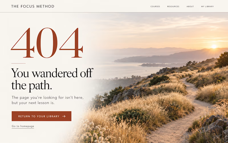
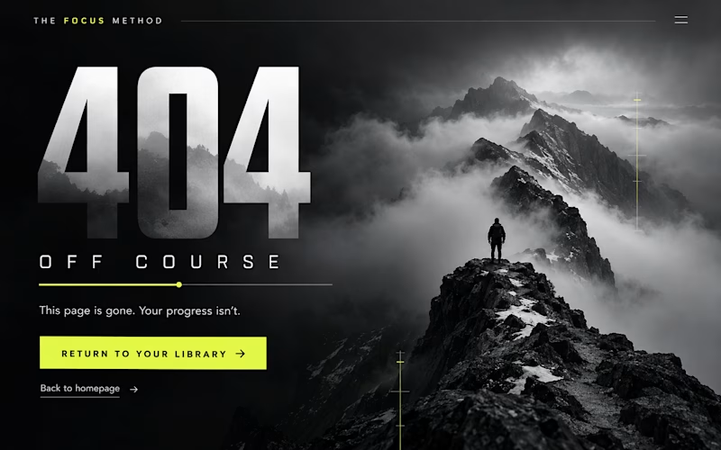
Option A: clean, one clear CTA, built mobile-first, easy to scan.
Option B: cluttered, no clear next step, built desktop-first.
This is the difference we fix on almost every client project.
Which one would make you stay on the page longer


1 vote
Ends in 1d
The network for creativity
Join 1.25M professional creatives like you
Connect with clients, get discovered, and run your business 100% commission-free
Creatives on Contra have earned over $150M and we are just getting started




Related posts



Cinematic is like saying, I'm going to die

The blur on the buttons is the only difference between these two clips. timing, easing and colors match.
Most people won't notice. if you do, drop a 1 or a 2.
5 voted
42%
7 voted
58%
12 votes
Closed


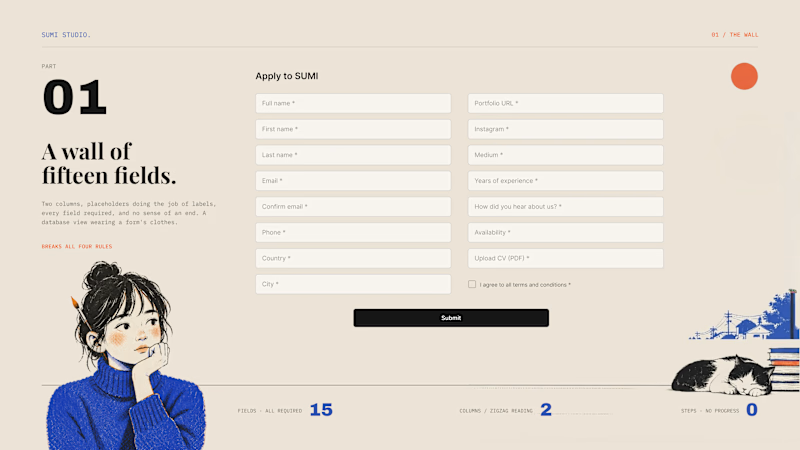
Same studio. Same job. Why does one form get finished and the other get closed?
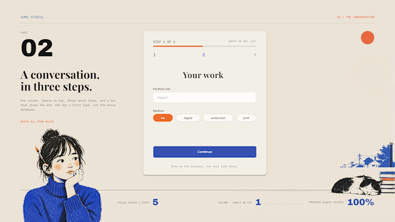
Nobody abandons your product. They abandon your form. Left is what usually ships: two columns, placeholders instead of labels, fifteen required fields, no end in sight. Right is the same ask, rebuilt. What we changed:
One column, always. Zigzag reading kills momentum.
Labels on top, not inside. Placeholders vanish the second you type.
Chunk it. Three fields across three steps beat one wall of fifteen.
Show progress. People finish what they can see the end of.
A form isn't a database view. It's a conversation with a slightly nervous person. Ask for a first look, not a life story.
Which field makes you close a form on sight?
4 voted
17%
19 voted
83%
23 votes
Closed
