The network for creativity
Join 1.25M professional creatives like you
Connect with clients, get discovered, and run your business 100% commission-free
Creatives on Contra have earned over $150M and we are just getting started
Back to feedPost
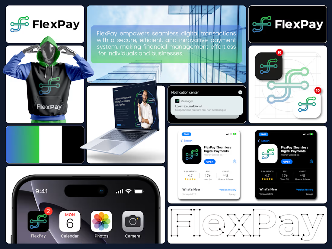
FlexPay is a modern fintech brand identity designed to reflect seamless, secure, and intelligent digital transactions.
The visual system combines fluid line geometry, a tech-inspired symbol, and a bold green–blue gradient palette to express connectivity, trust, and innovation.
Every element from the app icon to UI mockups reinforces clarity, efficiency, and financial empowerment in the digital space.




thank you so much 😍
The network for creativity
Join 1.25M professional creatives like you
Connect with clients, get discovered, and run your business 100% commission-free
Creatives on Contra have earned over $150M and we are just getting started











Related posts


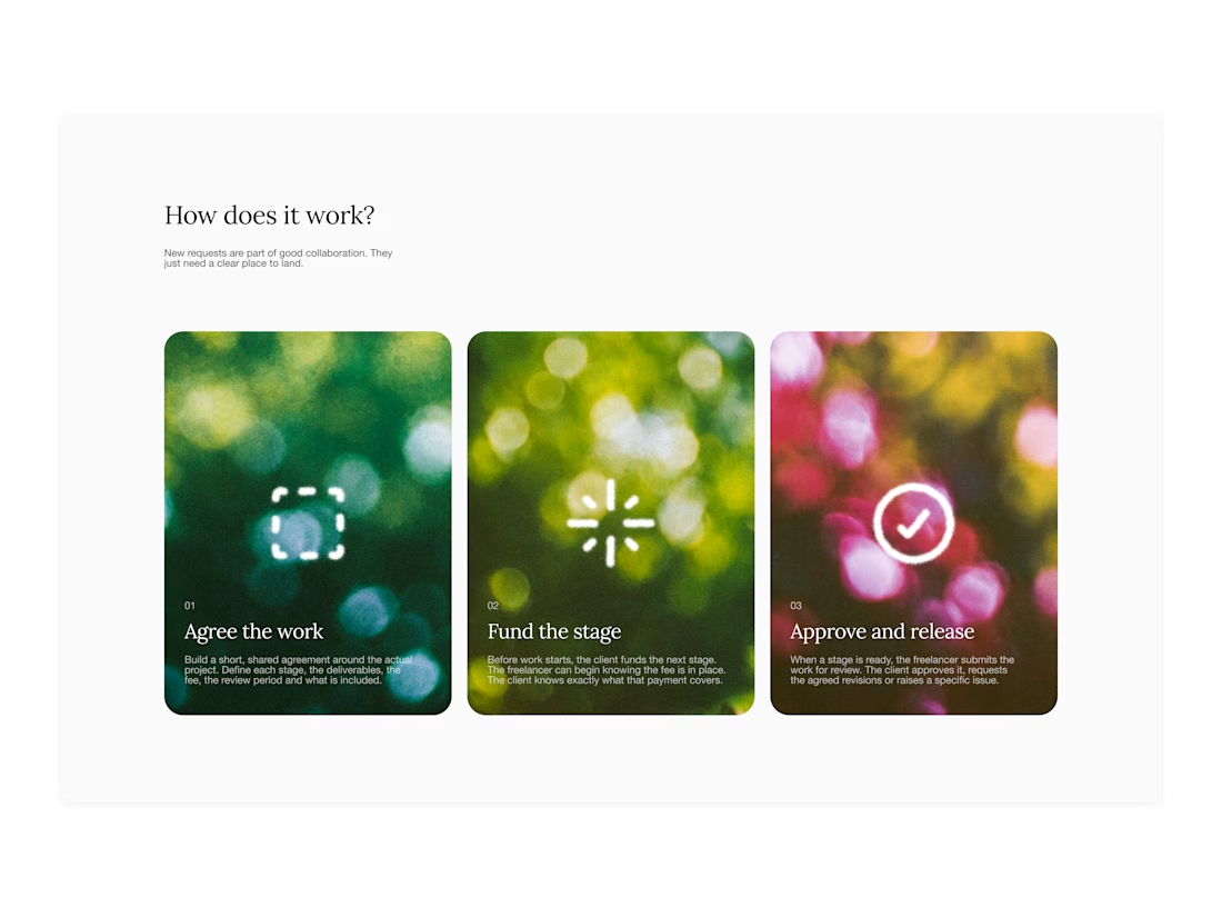

Your web sections always have such strong art direction. Great to see the brand carried right into the layout.

I created a brand identity concept for Velora, an AI productivity platform. I explored the logo, colors, typography, and how the brand could look across a website, mobile app, and everyday products. I wanted everything to feel consistent, modern, and easy to recognize.
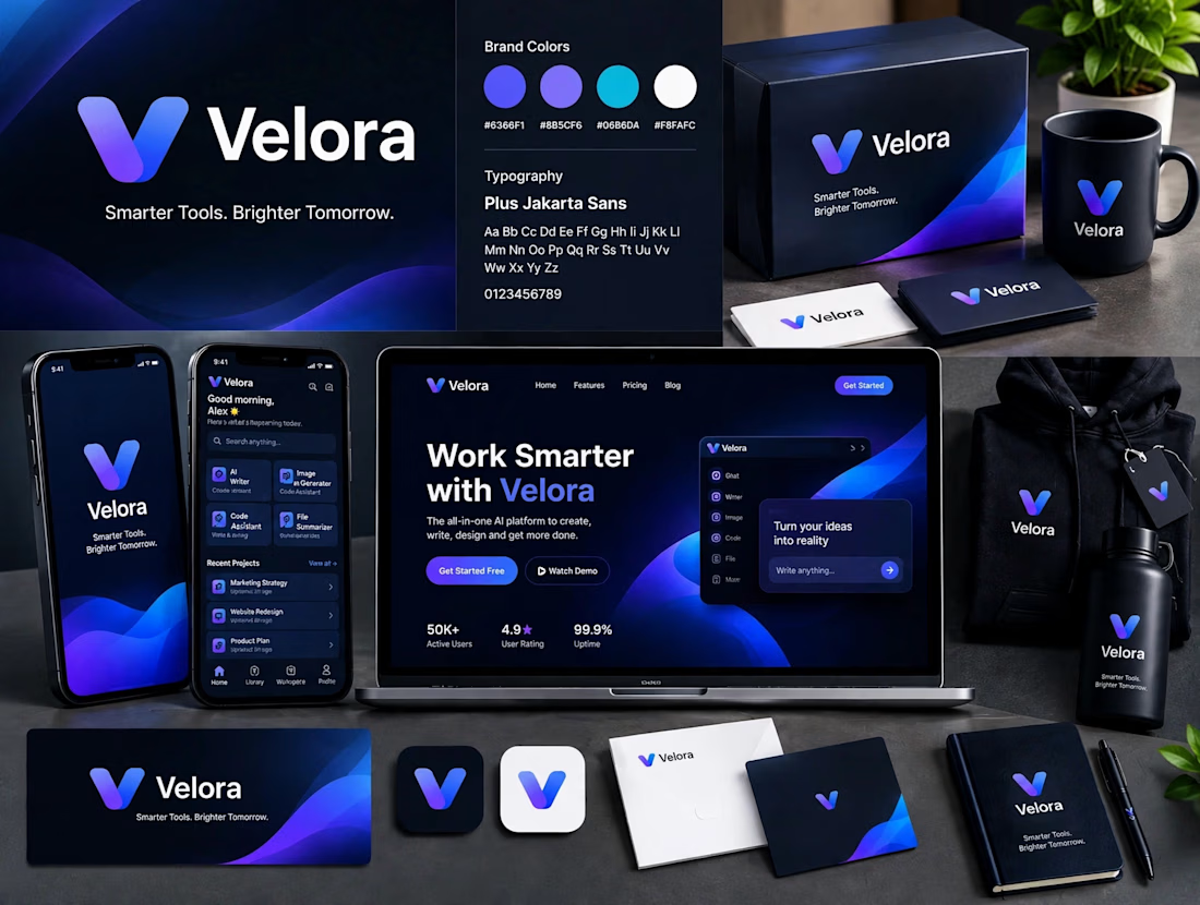

The blue is perfect for this. I’ve seen so many AI brands do boring black/white but this gradient gives it energy. And Plus Jakarta Sans was a great choice, keeps it friendly.

Hi Brand Designer and Inpirees,
I just finished designing an AI automative B2B SaaS branding.
This is a self-made project that I challenged myself to test the skills of my newly unlocked branding skills. 🤞
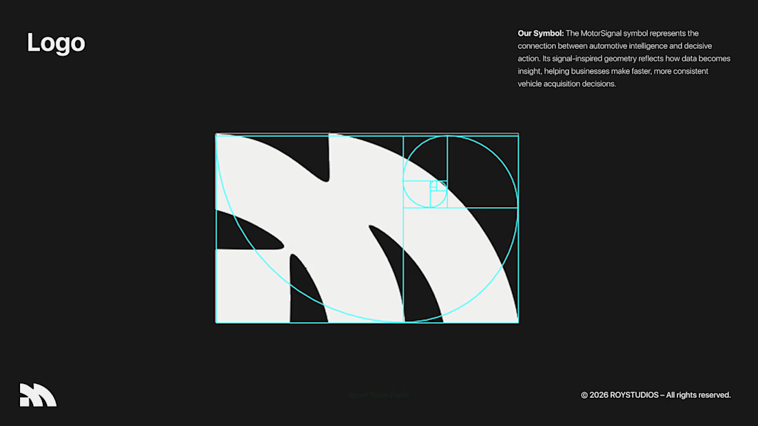
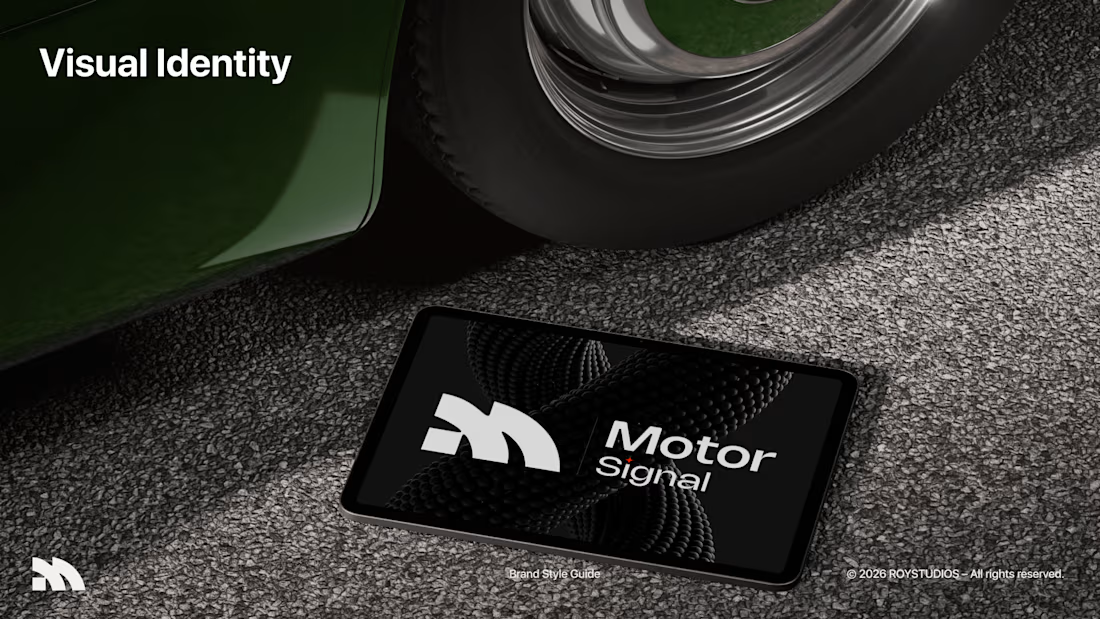
Motor Signal is an AI-powered vehicle quotation software that helps businesses to evaluate their user's motor vehicles easily and faster.
This was a very niche industry that I chose to do a project on.
I want you guys to be the judge for this project, and give me your wisdom on this project and how you guys would design this project if it were you. 🤏
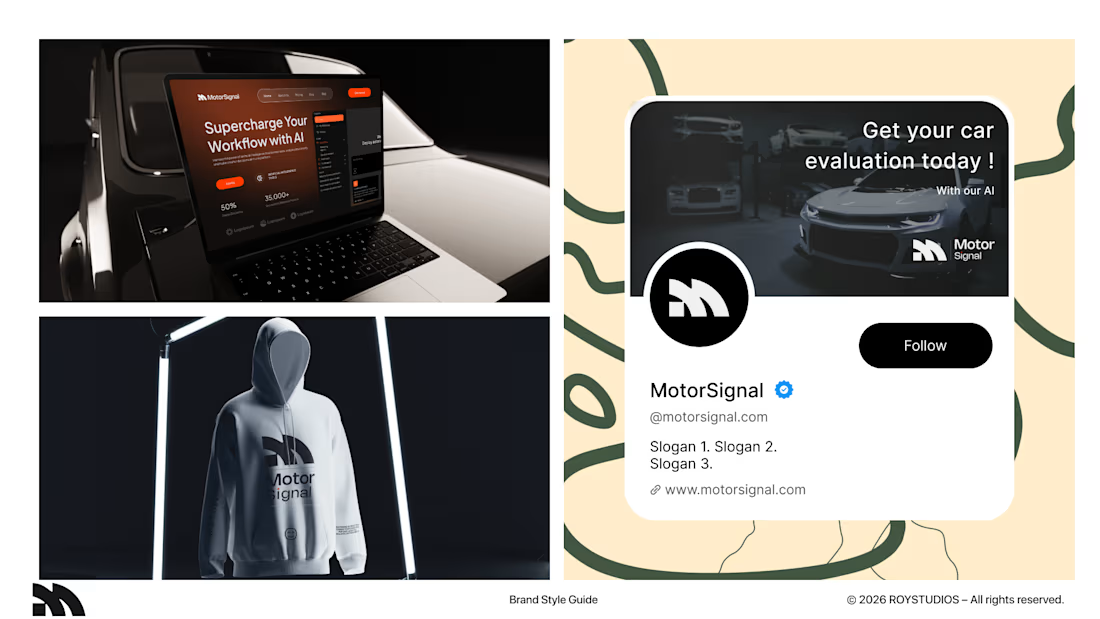

That's really great specially 3D t-shirt show and business card🔥🔥
Nice job Sahil❤️❤️