The network for creativity
Join 1.25M professional creatives like you
Connect with clients, get discovered, and run your business 100% commission-free
Creatives on Contra have earned over $150M and we are just getting started
Back to feedPost

The biggest mistake retail founders make is thinking their website is just a digital brochure. It’s not. It’s a 24/7 global salesperson.
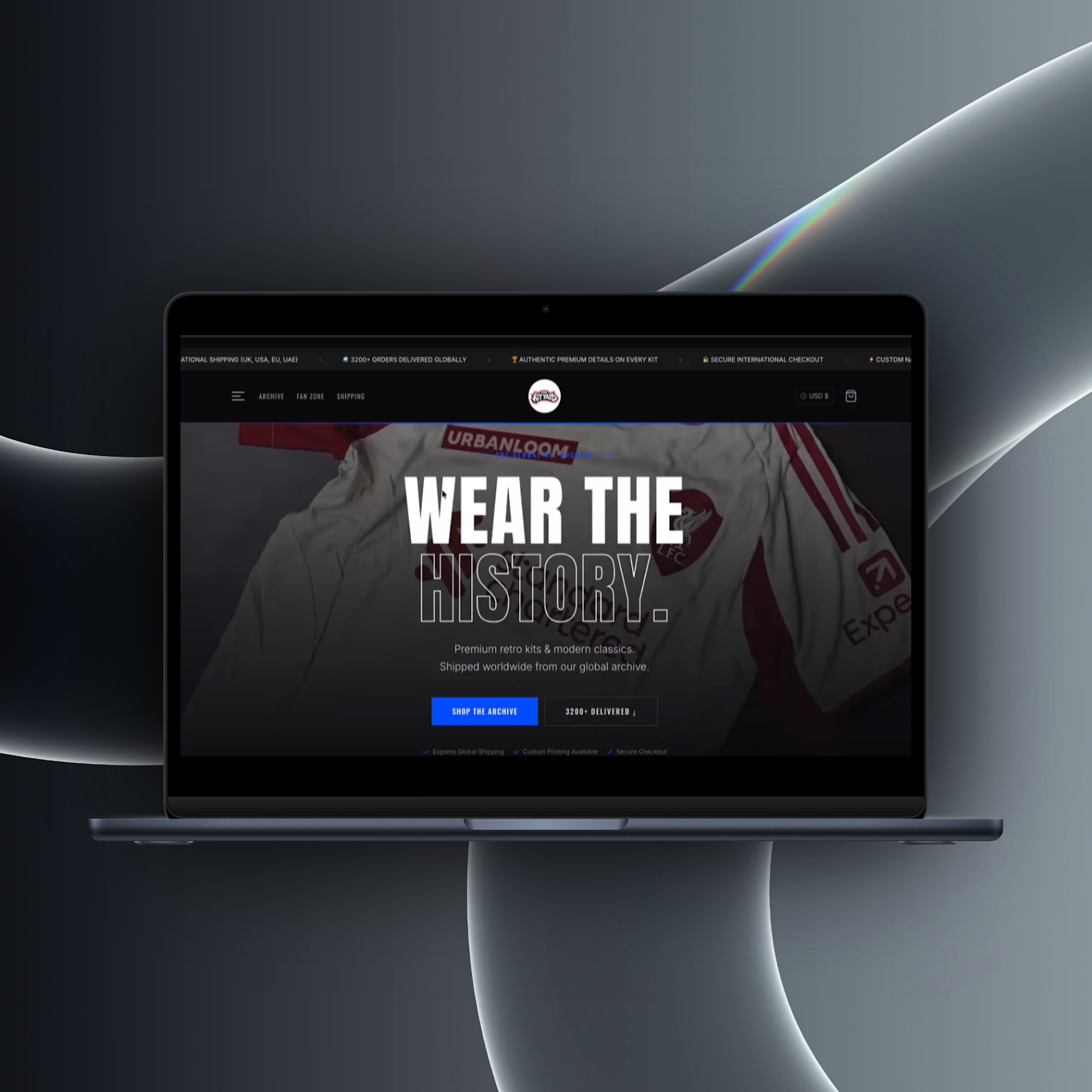
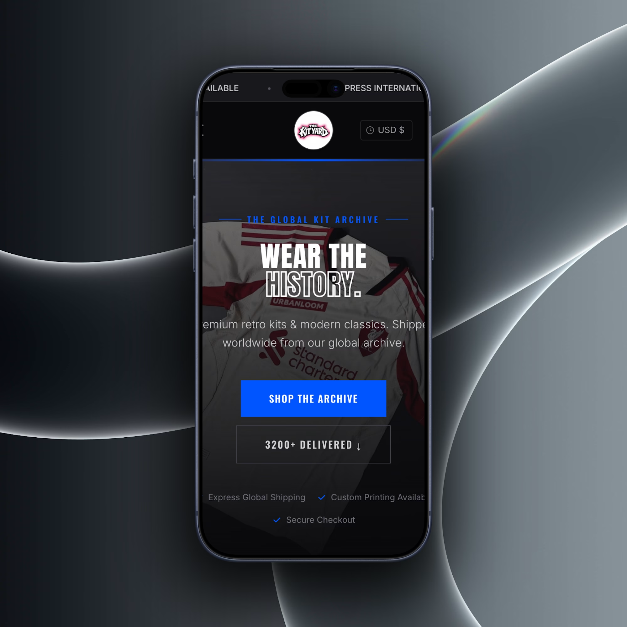
We just rolled out this custom architecture for "The Archive," a vintage sports apparel brand.
Instead of using a standard template, we engineered a dark-mode storefront specifically designed to build global trust. By integrating shipping guarantees and order volume directly into the header and product grids, we eliminated buyer hesitation before they even reached the cart.
If your digital storefront isn't actively killing buyer friction, it's costing you sales. Let’s upgrade your architecture.


The network for creativity
Join 1.25M professional creatives like you
Connect with clients, get discovered, and run your business 100% commission-free
Creatives on Contra have earned over $150M and we are just getting started





Related posts

Which hero visual feels right for this brand?
While working on the homepage for Halfspace, a website design and SEO agency, I explored two different hero visuals for the same headline and layout. Same message, same structure, just a different visual metaphor and mood.
Option 1 - Rocket Launch. Bold, literal, and energetic, visually reinforcing the "launch your business" message with motion and fire.
Option 2 - Glass Cube. Abstract, sleek, and premium, giving a more refined, tech-forward feel without relying on a literal metaphor.
Would love your honest UX/UI take, which direction feels more impactful, memorable, and aligned with a web design/SEO brand, and why?
11 voted
41%
16 voted
59%
27 votes
Closed

Both design are great; it's hard to choose one





Option B feels nothing but premium

CINÉRA is a great example of cinematic storytelling for a brand. The 3D gallery and booking flow is so smooth!
Building similar experience-driven ads for DTC brands with AI. Love this direction.

I wanted to make a photography website that felt more like an experience than a portfolio.
So I built CINÉRA — a cinematic photography studio website with a 3D gallery, interactive archive, real availability, and a complete booking flow.
You can explore the work, pick a date and...

Appreciate it! That’s actually a big part of what I was going for — making the experience itself part of the brand. Your DTC work sounds interesting too, would love to see what you’re building.