The network for creativity
Join 1.25M professional creatives like you
Connect with clients, get discovered, and run your business 100% commission-free
Creatives on Contra have earned over $150M and we are just getting started
Back to feedPost
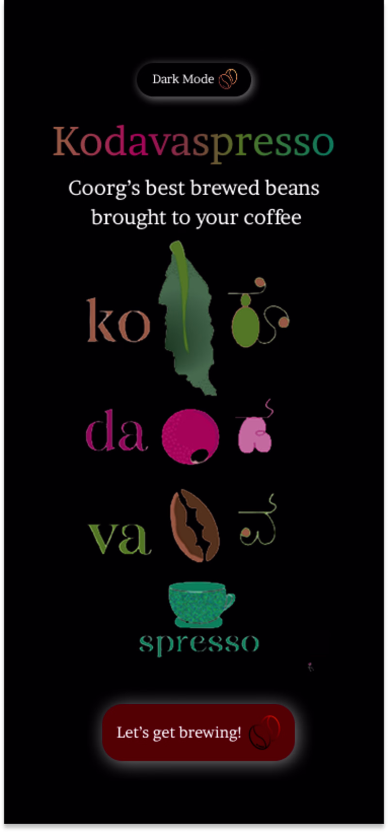
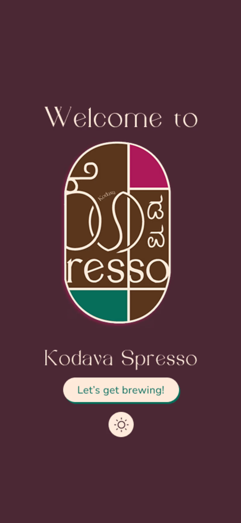
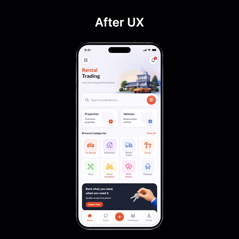
Taste Test
A quick before n after of a coffee app welcome screen redesign. Focused on simplifying the layout, improving hierarchy, and creating a warmer first impression for users. ☕
Which one works better for you, before or after?
1 voted
25%
3 voted
75%
4 votes
Closed
I’d go with New — feels much cleaner and the hierarchy is easier to scan.
🙌 thanks!
Glad it resonated!!!
New is better 👏.
The network for creativity
Join 1.25M professional creatives like you
Connect with clients, get discovered, and run your business 100% commission-free
Creatives on Contra have earned over $150M and we are just getting started
Related posts
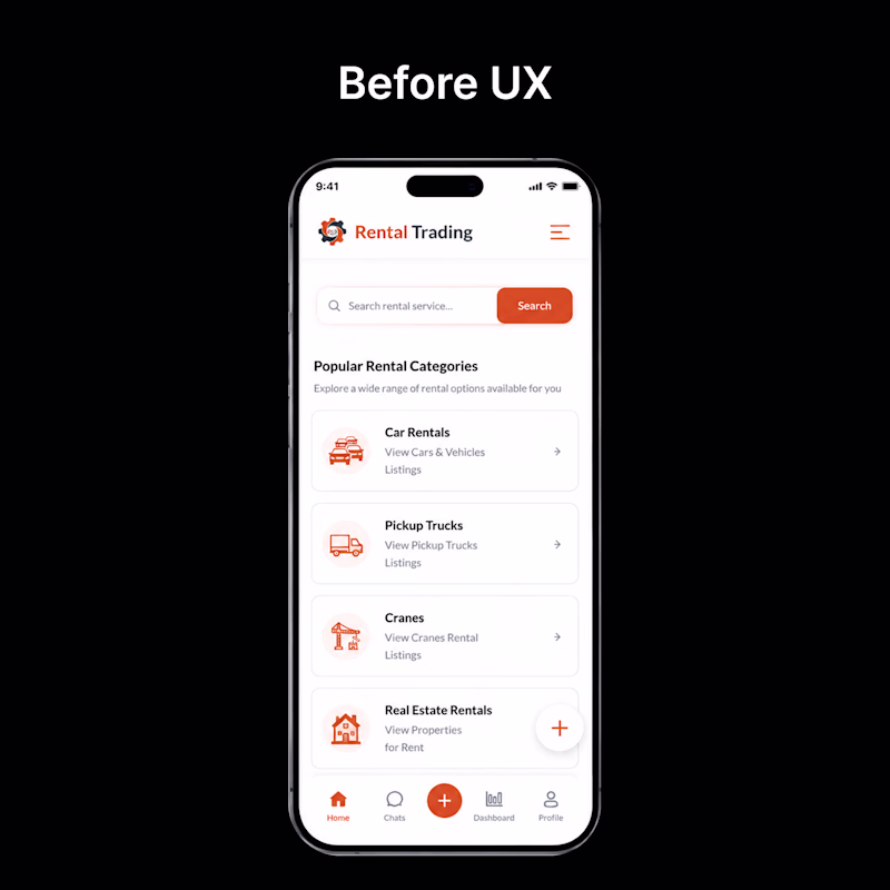
👀 Before vs After — Which UI would you choose?
Every redesign is more than just a visual upgrade—it's about creating a smoother, faster, and more intuitive experience.
🅰️ Before: Functional, but cluttered and harder to navigate.
🅱️ After: Cleaner layout, improved hierarchy, better usability, and a modern visual style.
If you were using this app for the first time, which version would you prefer?
👇 Vote in the comments:
❤️ BEFORE or 🔥 AFTER
1 voted
4%
24 voted
96%
25 votes
Closed
Pure design bliss.
Two homepage concepts for film production studio - which one do you choose? 🧐
38 voted
57%
29 voted
43%
67 votes
Closed
amazing!
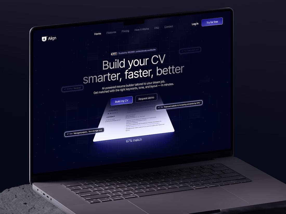
A fresh take on resume building 🚀 AI-powered tools to help users craft better CVs and land their dream jobs. What do you think?
Challenges
View allTrending
Claude
Claude has entered the design space. How are you using Claude Design?
Contra University
Learn from expert creatives how to earn more using next-gen AI tools.
fifaworldcup2026
The World Cup is here and the whole world's watching. How are you designing for the world stage?
creativeaiflow
Creative AI workflows are evolving. What tools do you use, and what are their strengths and weaknesses?
freelancerlife
Freelancer life is wins, pivots, and everything in between. What’s yours right now?