The network for creativity
Join 1.25M professional creatives like you
Connect with clients, get discovered, and run your business 100% commission-free
Creatives on Contra have earned over $150M and we are just getting started
Back to feedPost

Sharing my UX/UI work for Lemonads, an AdTech platform designed to simplify Google Ads management. This case study explores how I turned complex advertising data into clear dashboards and intuitive workflows.
#ProductDesign #UXUI #AdTech #ui


Strong product-design thinking here—turning dense ad-management data into a calmer dashboard is no small task. The hierarchy and status cues make the workflow feel much more approachable.
Thanks, @Rohan Ahmed Getting the hierarchy right was definitely the key to making the data feel calmer. Please follow my profile to see more UI/UX case studies!

Turning negative keyword management into something visually clear is no small feat, that's usually the most tedious part of running ads. What was the biggest UX challenge in simplifying a workflow that's normally just spreadsheets and rules?
Thanks, @Diego Sánchez ! Believe it or not, we had a lot of background here. We run a sister agency that trains people in Google Ads, so we used our allied marketers and their data as our main reference, along with spreadsheets, APIs, and competitor software. The hardest part was grabbing...

Great work
Thank you, @Rahman Rahe! Glad you liked the design. Please follow me for more product design content!

It's cool
Thanks, @Girum Asmare! I appreciate it.
Please follow my profile to catch my next design projects!

AdTech dashboards are notoriously easy to clutter, so pulling off a clean workflow for Google Ads data is no small feat. The biggest challenge I usually run into with ad platforms is balancing granular metrics for power users without overwhelming clients who just want quick ROI...
Thanks, @Dauda Evelyn ! For this initial launch version, we didn't build customized view toggles for different tiers. Instead, we focused on a single core layout, but we put a lot of emphasis on making the tables highly customizable so each user can filter and select the specific metrics...
That flexibility in the table design is usually the best middle ground for a V1—giving power users the control to trim the noise without hardcoding separate views too early. It'll be interesting to see what metric presets naturally surface once you start getting usage data. Following along to see how the dashboard evolves!
Having an in-house Google Ads training agency as your built-in user research is such an unfair advantage most product designers don't get. You cut off right at "the hardest part was grabbing..." though, what was that specifically, the raw data itself or getting it into a usable format?
The network for creativity
Join 1.25M professional creatives like you
Connect with clients, get discovered, and run your business 100% commission-free
Creatives on Contra have earned over $150M and we are just getting started





Related posts

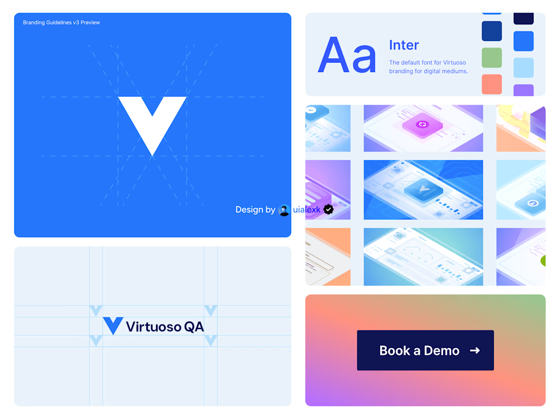
Branding v3 for Virtuoso
This design evolution, made an impact to the brand growth's by:
- Increasing website conversions
- Having consistent brand presence across digital mediums
- Increase brand awareness
See full case study here

One of the best designs I’ve seen today. Really solid work


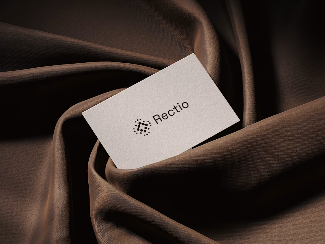
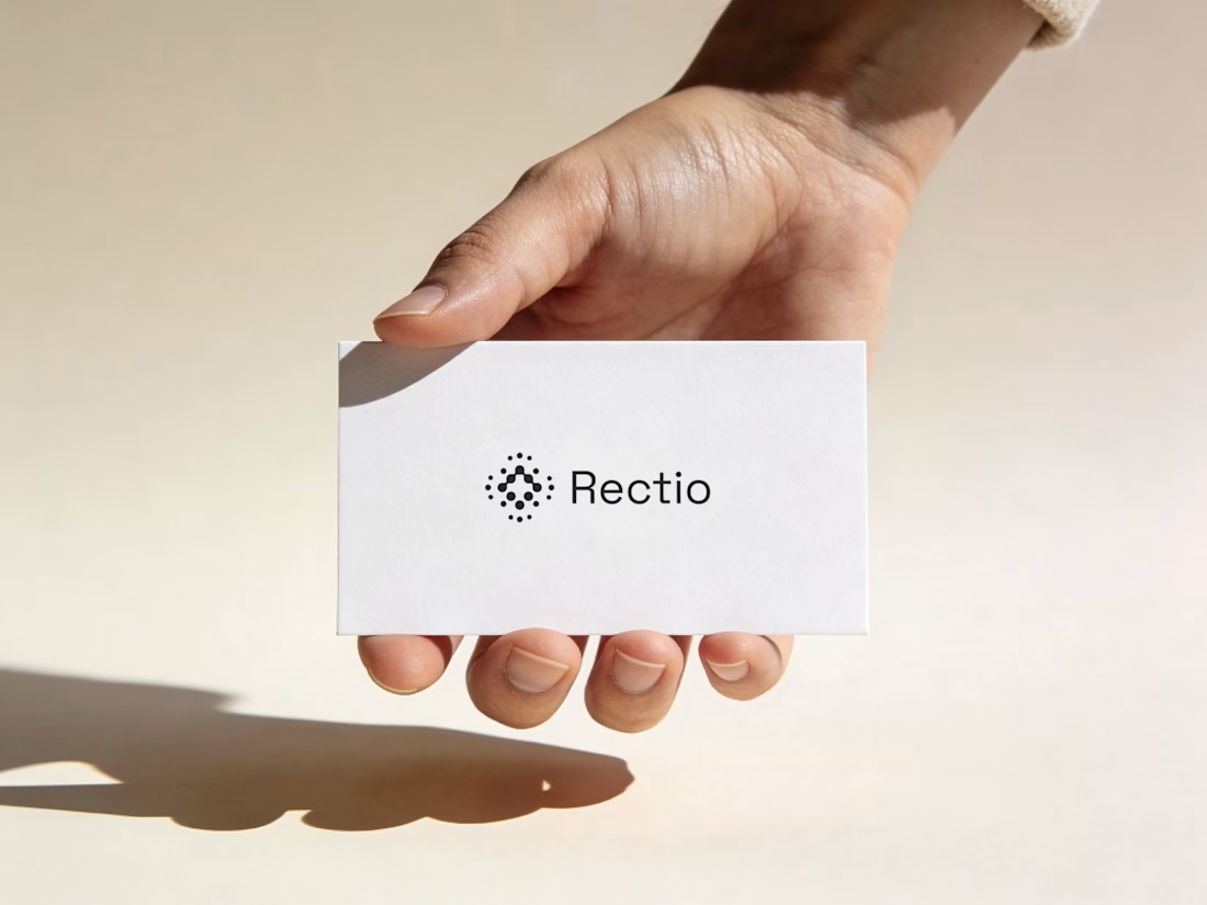
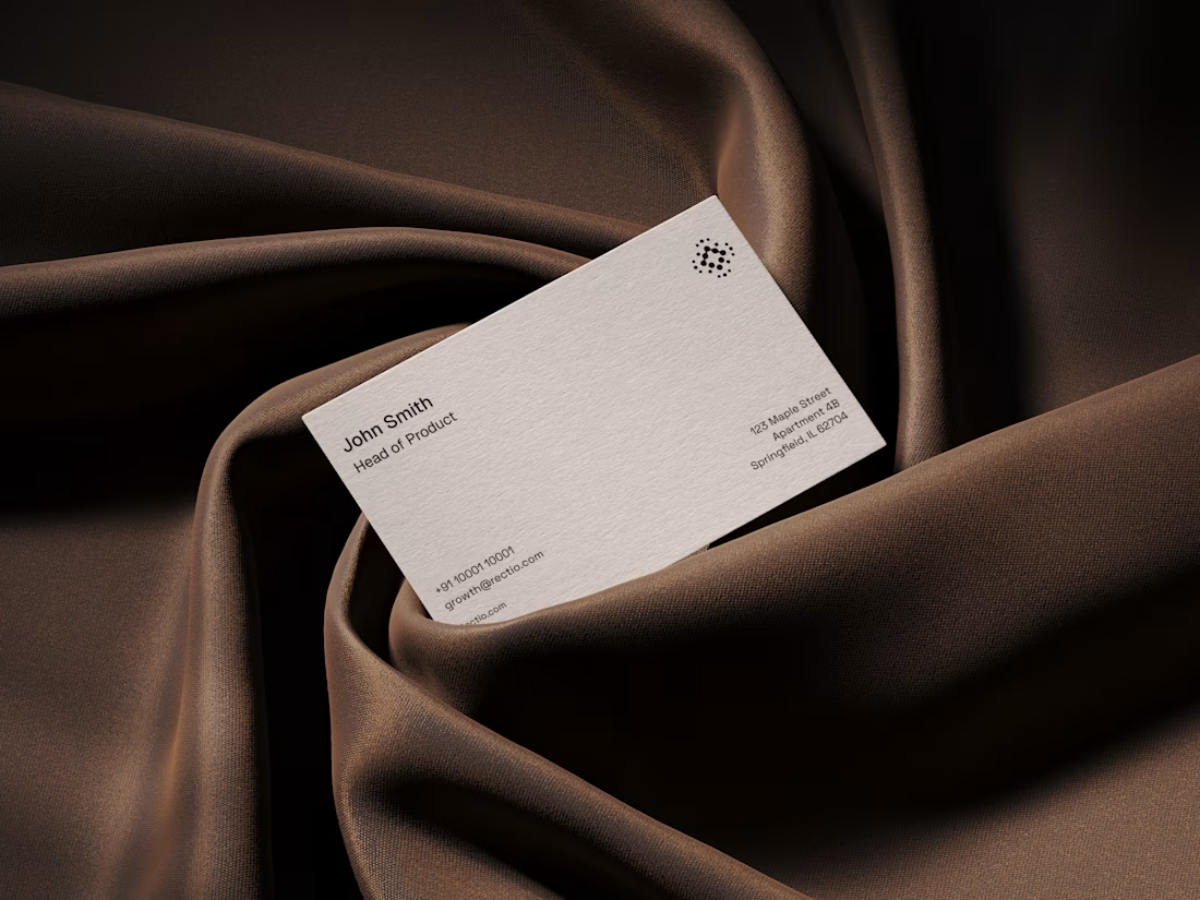
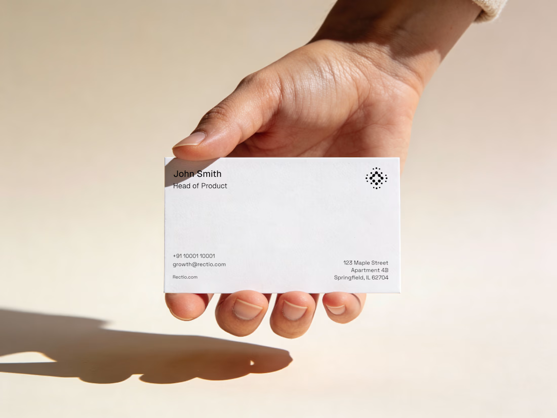
Rectio — Brand Identity
Brand Identity • Visual Direction • Business Cards • Mockups
A modern and minimal branding direction for Rectio, from visual identity to business card applications.
Created by Artonest Design Studio — artonest.design



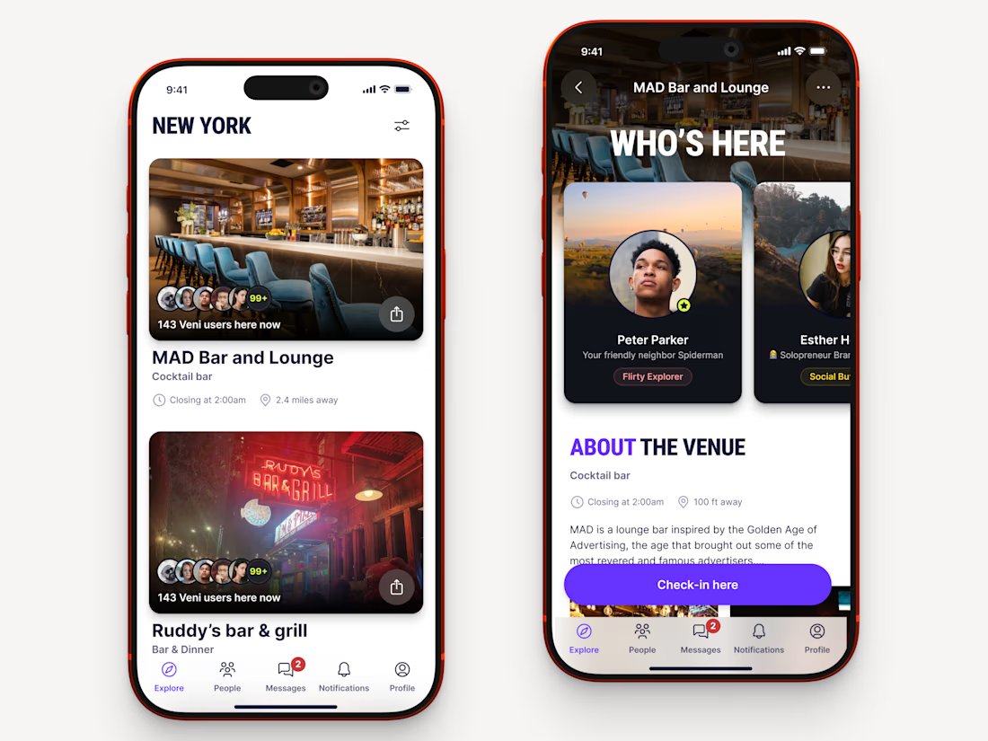
Recently worked on a mobile app for local networking.
Find venues (bars, clubs, conference halls, etc..) nearby, see who's there and connect.