The network for creativity
Join 1.25M professional creatives like you
Connect with clients, get discovered, and run your business 100% commission-free
Creatives on Contra have earned over $150M and we are just getting started
Back to feedPost

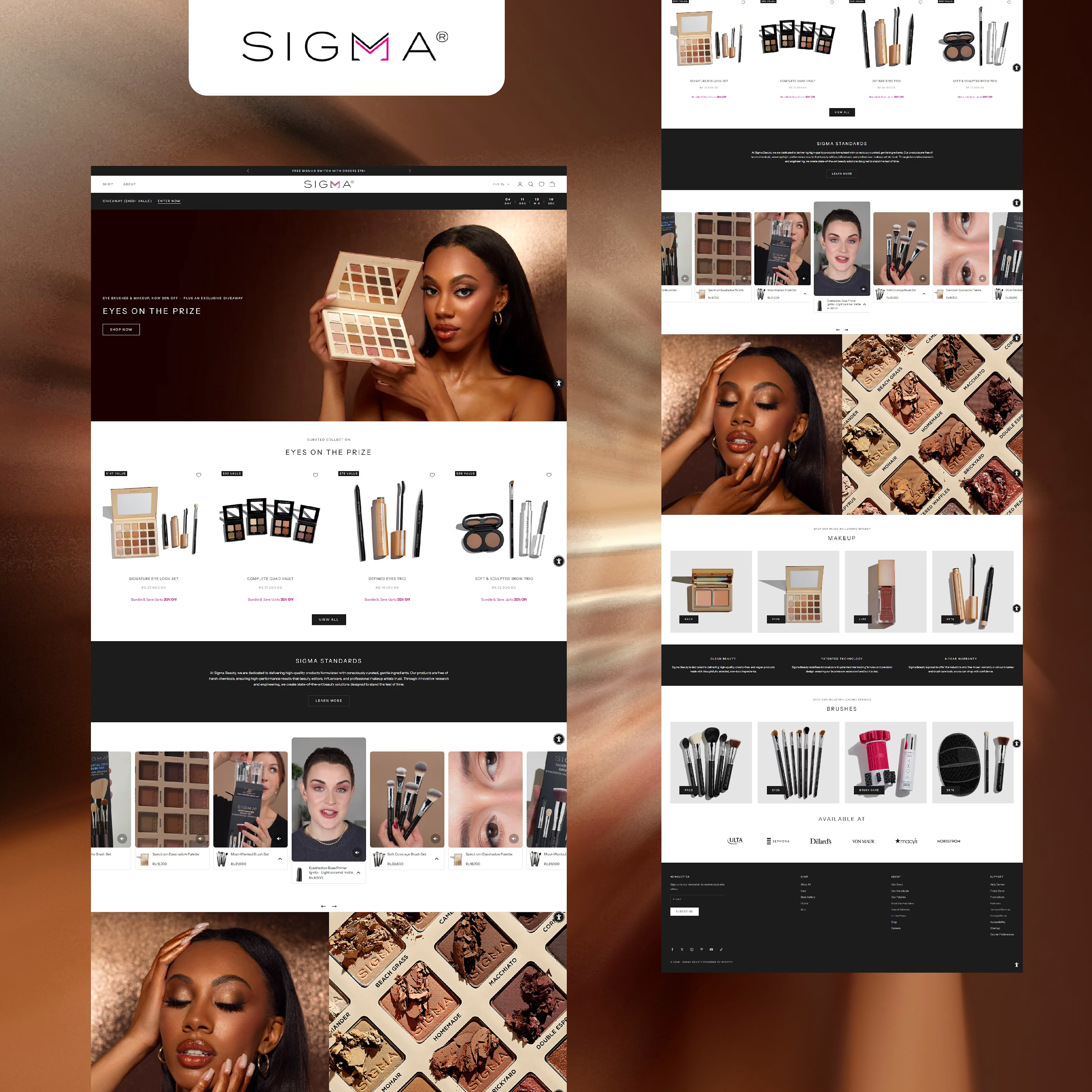
Designed and developed a modern ecommerce website for Sigma Beauty to showcase makeup products and collections. The website features a clean product-focused layout, high-quality visuals, and structured product categories to enhance the shopping experience. Built with responsive design and optimized navigation to ensure smooth browsing and seamless purchasing across all devices.


The network for creativity
Join 1.25M professional creatives like you
Connect with clients, get discovered, and run your business 100% commission-free
Creatives on Contra have earned over $150M and we are just getting started

Challenges
View all


Related posts

Working on the homepage for Still Blooming, a wedding and floral studio, I explored two different layout directions for the hero section. Same brand, same copy, just a different structure and visual rhythm.
Option 1 : Left Aligned. Text sits on the left with supporting content beside it, giving an editorial, asymmetrical feel.
Option 2 : Centered. Everything is stacked and centered, giving a clean, balanced, more classic hero layout.
Would love your honest UX/UI take which direction feels more elegant, functional, and true to a wedding/floral brand, and why?
22 voted
41%
32 voted
59%
54 votes
Closed

Great Design :)


Some designers are obsessed with removing friction. Usually, they’re wrong.
When it comes to high stakes fintech "invisible" is a bug, not a feature.
We designed the Tithe onboarding with a mandatory slide to confirm. One second of friction to ensure a lifetime of trust.
Don't just make it fast but rather feel right.
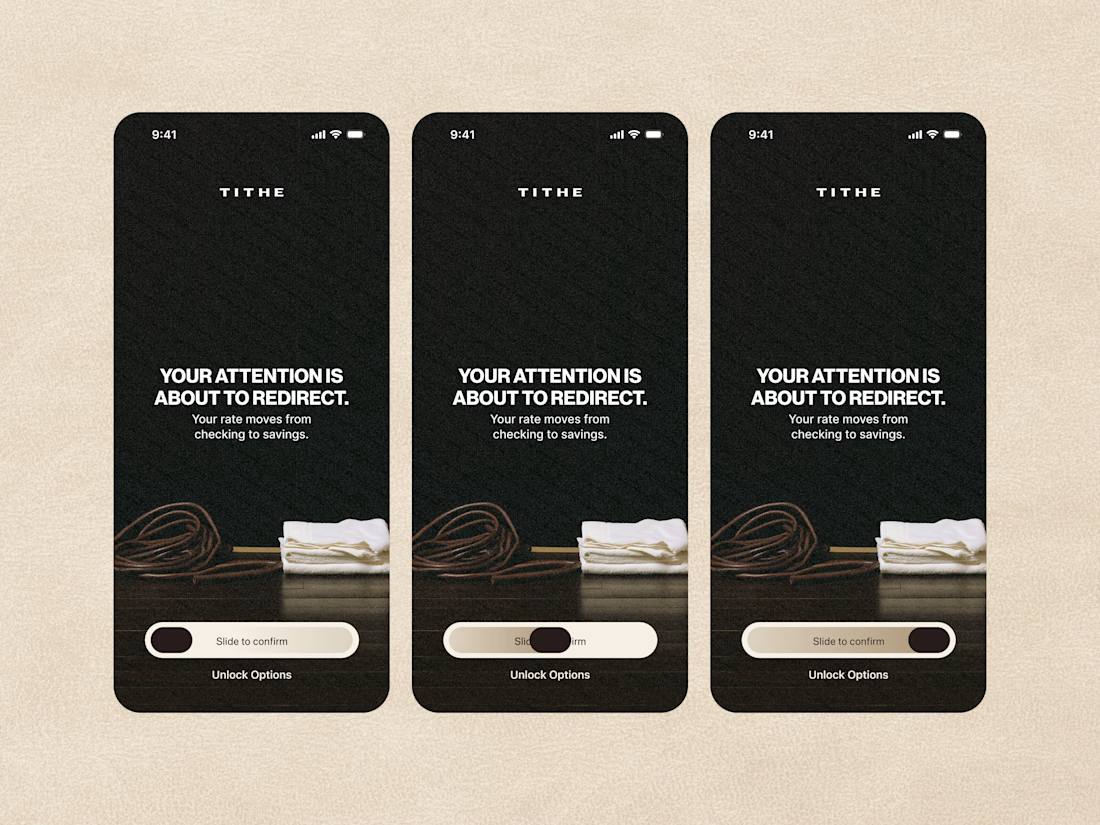

The slide-to-confirm is a nice touch. For financial decisions, that extra moment of intention makes sense.