The network for creativity
Join 1.25M professional creatives like you
Connect with clients, get discovered, and run your business 100% commission-free
Creatives on Contra have earned over $150M and we are just getting started
Back to feedPost

SparkleSocks ✨ Whimsical Landing Page ShowReel
SparkleSocks is an enchanting, high-converting e-commerce boutique for handmade luxury socks designed specifically for unicorn lovers.😊


The network for creativity
Join 1.25M professional creatives like you
Connect with clients, get discovered, and run your business 100% commission-free
Creatives on Contra have earned over $150M and we are just getting started











Related posts

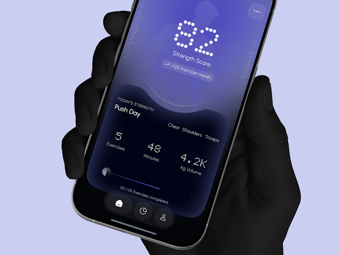
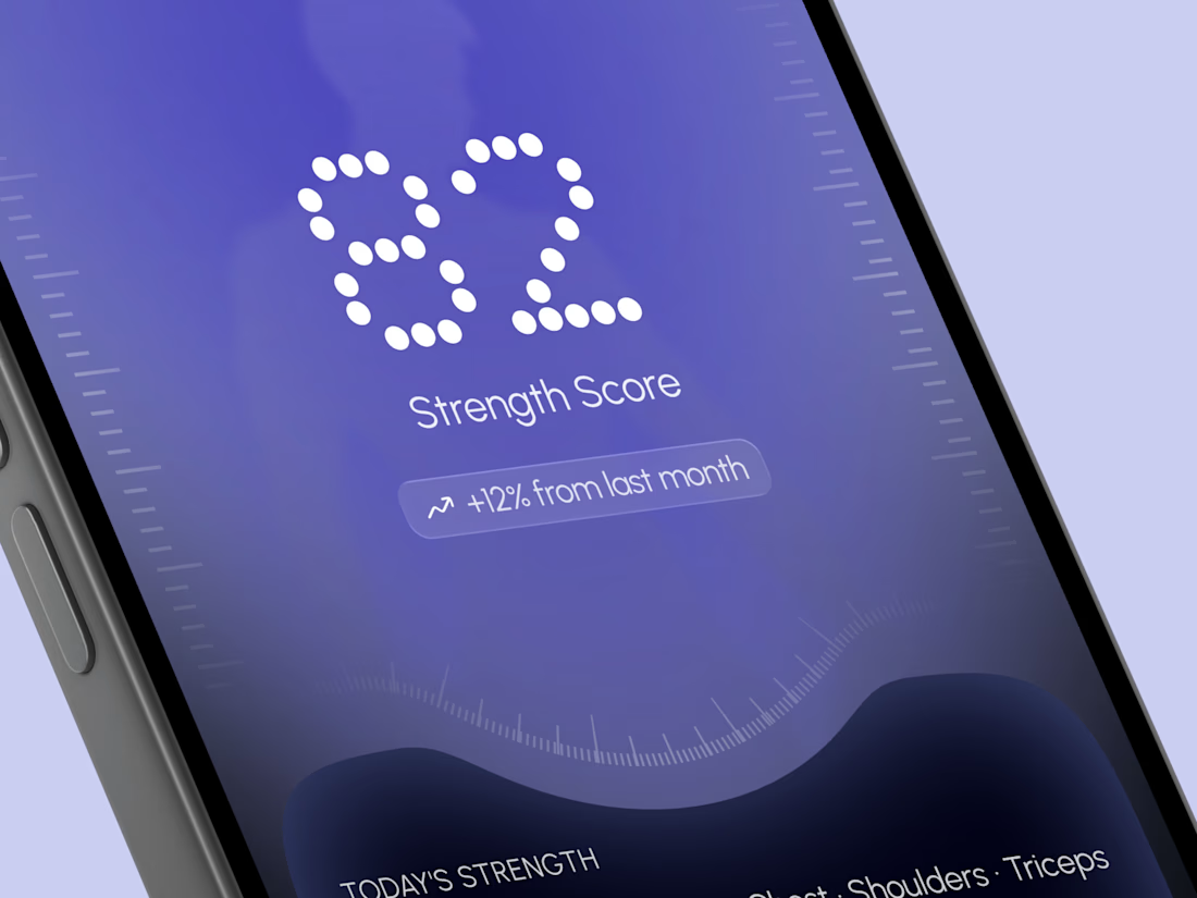
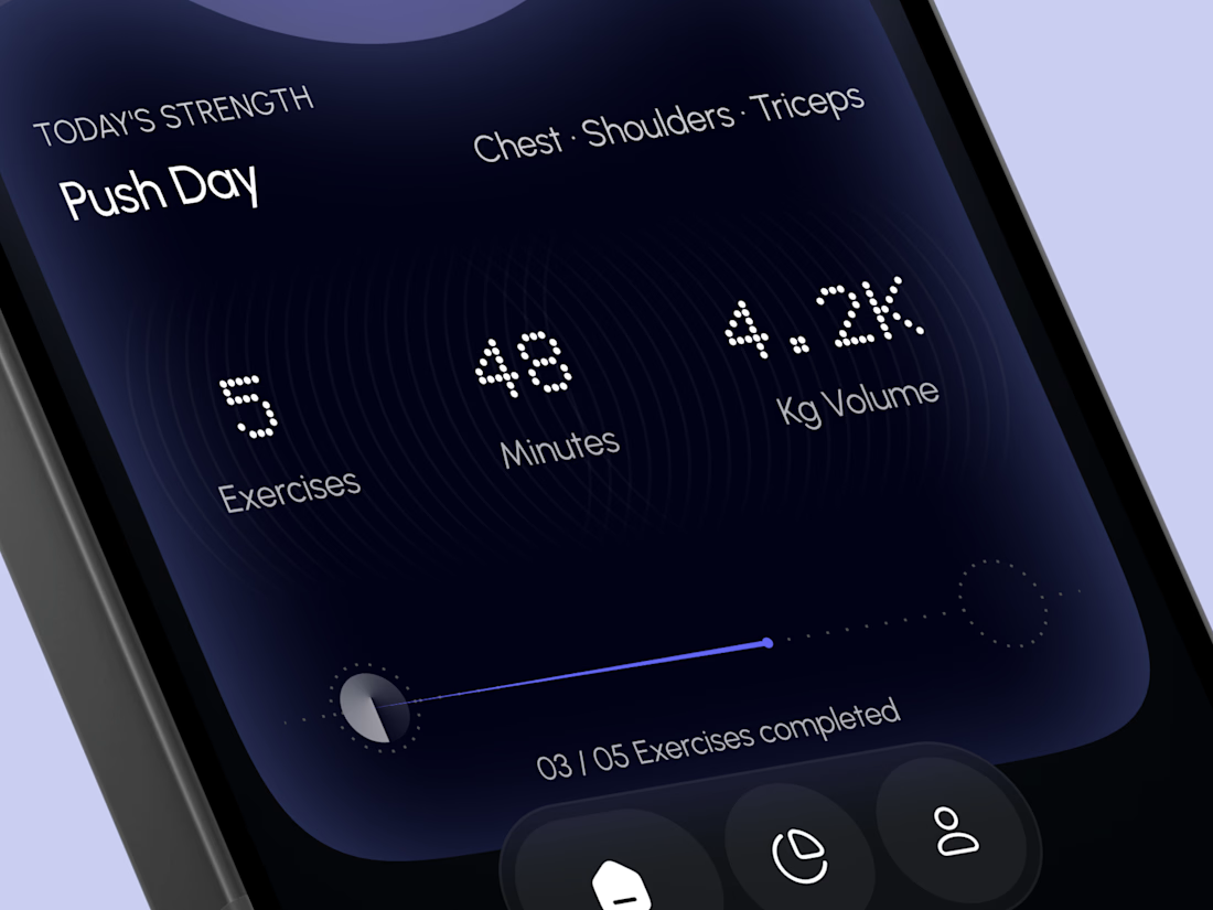
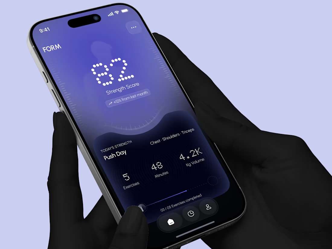
Designed a modern Strength Training Mobile App.
A deep indigo and violet gradient with a soft body silhouette and dotted display numbers for a bold and focused first impression.
A glowing strength score, a clear workout card with exercises, minutes, and volume, plus a simple progress bar make every training session easy to follow. A curved dark panel, fine tick marks, and a floating tab bar keep the whole app sleek, modern, and easy to use.


High end execution

Sunny Rock — Cinematic Paris Travel Website | Creative Web Development
Experience Paris through Sunny Rock, a cinematic travel website concept designed to combine immersive visuals, elegant UI/UX, and interactive scrolling into a premium digital experience.
This self-directed project explores modern web design through cinematic imagery, scroll-driven animations, glassmorphism, smooth transitions, and responsive layouts.
🛠️ Technologies & Skills
HTML5 & CSS3 — Semantic structure, modern styling, and responsive layouts
JavaScript (ES6+) / TypeScript — Interactive behavior and animation logic
React.js — Reusable components, hooks, and state management
Tailwind CSS — Utility-first styling and responsive design
HTML5 Canvas API — 2D rendering for visual effects and image sequences
Scroll-Driven Animation — Frame-by-frame image sequences synchronized with scrolling
requestAnimationFrame & Linear Interpolation (Lerp) — Smooth animation updates
Lenis Smooth Scrolling — Fluid scrolling experiences
Intersection Observer API — Scroll-triggered reveals and entrance animations
UI/UX & Visual Design — Visual hierarchy, typography, glassmorphism, and interaction design
SVG Graphics — Scalable icons and vector elements
AI Visual Generation & Prompt Engineering — Cinematic visual assets
Cloudinary — Media hosting and image optimization
Performance Optimization — Efficient asset loading and animation rendering
Python & Browser Automation — Development utilities, asset processing, and testing
✨ Design Highlights
Cinematic, immersive visual storytelling
Premium travel-inspired aesthetic
Smooth, scroll-based animation sequences
Modern glassmorphism interface
Responsive layouts for different screen sizes
Interactive elements and refined micro-interactions
Project Type: Self-Directed Portfolio Project
Focus Areas: Creative Front-End Development · Web Design · UI/UX Design · Interactive Experiences · Animation
Designed and developed by Ubaid | Ubaid Web Studio.🔥


Your next client might be one portfolio away. ✨
MyFolio Pro — a premium Framer template for freelancers, UI/UX designers, and creative agencies.
Template link: https://framer.link/E9JSnLX



love this as well man