The network for creativity
Join 1.25M professional creatives like you
Connect with clients, get discovered, and run your business 100% commission-free
Creatives on Contra have earned over $150M and we are just getting started
Back to feedPost

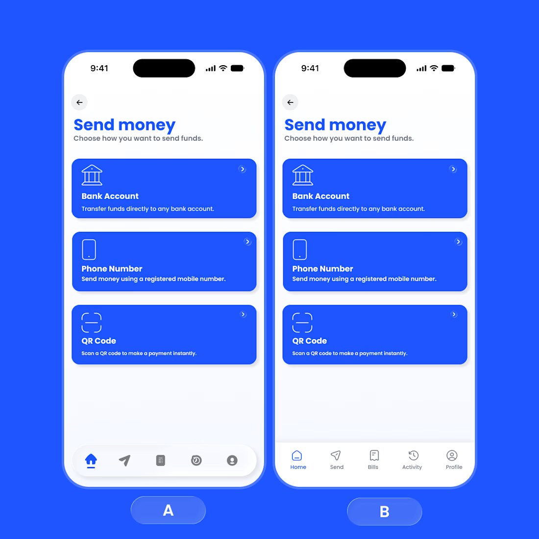
👀 Design Poll: Which Bottom Navigation Wins?
I’ve been exploring two approaches for the bottom navigation on this Send Money screen, and I’d love your feedback.
Option 1: Filled active icon style (left)
Option 2: Outlined active icon style (right)
Both follow the same layout and interaction, but the active navigation treatment creates a different visual feel.
Which one would you choose?
🅰️ First – Bold, stronger emphasis, easier to spot the active tab.
🅱️ Second – Cleaner, lighter, and more minimal.
Drop your vote in the comments:
A or B If you can, tell me why—I'd love to hear what stands out to you from a usability and visual perspective. 💙 make it for twitter short
The network for creativity
Join 1.25M professional creatives like you
Connect with clients, get discovered, and run your business 100% commission-free
Creatives on Contra have earned over $150M and we are just getting started
Related posts

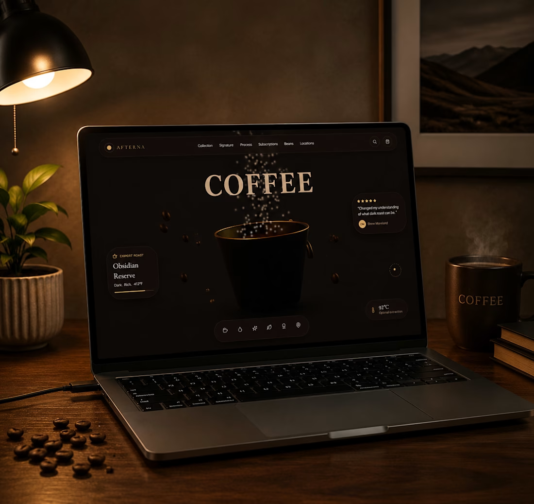
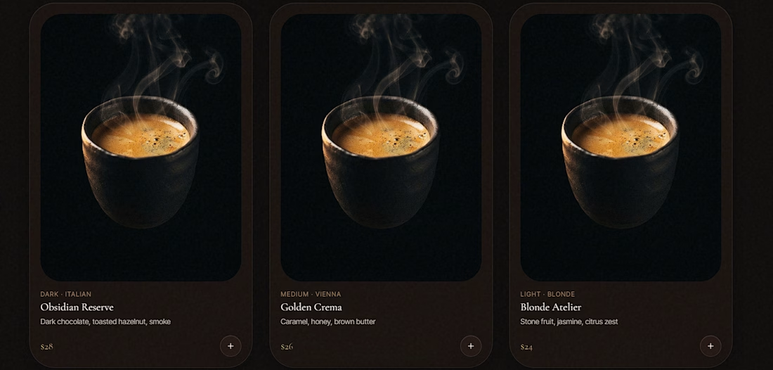
Just finished a new concept project: a premium Starbucks-inspired landing page.
The goal wasn't simply to design another coffee website. I wanted to create an immersive experience that combines modern UI, interactive 3D, and smooth motion to make the brand feel more engaging from the very first interaction.
Built with:
• Base44
• React
• Tailwind CSS
• GSAP
• Spline
Some of the highlights:
• Interactive 3D hero section
• Glassmorphism UI
• Cinematic scroll animations
• Premium micro-interactions
• Fully responsive layout
One thing I've learned while building projects like this is that AI can speed up development, but the final quality still depends on design decisions, iteration, and attention to detail. The best results come from refining the experience not from a single prompt.
I also recorded a walkthrough of the project, and you can explore the live version through the link in the comments.
I'd love to hear your feedback.
What would you improve or add to make this experience even better?
#WebDesign #UIDesign #Frontend #CreativeDeveloper #GSAP #Spline #React #TailwindCSS #Base44 #AI #LandingPage #MotionDesign #InteractiveDesign



Fantastic concept. The combination of 3D, motion, and micro-interactions creates a premium feel. I would just ensure performance stays smooth on mobile and keep the primary CTA visible throughout the experience so the visuals continue to support conversion.

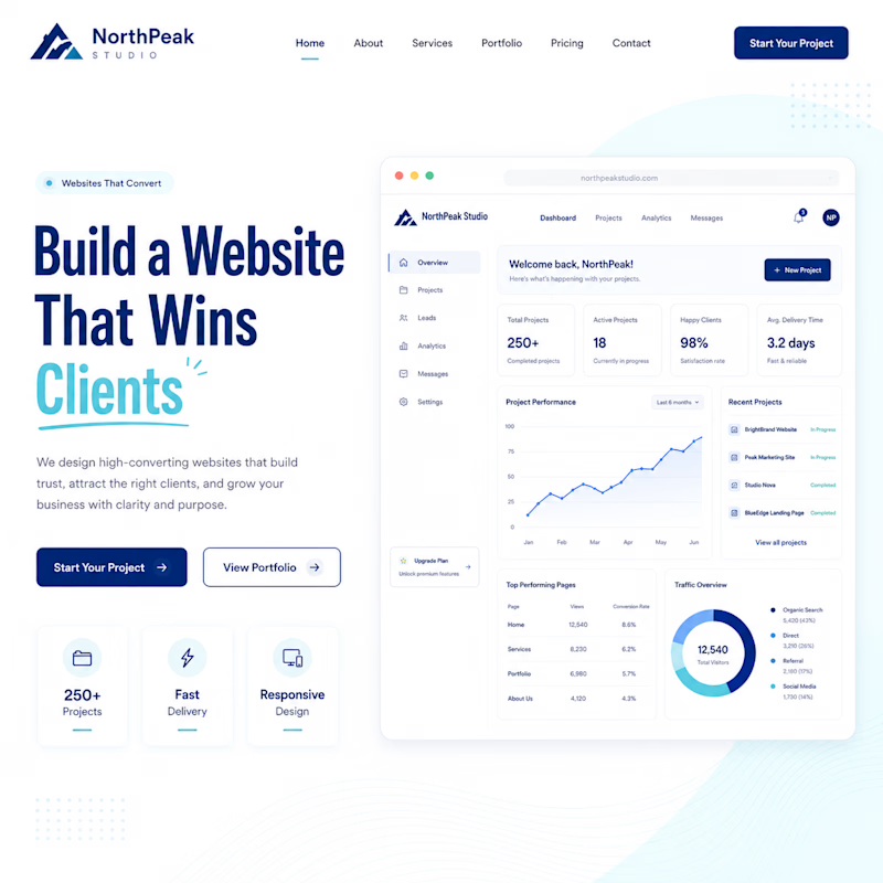
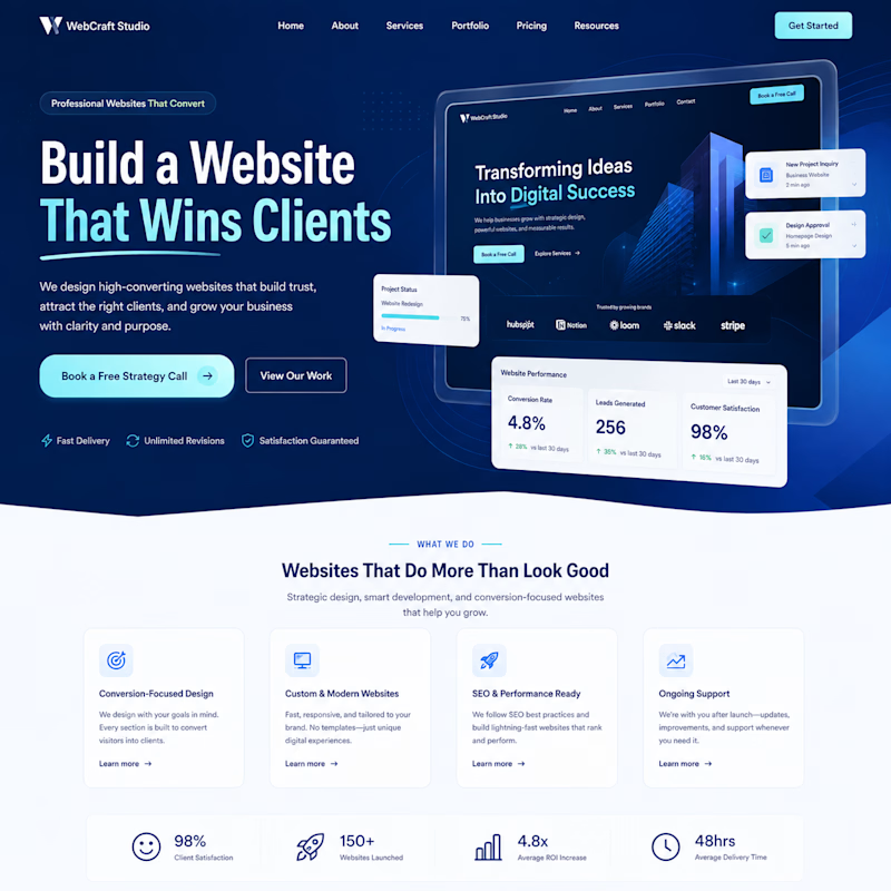
Your homepage hero section creates the first impression.
Which one would make you stay and keep scrolling?
🅰️ Option A: Clean & Minimal
🅱️ Option B: Bold & High-Impact
Vote below and tell me why you picked it! 👇
🅰️ A
🅱️ B
#WebsiteDesign #UIUX #WebDesign #LandingPage #CreativeCommunity #DesignInspiration #Contra


3 voted
30%
7 voted
70%
10 votes
Closed


The real answer depends on what happens after the scroll. option B sells the vision faster. option A earns trust faster. whichever one matches your actual sales process after the hero is the right pick, not whichever looks better in isolation
creating a new navigation for an old template
taking my time with the small details
trying a few subtle interactions
and seeing how good i can make it feel



Nice work🔥👏










Trending

Claude
Claude has entered the design space. How are you using Claude Design?

Contra University
Learn from expert creatives how to earn more using next-gen AI tools.
creativeaiflow
Creative AI workflows are evolving. What tools do you use, and what are their strengths and weaknesses?
freelancerlife
Freelancer life is wins, pivots, and everything in between. What’s yours right now?